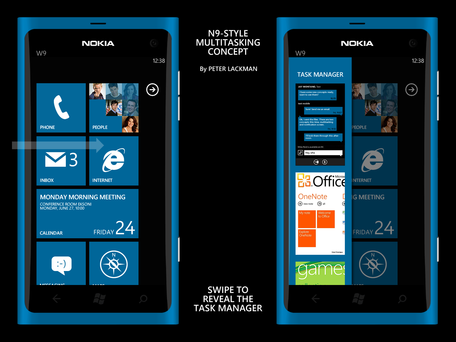
Nokia Windows Phone 7 UI Concept: N9-style multitasking
Hello again folks,
after reading the following quotes after the announcement of N9 from Nokia spokesperson Mark Squires,
We did the alliance after they announced Mango and we’ve jumped on a moving bus. That means the majority of early products will be based on that.â€
“However, as we move forward, you will see more of that ‘Nokia stamp’  in those future devices. People right now can only see pieces of the puzzle, they can’t see the whole picture.â€
I decided to do some concepts what those statements might actually mean. Since those statements were said during an interview regarding N9 and MeeGo, I believe it might mean that Nokia is considering using some of the more innovative elements of Harmattan UI in the future, eventually showing up also in Nokia’s version of  WP7 as well. One of those elements is the multitasking, which is what this particular concept is about. As we know, Harmattan UI has a whole homescreen reserved for handling multitasking showing all currently open applications. It can be accessed by swiping from either left or right edge of the screen, depending of in which homescreen the user currently is. While it can’t (nor should) be translated to the Metro UI as it is, here’s a concept how some parts of that could be adapted to WP7:
N9-style multitasking in WP7
I would change the current  way of handling multitasking in WP7 which is a long press of the physical Back button to something similar seen in N9 and the Harmattan UI, accessible by a single swipe from anywhere. I don’t like the current way because I feel that the long press takes time and the button itself is not very conveniently located if using only one hand. Additionally, the current way shows only the two latest applications after the long press requiring several more swipes to reach the end of the list, which I find inconvenient (I personally would prefer seeing all the open applications immediately, like it’s done in N900).
So in this concept swiping right from the left edge of the screen anywhere (home screen, Applist, inside an application) reveals the Task Manager, which is a narrow screen on the left side of the screen showing scroll able card list of currently open applications. This would provide a very fast and convenient way of switching between applications.
But hey, see it for yourselves, I made a video:
What do you think, could this work?
Frequently asked in comments:
1. Are you affiliated with Nokia?
No, I’m not. I’m just a Nokia fan that likes to dream.
2. Since WP7 uses a lot of scrolling from left to right in the applications, hubs and etc. don’t you feel it might be a problem?
No I don’t, the curved screen used in N9 (and presumably in the Sea Ray) actually makes it very easy for user to separate the two gestures.
3. How is this any more efficient than the current multitasking screen, since you see only two (or three) open applications with this as well?
I heard that Mango has a maximum limit of six open applications at the same time, so it would require only one flick of the card list will show you the rest of possibly open applications.
4. Can I follow you on Twitter?
Sure. It’s @PeterLackman.
Category: Concept, MeeGo, Nokia, Windows Phone


Connect
Connect with us on the following social media platforms.