Nokia USA site gets fresh new look (and a glance at Nokia sites through the decade)
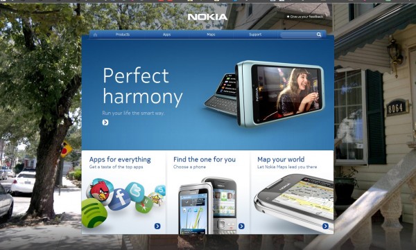
You may have noticed yesterday that Nokia USA got a nip&tuck, with a facelift similar to the Nokia Ireland site.
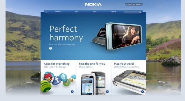
Here’s Nokia IE site. Not sure when Nokia Ireland made the switch but it was a while before Nokia USA yesterday.
It’s simplified, it looks cleaner
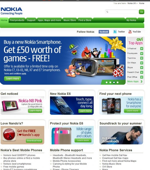
Here’s the ‘old’ look, as seen on Nokia UK today. It’s had this greeny theme since about 2006. Where’d the green come from?
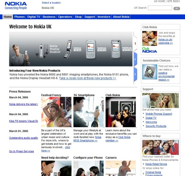
Here’s how the site looked in 2005. Very classic BLUE.
Look at that. A 3G smartphone all those years ago already huh? This is pre-Nseries era (introduction late 2005). Imagine coming out in 2007 without 3G on your smartphone. Perhaps too ahead of its time.
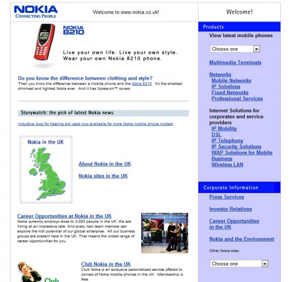
 Wow, check this out. From the year 2000. Internet wasn’t really that popular then. It looks like a wordpress blog. Check out that beautiful 8210. Still one of the sexiest looking phones IMO.
Cheers ezenwa  and Janne for the tip.
Category: Nokia



Connect
Connect with us on the following social media platforms.