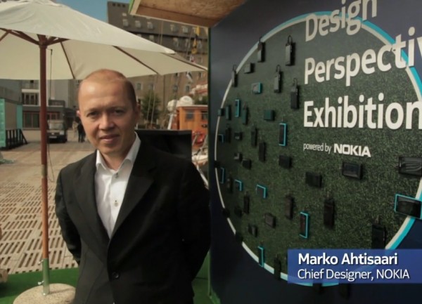
Video: Marko Ahtisaari on N9, “I know we have out simplified the iPhone”. Swipe to come to lower price points and possibly next Billion.
Just found this  video of Marko Ahtisaari, Nokia’s Chief Designer, speaking about Patterns of Human Interaction in Phones – N9 in particular of what Nokia’s trying to do. Some of the things he talks about were previously discussed in that very revealing video last year that hinted towards the innovations in the N9 but also possibly a move to Windows Phone.
Some things of Key interest:
1) In the new patterns introduced, N9 is just a first step. Just the beginning. More gestural interactions beyond the glass is expected
2) Two patterns introduced to Nokia, Swipe and Windows Phone. Both the beginning of multiple products, and in case of swipe, coming down to more accessible price points. MMM.
3) Swipe at Next Billion type price points? Even at mid-range that would be highly disruptive. Think about the new batches of 1GHz S40 devices. Now think about those utilizing swipe. This is great forms of interactions, but very friendly on the pocket.
OK the video
- Marko is interested in improving things people use 50-100 times a day. He’s not interested in using a wow feature that you use every 90 days and never remember afterwards.
- Scene on pattern: Phone market – over medialised, so hot that sometimes under false impression that all innovation is done – that it’s about adding the 537th feature or cloud this or that or ecosystems. 1890 – tillers – took 15 years to switch to steering wheel.
- Nothing could be further from the truth. He likens the automotive industry
- Dominant candidates: pattern of iPhone – multiple screens of apps (old pattern from computing industry.) Model is elegant and simple. Getting anyway – just go through the front door. It’s easy, but it feels silly after a while.
- Evolved a little – you can press buzzer on door twice, skip on one leg from dining room to living room.
- Asks how many uses iPhone and how many uses multitasking – less use multitasking, confirming Marko’s point of features that aren’t used by its users so often.
- Marko says – clearly there’s a better design than that.
- Second model – faster growing – multiple homescreens with widgets.
- Bet of pattern that personalization is so organic and easy that it happens over time, usin the device through homescreen (oh boy, did I ever with N900)
- Marko says with this interaction, folks don’t use the full potential.
- This is a pattern of Symbian and Android. Marko says that Belle is the most accessible to learn and snappiest version of that pattern on the market
- Biggest task in N9 – make room for possibility that there is better design than those two patterns.
- Someone he was working with said it lacked homescreen and widgets so it’s not a smartphone. Marko says that means they have restricted their imagination to a pattern already.
- To look for N9 pattern, they set themselves a task to make an all screen phone with no physical keys. People want larger screen no matter what size phone. They are still too big in and out of a pocket. If they could design an elegant overall experience with just a screen on the interface it would allow to make a larger screen to product ratio. That would allow more screen essentially.
- People wanted (even without explicitly saying) a design with full mobility. Marko says it’s something Nokia was known for, one handed use and going about other things.
- Most touch screen UI are immersive, requiring much more of our attention than they ought to.
- Folks head down pinching and zooming.
- N9 is just a first step in this
- Team’s goal is to give people their head up again so they can be more present to the world around them.
- Why is this important? Big human fundamentals. Latest research on MicroSociology shows humans can make each other feel like they are welcome – multitude of things – eye contact, physical things done subconsciously. Part is eye contact – if we are designing tech then shame on us for taking that away.
- This means;
- Better one handed use
- Better slopier use (so you don’t need such perfect actions to use it, not about making things smaller, beautiful, requiring precision.
- Display and glass flow seamlessly – gives a clue how we’ve solved the pattern.
- All starts with a simple gesture – swipe. When in any app e.g. clock and I’ done – just swipe from anywhere – the swipe away is that simplification.
- No physical homekey, no digital home key that you have to press. But wheneer you are in any app, just swipe from any edge
- Waking up the device is just a double tap. And then swipe – means you can wake it up with one hand.
- This is what I’m interested in, things people use 50-100 times and improving those on a daily basis.
- It doesn’t stop there. The three most important things – start activities (launching an app) notifications and switching between activities – something most phone designs have not yet succeeded on.
- Home has three views proceeding in carousel.
- [a few minutes I’ve ignored]
- When you swipe away, you go back to the view of home from where you came. Â You don’t always have to go through the front door. This makes this pattern very fluid – it feels like you’re flowing. The only way you’ll believe that is by using it.
- We prototyped both. Living with it for a week and sharing with outsiders.
- You have to live with it to see if it improves things and it was clear that the fluid version – though may seem to be harder to understand – is more fluid and  you don’t actually lose your sense of place.
- Allows refinement and reduction
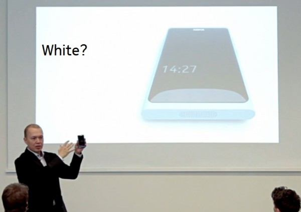
- Back is extremely organic, tapered ends, pillowy organic shape. Harks back to many classic Nokias.
- Extremely difficult product to manufacture
- An example of extreme product making – like fitting a boat into a bottle.
- Display and glass itself is a laminated deep black. 2 1/2 dimensional glass. Curved to accommodate swipe gesture. Laminated display makes it seem interface is on surface of the product. This is important because this UI is the first example of a fully direct UI.
- We have finally got rid of the mouse key. Nothing off screen you need to press. Everything happens here. Anything we can do to improve impresison of naturalness, it’s right there on the surface.
- The coloured polycarbonate when it wears it wears elegantly, not like painted plastic.
- Polycarbonate much better antenna performances than competitors. Unlike competitor products, you don’t have to hold it in a special way. No death grips of any kind.
- Allows us to do many colours – we’ll be doing much more colours in the portfolio.
- As more and more complex phones evolve, if you look at what’s out there, there are black and grey rectangles with rounded corners and buttons. Not a lot of choice. Two patterns and that.
- This gives a footprint that is different of a product as a whole.
- The pattern is what cuts through on a daily level.
- has become a replacement of note taking – an easier way to document. No need to write a sign, just take a picture of it (true, great for note taking in class, photocopying article extracts and necessary journals with the camera)
- Fastest shot to shot time of any camera – Marko gives a demo of N9 taking shot after shot (and this isn’t burst mode – this is normal shot after shot)
- Mark asks how an interaction could evolve beyond the glass. He talks about interactions in gaming, gestural interaction of different kinds.
- What is the essential simplification like the swipe? (Reminds us of those things we speculated early about the N9 – with hover gestures, kinect like pattern of interaction – which Nokia has patents)
- Talks about tight integration of NFC bluetooth speakers. Just tap to connect and play. No digging through menus.
- Search for the pattern doesn’t stop on the glass. Pattern is much broader than that.
- Responsibility – to connect the next billion. If you can provide affordable access, that increases sustainable choices for those people. As an industry, overall there is less into 0-10 eur phone than to expensive phone like the N9. Not possible to launch bottom up. He’s just as interested in those 0-10 devices.
- How do we make patterns from high end very accessible
- How do we make next billion affordably connected.
- When you look at this I know we have outsimplified iPhone. I’m nearly certain we have something more powerful than the Androids of multiple homescreens.
- Goal to make the next level of the new natural that when you put it down, it feels like technology from the future in how natural it is, everything else feels like older technology.
- How do we get people to try it? It is the beginning of many products
[vimeo=http://vimeo.com/28758945]
Here’s another video with Marko
[vimeo=http://vimeo.com/28755505]


Connect
Connect with us on the following social media platforms.