Nokia going Metro: New Conversations website
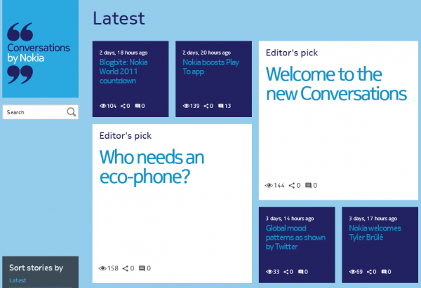
A few days ago we ran a story about Nokia’s Conversations website being down because of upcoming changes. Those changes have been made and the site is now back up and running in time for Nokia World 2011 on the 26th.
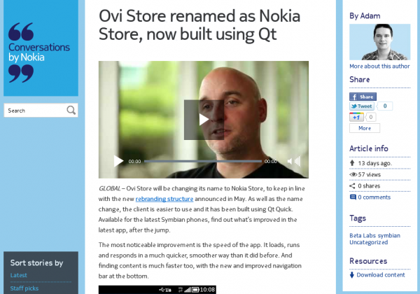
One thing immediately becomes clear within seconds of viewing the site; it looks a whole lot like Windows Phone and it’s Metro design language. The team over at Nokia Conversations have gone out of their way to make the site more interactive and above all design it in a way that the article is important and nothing else. I’d say they did a pretty good job, it does take a little while before you get used to it though, but the removal of all the ‘fluff’ from the top does make the site very article centric.
It has to be said, Nokia is really doing a good job in changing their online presence with the new look of several websites now. The look of Nokia websites seems to be linked far better these days than it was in the past.
So, what do you think? Is this new Conversations website an utter abomination or truly an improvement?
Thanks DM for the tip!


Connect
Connect with us on the following social media platforms.