Advertisements

In the first half of my review, I was thoroughly impressed with the hardware aspect of Nokia N9. Now it’s time to dive into the software department of this unique phone, and things are starting to look even more intriguing…
*MeeGo 1.2 Harmattan with Swipe UI
I really have to comment Nokia guys on pulling this one off. Alongside the top-notch hardware, the Swipe UI really turns using N9 into a truly refreshing and unique experience. Personally, I had been missing this particular feeling since the day I parted with my N900.
As I explore N9, jumping between menus, apps and generally trying to comprehend the extra layer of movement freedom I’ve suddenly found myself into, a realization comes to my mind. Nokia had tasked itself to take N9 as far as possible from its Maemo roots and spiritual predecessor, the N900. The UX changes are indeed quite staggering, and one would never think N9 as a Maemo 6 OS (later renamed ‘Harmattan’ by Nokia) device unless he or she had a look at the ‘About product’ section in the phone’s settings.
In comparison to Maemo 5 OS running N900, completely gone is the homescreen that could be populated with a rich variety of useful widgets. Perhaps not so unexpected, I still have mixed feelings about its absence. On one side, it does go towards complicating things, and thus disrupting what Nokia is trying so hard to accomplish here –  delivering a coherent and intuitive user experience. Nevertheless, I’m still missing that edge of wild freedom that the mobile computer in N900 had granted me. Not so apparent this time around, the Linux based mobile computer is still there in Nokia N9, there’s no doubt about that.
With the complete UX redesign on N9, we now have 3 main windows (or panels) that are accessed by horizontally swiping in either direction: Events, Main menu and the task manager. For now, those windows work in portrait mode only as do the majority of the built-in apps.

While the other two panels are self explanatory, the Events panel is a curios addition to the smartphone experience on Nokia N9. The panel not only combines information about missed calls or unread messages and emails, but also displays weather information and the combined feeds from Twitter, Facebook and Associated Press networks. Touching any news item in this view will conveniently launch the respective built-in app. Having all up-to-date-information in a single, easy accessible place is quite comfortable yet in my opinion hardly a replacement of the home screens found on N900.

There are two more noteworthy elements that compose the user interface on N9 but are not immediately apparent. First off, there’re 4 quick-launch icons that are normally hidden but can be accessed by slightly dragging the lock screen in any direction, and then releasing it. Alternatively, the four shortcuts can be accessed from any running app with a short upwards motion from the very bottom of the screen.
By default, it will contain shortcuts for the dialler, messages, web browser and the camera. You can’t replace those shortcuts right away, however, but there’s a freely downloadable app calledÂ
Shortcuts in the Nokia Store that enables you to do just that:
The final major element of Nokia N9 UI is the status bar. It can be instantly accessed within any app by tapping the rather thin bar at the top of the screen. The status bar doesn’t work in the entirely same manner it does on Android, however. On Nokia N9, it’s intended for controlling ringer and media volume, as well for managing active data connections and IM availability. What I’d love to see here is a tighter integration with 3rd party apps rather than just built-in services.
* The #N9Effect. So how does Swipe UI hold up in day-today usage of Nokia N9? In all honesty, I have to say that it does in fact offer some very tangible improvements (especially when multi-tasking), and generally just making the whole smartphone user experience feel very smooth, very natural. To my surprise, the absence of physical controls wasn’t really missed, and I think that does speak volumes about Swipe UI.

It’s also interesting to note how N9 even started to change my interaction with my other smartphones, when IÂ tried to double tap the mobile screen to wake it up, or swipe the screen away to close an app before realising it’s not an N9.
 It’s fascinating how these little things that make a whole lot of sense come quietly together in N9. Things that otherwise would be unremarkable until you catch yourself thinking why hasn’t this or that been done before, on other smartphone OS’s.That being said, Swipe UI on N9 does require some getting used to. Not because I find it flawed, but mostly because I had to unlearn certain things that I have established in my mind after using other smartphones. Over a short time, say, 3 days – I was getting more proficient with using Swipe UI. The biggest advantage I found is that user can quickly jump between open apps without the need to aim precisely at the screen, thus helping me keep focus on more important areas that resolve on the mobile’s screen.
Still, as fluid and elegant the transition between apps is on the N9, there’s a bit of annoyance when apps start accidentally minimizing. When swiping between photos, I would occasionally minimize the gallery app. Similar thing can happen in the web browser, where the smaller vertical screen estate in landscape mode increases the chance of me dragging the window away while scrolling through a web page. You might have to repeat certain screen gestures until you nail them down just right. But, again, I found that my old habits of using the mobile screen were getting in the way, so the learning curve has probably more to do with the user than with the phone itself.
I recommend checking whether the ‘Swipe down to close app’ option is enabled in the phone settings so you won’t end up sending every app you open to run in the background. As much as Nokia N9 makes multi-tasking look easy and fun, you should always be aware of the additional strain on the battery life. There’s no hand-holding to be found on Nokia N9 in that respect. Luckily, there’s a ‘close-all’ option that pops-up if you press and hold any area in the task manager screen. Going back to the first part of my review for a bit, with a careful open app management but otherwise not limiting myself too much I was able to squeeze two full days out of Nokia N9.
Don’t like the way Swipe UI handles the closing of apps? Then I’d heartily recommend trying SwipeManager to mould the user experience to your preference. Personally I found it incredibly useful to set app closing to the ‘swipe up’ gesture as the fingers are naturally much closer to the bottom rather than top edge of the screen.

And while at it, check outÂ
MyMoves app that allows users to utilize different touchscreen gestures for launching apps.
*Apps & Services. With a single core 1GHz Cortex A8 CPU and 1GB of RAM at its heart, Nokia N9 handles most situations without any noticeable effort and delays, be it browsing a content heavy web page or multi-tasking a dozen of apps. N9 comes pre-loaded with several apps you might already come to expect inducing Nokia Maps, RSS feed reader, Joikusoft Wi-Fi Hotspot, and a Documents app that can open several popular file formats like pdf’s and docx., just don’t expect to be able to edit them. I did not, however, find a built-in voice recorder, but thankfully Nokia Store had one available for free, although a bit too simplistic.
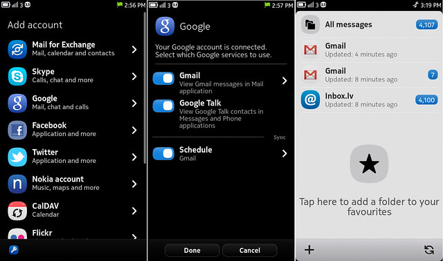
Just like N900, there’s whole a truckload of different communication services Nokia N9 supports right out of the box. You can sign in your Skype, Google, Mail for Exchange, Flickr as well as FaceBook, Twitter and YouTube accounts. Configuring those different accounts on Nokia N9 is incredibly easy and can be done in just a few steps.

The built in twitter app is quite decent but there’s nothing to shout about. I especially liked that you can refresh your time line by simply dragging the page down. I did, however, find one particularly glaring issue – Â it doesn’t support picture uploading. Apparently it’s a ‘bug’ in all current public firmwares of N9, and I was told that this will be addressed in an upcoming N9 fw update. Whenever that comes. There’s aÂ
workaround as recommended by other N9 users, but that’s hardly the solution I’m looking for. Here’s where Pixepipe would really come in handy, but as you might’ve already guessed, it’s not present in Nokia Store. Aside from that, If you wish to have slightly more features, you can always try TwimGo from the Nokia Store for free.

The default web browser is a mixed bag. It renders websites fairly well and has a very nice, clean looking UI. The tabs work in exactly the same manner as on the N900  – each tab is handled as a separate window in the task manager. The placement of bookmarks is a little strange though – they reside in the same menu as the apps, which is kind of a messy business. It’s  great to have a few select bookmarks, but certainly not ideal for 10+ bookmarks. Hopefully an upcoming update will fix this issue or at least bring folder support so users can separate apps from the bookmarks.

The music player is something I really enjoyed on N9. It goes pretty much in line with the principles of effective and clean design that characterizes the rest of Swipe UI. All the necessary controls are laid out for an instant access, and you can even swipe the large cover art sideways to easily switch between tracks, or tap it to pause the playback. If you’re used to tinker with the equalizer settings, however, be warned – there’s none. The 3.5 mm audio output is stellar though, and coupled with the fact that there’s a native FLAC audio support, the N9 can become a stellar portable media player along with some expensive headphones!

Nokia N9 also has a couple of pre-installed HD quality games including Galaxy on Fire 2 and the grand-daddy of all time killers – Angry Birds. While I’m not a fan of the later, Galaxy on Fire 2  is a very nice surprise. It originally came out for iOS devices but was later ported to a range of different Android smartphones and tablets. Down to its core, Galaxy on Fire 2 is an expansive space sim very reminiscent to one of my all time favourite PC games called Freelancer. The plot might feel a little dry and predictable but the gameplay is top notch, and you can literally spend hours just trading and doing side-missions in different systems. It also doesn’t hurt that it’s one of the better looking games currently out there on our mobile phones.

*The biggest problem area in Nokia N9 is, understandably, the number of quality 3rd party apps. The limited ecosystem of this first and last MeeGo phone is something you have to bear in mind when deciding whether to invest in Nokia N9 or not. It’s the lingering question of how many developers outside the dedicated community will take their precious time to port their apps to N9, with the help of Qt or not. Nokia has already promised to support N9 with updates for a least 2 years. From my past experience with N900, you still had a decent number of useful apps, and completely for free.

What I wish to know is whether down the line N9 will be seeing any of the high-profile names such as Sports Tracker, WhatsApp Messenger or Evernote. As we all know too well, you absolutely have to have some AA quality apps to coincide with the launch of the phone, no matter how polished the actual hardware is. So, let’s take a quick look at what I’ve managed to find while casually browsing Nokia Store on my N9:
gPodder is one of my old Fremantle favourites that looks and runs very nicely on Nokia N9. I couldn’t ask for more functional podcast client that on top of all is absolutely free. There’re no in-app ads either. It’s a crime gPodder isn’t already pre-loaded on N9.

Foursquare For MeeGo seems to be the official app. It’s very responsive and well animated, and as much as I use foursquare (read: very casually) the app seemed to have all the necessary features.

Internet Radio Player has a ton of different free stations to choose from. You can sort the extensive list of stations by genre or name. There’s even a fancy Equalizer that you can tweak or just use one of the presets.
Filebox – I couldn’t find a built-in file manager so this one comes very handy. It supports multiple file selection, opens zip/ tar files and works in portrait and landscape mode. You can even choose your favourite theme colour. Yep, it’s free.
Screen Capture – here’s an app I’ve been using quite a lot throughout my review. I’d prefer to map the screenshot trigger to one of the volume keys rather than have to manually re-set the timer each and every time. Or having to use the overly sensitive proximity sensor – I’m looking at you, ScreenshotMee.
MeeCast – the built-in AccuWeather app isn’t bad but I’ve found MeeCast to offer a less cluttered overview for the week’s forecast. You can even customize its appearance with different iconsets.
Converter Maemo – An old and familiar friend to Nokia users, Offscreen Technologies, has already managed to port several of its Symbian and Maemo apps over to MeeGo. The apps does what it says, that is, converts different types of units like speed, temperature, pressure or volume.
Battery Usage – an absolutely essential app for analysing and monitoring the power consumption on your smartphone.

Toshl is an absolutely gorgeous looking app that helps you keep track of your expenses. It’s still relatively buggy on MeeGo, and you will need to buy a Pro account if you plan to keep track of more than one budget.
Wallpapers for MeeGo is another sweet way of showing off the vibrant screen of Nokia N9. It almost makes you wish you could set wallpaper not just for the lockscreen…
So these are some of the interesting apps I’ve stumbled upon while browsing theÂ
Nokia store. The situation isn’t as dire as one might think, and you can also find several more or less stable off-store apps (like Firefox for MeeGo) should you ever feel adventurous.

*The bottom line, or should you buy Nokia N9 – As crazy that might sound, the N9 was probably one of the closest iPhone rivals without even realizing it. Like other reviewers have stated before, it’s hard not to immediately fall in love with N9. It’s even harder to put it down in the first few days. The outer shell and UI is gorgeous and refreshing, the tech inside – solid.But you have to be prepared to take a certain risk when investing in the N9. As I mentioned, the apps and the ecosystem are amongst the biggest drawbacks of this handset, and it’s not entirely clear how well and how far those will develop further on. Coupled with the fact that it’s now the eve of Nokia World that is bound to have several Windows Phone announcements, I simply cannot immediately recommend this phone to everyone. It’s definitely easier to recommend someone N9 than N900, but at least things were much more clearer with its predecessor. None of them are, in fact, a mainstream product. Clearly the effort has been made with Nokia N9, and the potential, dare I say, was huge.
I think those who will end up buying the N9 will not be second guessing this decision in the first place. Those are the techie users who are perfectly aware what they are getting into, and know to look past the shinning armour and see the untamed Linux beast within.
As for the people who are not avid smartphone app users and are just looking for a sleek looking, intuitive and simply great phone, the N9 can be the perfect fit.What attracts me the most in Nokia N9, aside from Swipe UI, is the spot-on hardware. But in that twisting turn of events, I’m now far more excited for N9’s WP running counterpart Nokia 800 aka Sea Ray than I was ever before. It’s only with a heavy heart that I had to I highlight the earlier mentioned flaws in this otherwise superior smartphone experience that Nokia N9 has to offer.
First I was confused by this feeling, perhaps even slightly angry; but now I’ve found comfort in knowing that, despite being surrounded by the turmoil with MeeGo earlier this year, in the end, Nokia N9 still received a well deserved limelight. And what’s more, it has helped remind the world that Nokia can still deliver some stunning and unique smartphones.
_______________________________________________________________
I believe this pretty much sums up my thoughts & feelings on Nokia N9. If you haven’t read the first part of my review where I covered the hardware of N9 – be sure to check that one out too! Oh, and you can also follow me on Twitter @_Nexus  🙂
Advertisements
Category: Maemo, MeeGo, Nokia, Reviews


 What I wish to know is whether down the line N9 will be seeing any of the high-profile names such as Sports Tracker, WhatsApp Messenger or Evernote. As we all know too well, you absolutely have to have some AA quality apps to coincide with the launch of the phone, no matter how polished the actual hardware is. So, let’s take a quick look at what I’ve managed to find while casually browsing Nokia Store on my N9:


Connect
Connect with us on the following social media platforms.