Mango vs. MeeGo: Transition from N9 to Lumia 800 (and back)
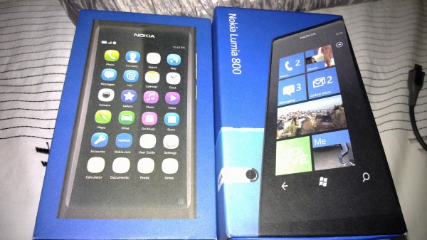
 If you follow me on Twitter you would know that Nokia Connects shipped me out a Lumia 800 to trial. (Yes, Nokia Connects. Shipped to Australia from the UK 😀 ) As you also know, Nokia Australia sent me an N9 to keep, so I can constantly bring new updates on the device and reviews. I am the first to recommend the N9 to those in countries where it is available. It is such an amazing device. In my eyes, it is the first time Nokia has matched good hardware with good software, and really given Apple a run for marketshare. But the N9 is not a mass market device, nor has it been marketed correctly. Fair enough, since the N9 and Lumia 800 share the same design. Nokia’s strategy is to go with Microsoft, so impeding that would be a poor business decision.
Anyway, I am not here to talk about the success of these devices or the Nokia “ecosystem” and their strategy. I am here though, to share a comparison between the N9 and Lumia 800, MeeGo vs. Mango, Swipe vs. Metro. I won’t bother with the hardware a lot, just mainly when it comes in conjunction with aspects of the software.
Jay: Michael asked me to just take a look but I decided to butt in and interrupt now and again instead of waiting to comment later :p I’ve grayed it out though so you pay attention more to Michael’s stuff.
Likes about N9 and MeeGo
- Swipe: So simple and so easy to pick up. It has definitely become second nature. In fact, I swipe on my N8 and on any other phone I use, because it has become a habit. [Jay: It’s amazing. Really. Except in some games where you accidentally swipe away, other than that, everywhere else, swipe is just very, very awesome]
- Double tap screen to wake: Like swipe, second nature. When I first opened the Lumia 800’s box, booted it, I double tapped the screen. I got frustrated that it wasn’t working, until I realised, “Wait, it’s not my N9”. [Jay: This and the swipe to unlock is actually not a natural movement at first. Everyone I’ve shown N9 to can’t unlock the screen. However, once they get it, they find it very straight forward. This like pinch and zoom (which is also unnatural at first) becomes a must have gesture when you learn it.]
- Unique: It is the only device of its kind. (Sorry N950, you don’t count! )
- Three Homescreens: These views are so easy to use and get used to, I am having trouble living without it on the Lumia. (Live tiles helps and I’ll talk about that too.)
- Hackability: I know this isn’t for everyone, but neither is the device. The N9 does target a niche market. I like the inclusion of developer mode. Although the OS isn’t as user customisable as Symbian and Android, you can still modify the system A LOT. ( Like I’ve shown you with adding IM accounts, changing icons from static to dynamic etc.)
- No self reboots: The only reboots I ever do, are after I use terminal, and the restart is needed for changes to take effect.
- Real Multitasking: This is probably the largest thing that I forget about when using multiple devices. MeeGo-Harmattan doesn’t “freeze” the applications. They indeed run in the background, visible when you navigate to a webpage, swipe away, and watch it load in the Multitasking homescreen.
- Screensaver: I struggle to live without this. It is so handy just pick up the device, look at the screen and see the time, as well as any new email, call or message notifications.
- Laminated Screen: It just feels so nice under your fingers. I know I said I wouldn’t talk about the hardware, but it relates to software. It makes those swiping action so much easier and smoother
Dislikes about N9 and MeeGo:
- “Dead OS”: Although Nokia continually states it will get support, many are skeptical. This mainly impacts developers. No users, No developers, No apps. And consequently, No apps, No Users.
- Battery Consumption: The N9 has decent battery life, but I expect it to be better. In the current times of smartphones, battery is a major part that influences user decision. (Android is renowned for being heavy on the battery, thus many people will go elsewhere.) I tend to get at least a day ( my day is usually 13+ hours switching between 3G, WiFi and no signal at all, so that is something to consider) out of it. Which is still good don’t get me wrong. I am just greedy and want more. For most people, this will be enough.
- Ringer Volume: I find it is way too soft, even on full. I had to go through some terminal commands, to up the volume. (Yes, even though it is full, the volume can go higher? ) [I find speakers on both Lumia and N9 to be quite poor. There’s no body to the sound and they’re kinda quiet. Tinny and quiet. It’s annoying to hear punchier sounds from my Omnia 🙁 )
- Keyboard: It is way better than Symbian Anna/Belle, but I tend to, more often than not, hit the full stop/period ( . ) instead of a space. It is quite annoying. (At least some apps let me use landscape keyboard so this alleviates the issue a bit, but still, it is annoying.) No, I will not use Swype, it is even worse. [Haha, agree. It’s the best Nokia virtual keyboard by far, but usability pales in comparison to Lumia/4S]
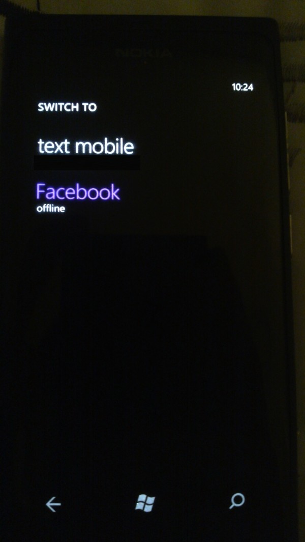
- Messaging: I love it. You can have Skype, MSN, Facebook chat, etc. in the one app. (“Wait, why is this in the dislikes?”)Â I dislike that each service is separated. It would be nice if (like iOS and Mango) the services where in the same thread or linked contacts, just differentiated by a line across the thread saying “Text”, “Skype”, “Facebook” or whatever, or even, a thumbnail icon next to the time stamp.
Likes about Lumia 800 and Mango:
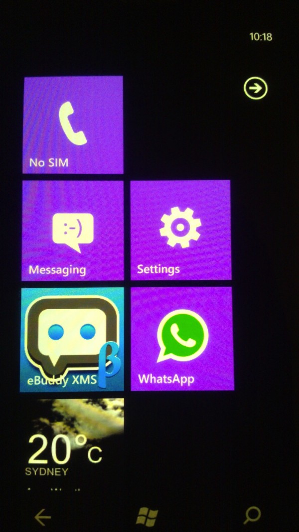
- Live Tiles: Okay, they aren’t the widgets you are used to on Symbian or Android, but they are still very helpful. Its simple, and elegant, looking a lot less cluttered than Symbian.
- Metro UI and Minimalism: Something I wasn’t sure about using at first was the whole Metro UI (Tiles and panoramic view), but I am warming up to it. It is incredibly fluid and simple to use.
- Camera UI: I like the way you swiping from the top(or left if in landscape), to view previously captured items is a really polished and fluid feature. Saves having to select gallery and scroll through items.
- 270 Degree Screen Rotation: I like it because it is different from what I am used to. It helps in bed sometimes as whilst it is charging, the phone can rotate so the cable isn’t being pulled as much.
- Pictures: This is super cool. The gallery actually connects to your Facebook account, and populates itself with the albums you have shared with your friends.
- Messaging: Like I stated above, I like how Mango groups your chat messages and texts in the same thread, and it is so simple to switch between the two.
- Build Quality: I know it isn’t SW related, but I must say, the glass on the Lumia 800 flows seamlessly into the body. I cannot feel the edge of the glass. Sadly, I can’t say the same for my N9. Maybe I am just unlucky?
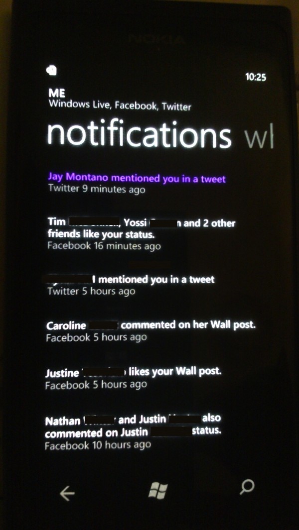
- “Me” Tile: This is really handy. It retrieves notifications for you automatically, and will inform you when you have “new items”. Helps when your Facebook tile isn’t up the top and you forget to scroll down and look.
- Keyboard: This is by far, the best keyboard on a touch screen I have ever used. I think I have spelt two words wrong so far. That is way better than the constant full-stop instead of space that happens with my N9.
Dislikes about Lumia 800 and Mango:
- Random Shutdowns: Within the first two days, the device shut itself down about a dozen times. The first was during installing apps, so I shrugged it off. Then they became more random, not having a common cause. (During messaging, calling Voicemail, WhatsApp, Facebook, XBox Live!, Standby and surfing the web.) [Jay: I’d just like to add that another Lumia from Nokia Connects, the one we’re using with Steve is experiencing similar random shut down problems. Mine and my batman lumia have had none at all. Never had it in 10 months with Omnia. Batch problem?]
- Arranging Live Tiles: When you arrange the tiles, there can sometimes be blank spaces where the tile once was, due to shifting it around. Tiles don’t just move to the next spot, pushing everything over one, instead creating a new gap. Some people may like this, I sadly don’t. [Jay: I would also like live tiles to have a scroll bar at the side so when I have filled my screen with tonnes of tiles, I can quickly jump to particular group of tiles via scrollbar]
- Contact Transfer: This was shocking. I had the vast majority of my contacts entered as “<unnamed>” or just the number. Even after using it for a week or two, my contacts differ between Lumia and N9, even though it is the same Sim-Card. [Jay: I love Contact Transfer. It’s what my Omnia dearly misses and is a great Nokia asset to transfer contacts. It works a treat for me, and Steve even managed to get his to pick him his LG dumbphone contacts]
- Call Quality: This is shocking. Even when I have full signal, (which is rare on the Lumia), I can barely hear the recipient of the call, and they can barely hear me. [No issue with call quality on mine. Normally on HSDPA but it depends on T-Mobile which seems to have a 70% suck rate in the UK. My Lumia on O2 always has signal, like N9 and N8]
- Signal Strength: I know it is supposed to be the same as my N9, but I doubt it. Maybe the indicator is too weird for my liking, as it is greyed out all the time, and I’m not sure if that is for 2G connection, or no signal :/ I find I need to reboot the device for it to fetch a signal and download text messages backed up for days.
- No Screensaver/Standby Screen: Extremely hard to get used to, coming from the N9. It is so useful as I take a glance at my phone and I know the time, and if anyone has contacted me. Okay, I know I can tap the lock button on the 800, but it is just that one less task that, for me, would make the experience a bit more pleasant and refined. [Jay: I love the N9/Symbian’s AMOLED standby clock. I like seeing it when the light is off and I don’t know where my Lumia/Omnia has gone but can see N8/N9. Or if just at a glance, I can look at the time, no button pressing necessary]
- Tethered Software Updates: The “luxury” that I have grown accustomed to on Symbian and MeeGo, of updating OTA through the device, is a must. Forcing the user to connect the device to a computer to update, is stupid. It will most likely mean that the user won’t update for a while, because of the hassle, or won’t update at all. (App updates happen on device, so why not FW? Besides more complex etc. )
- Ringtone Customisation: As far as I can tell, and I’ll be happy to be wrong, the only way to add additional ringtones, is through apps. This is stupid. If the app doesn’t have the latest tune you’re looking for, you can’t set it as your tone. [Jay: Whilst WP has done themselves a service by making ringtone apps, the whole act of adding a ringtone yourself is a little cumbersome. Pus you don’t get to set it as a message tone. It’s a little annoying and needs to be addressed in Tango/Apollo. Seriously, it’s not difficult to do, right?]
I could definitely go on and on about both for hours. But I think I have put you readers through enough torturous reading. You are probably thinking, “well, what is Michael’s verdict?” The answer isn’t simple. If you want different, you go for the N9. Completely different experience (at least for now) than anything else you will find. If you want something with apps, and that will get all the love and support you want, go Lumia 800. Personally, I love both. I have been swapping them around every few days, spending more time with the Lumia 800. (Maybe because I know I have to give it back soon 🙁 ) I like the simplicity of the Lumia 800, but then again, why “use the front door when you can use the back, or side doors” of the N9, thanks to Swipe?
I do know I will miss some things from the Lumia, mainly the Virtual KBD, “Me Tile”, push notifications for Facebook, sync/backup to skydrive etc, but they are all things that can be added to the N9 in updates, and also will be improved upon in the Lumia devices to come and WP Apollo and Tango updates.
Michael
Category: Mango, MeeGo, Nokia, Rant, Reviews, Versus, Windows Phone


Connect
Connect with us on the following social media platforms.