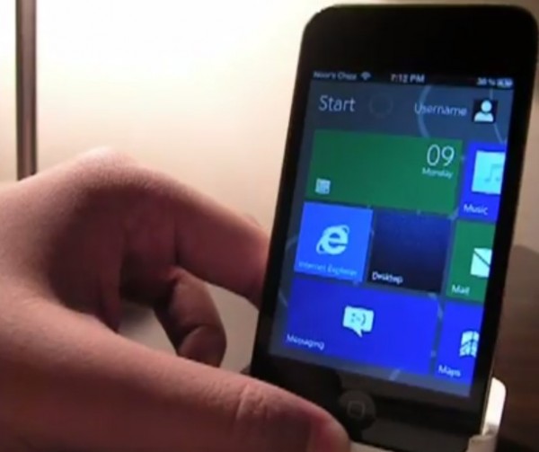
Video: Windows 8 Metro tablet UI for iOS
I wasn’t sure exactly what to expect given the title of Windows 8 on iOS. I assumed it would be some kind of WP8 emulation/theme, but no, it’s a Windows 8 UI for iOS.
This theme seems to act as a skin, replacing both lock screen and menu. In fact, pressing the lock button and home button seems to deliver you to the Windows 8 UI version.
This horizontal layout oddly seems to work out quite well. It’s pretty much just the touch tablet form minimised to a phone. The side swipe gestures are incorporated too and seems to be more intuitive than I had expected.
I wonder if we’ll see something like that in WP8 (when consumer features are revealed). Remember how quiet MS has been regarding the usual app list? I like this horizontal app list though it would be much improved it you could swipe into it rather than having to press a button.
I think having that slight background/wallpaper works even with these tiles, no?
by applecritics
Soooo many Apple bloggers demoing apple apps >_>
Cheers Arun for the heads up
Category: Nokia, Windows Phone


Connect
Connect with us on the following social media platforms.