My Dream Nokia #55: Nokia Lumia 720, 16MP shooter (+ideas for next MDN?)
You guys gave designer, Mkrtchyan Edgar, some great feedback in #54 of My Dream Nokia.
He took some comments on board and created a more lower end Nokia Lumia 720, though the specs aren’t exactly too low end. Note the message was passed through a translator so some things may be lost in translation.
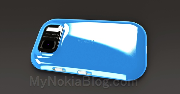
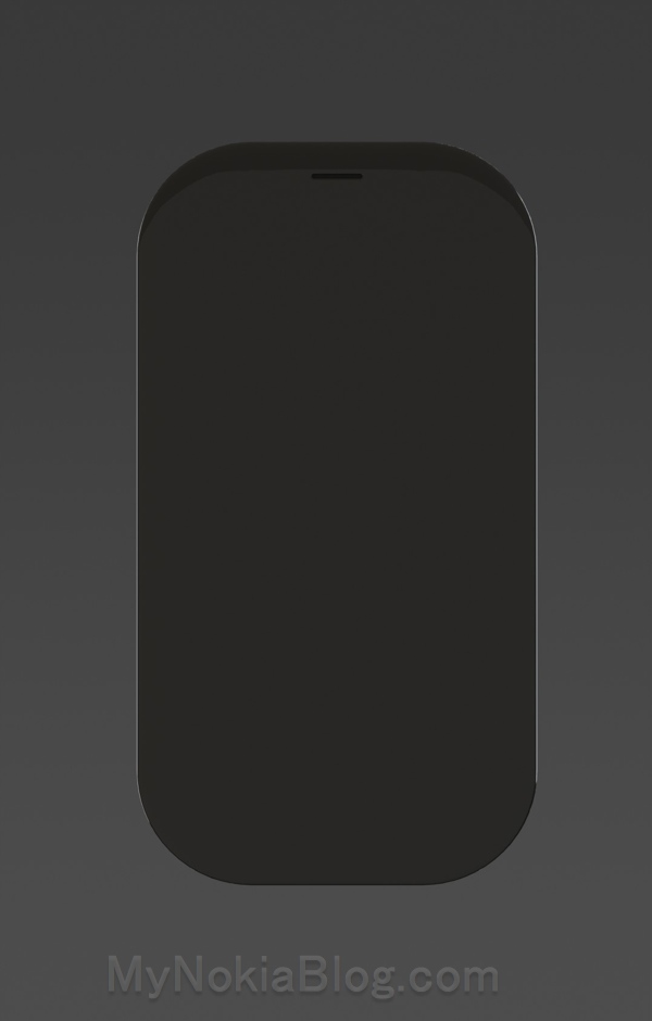
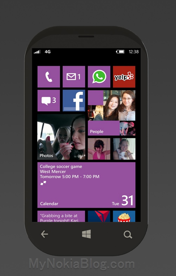
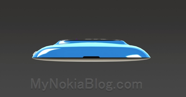
- design-first “rock” (pebble? see notes at the end) with a curved screen and large rounded! –
- hull is made of magnesium (such as “Surface”) which will make it light and strong, of various colors are possible.
- this shell-hidden below the removable 2200 mAh battery, micro sim card and memory card up to 32GB
- as you may notice there is not much open (USB, HDMI etc.)Â but do not be afraid 🙂
- Â charging the battery will be wireless
- The HDMI can be replaced by the application of Nokia “Play To” (with DLNA)Â jack-audio 3.5 will be replaced by the NFC or Bluetooth connection
- Another feature, the button of the camera is gone. I know some will criticize but a button on the camera with dual pressure (for “Auto Focus” and “shoot”) is very expensive and some people do not know in focus, so it just touch the screen to autofocus and capture the photo
- it will feature the same dual-core microprocessor that Lumia 1001 (1.6 gHz)
- the same screen size 4.3 “1280×768
- Â camera module, it will have a 16 Mpix sensor PureView (PureView or not), can record video in 1080p, the xenon flash is always present, the front camera is of 1.3 Mpix
- the Lumia-720 will be equipped with 16 or 32 GB, expandable with micro SD card up to 64GB
This will be his last design for a while since over the net few weeks, Mkrtchyan Edgar says he’ll be busy.
Looks quite nice from this angle. This design reminds me of the 710/first Nokia WP proto. It might work better without the bulge.
Buttons not present on the face when light is not on. I prefer that myself.
The curve might be a little too big/strong here for WP8.
If there are any other designers our there that would like to give this design idea a little bit more polishing, here was my original comment:
Another design I’d like to see is perhaps something that has the features of a pebble. All seamless curves, little or no straight lines. Wireless charging, no ports. Wireless USB. (Place on a dock that will connect it wirelessly). BT for headphones. Again, not a practical design, just something I’m interested in.
If you could design something along those ideas, that would be fantasticÂ
By pebble, if we look at the design from the 1001 where the sides curve, the top would also curve, not unlike the first iPhone but the screen would continue to curve (a little like the 800/N9) so that it’s like a perfect pebble. The top and sides could also curve out slightly. No camera bulge.
It would not be the most practical of designs, no. There are no charging ports. We’ll still have wireless USB (via a dock) and wireless charging as well as BT for headphones (with included BT-3.5mm for those wanting to use their own headphones).
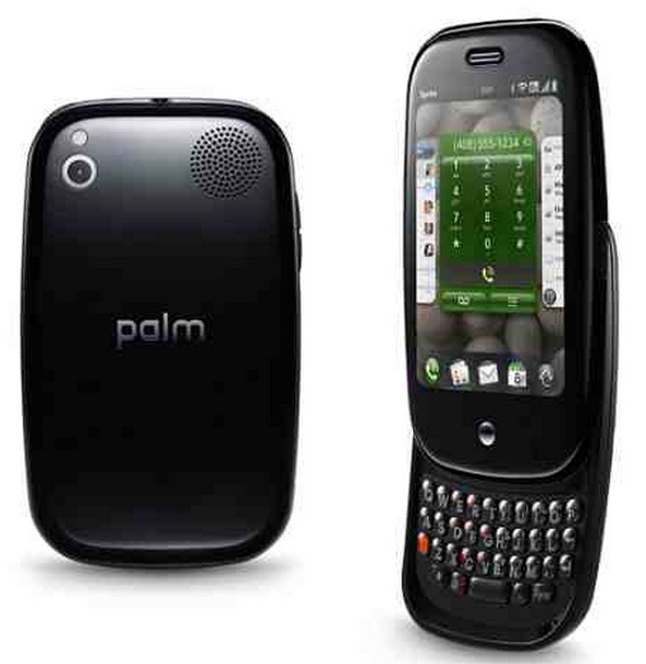
Actually, just think of it a little bit like a slimmer Palm Pre with everything smoothed out and no moving parts. I’d like the screen to be much closer to the edges (minimal wastage at the top, like the 1001 concept)
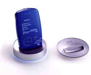
Other Pebble designs of the past. Sony MP3 player (I have one of these somewhere)
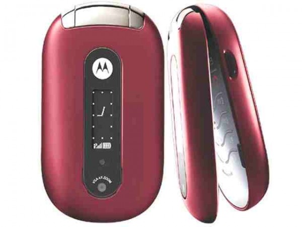
Actual Pebble phone from Moto. This is too curved and too fat though.
Edit from Edgar:
I had a little time to re-imagine my perfect phone, and here are the reports I Have Made:
-to begin the design Remains the Same! These Are The Same Against curves by the phone Becomes Thicker Than Before to include a larger battery (autonomie is a key item in my opinion)
appearance of audio-jack 3.5, and micro USB
-the biggest speakers
-of the biggest keys for volume-sliders and UNLOCKING
-the second-foncionalité the slider button is mute When It pushes the slider
Appears-logo “NOKIA” on the front (with the proper form That I Had Not Before 🙂
PureView-18 mpix sensor, 1080p recording, flash xenon + led flash
-the black magnesium lid, disponible en cyan & whitemy next idea was Will Be mini tablet nokia windows 8 RTM Will Happen very soon
I have some problems with my G-mail account, I Refer you my work with the new Outlook 🙂good day 🙂
Category: Concept, Dream Nokia, Nokia, Windows Phone





Connect
Connect with us on the following social media platforms.