Weekend Watch: Some ancient (and surprisingly good) Nokia TV adverts
These randomly ancient Nokia adverts popped up this morning on my YouTube feed (at time of writing, a few days ago).
I didn’t pay attention to what was going on at first. I was more taken aback by how old these adverts were. But they’re surprisingly clever.
Do we have anyone here who might have seen these adverts when they aired live?
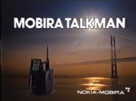
Mobira Talkman. 1984.
I think we have some pics to share soon of this. Possibly shot in the 80s. It looks like the Karate Kid should pop up some time here.
Now this is a phone that can fit in your car. The advert, though cheesy, shows a situation where two business guys in a car, one with a Nokia and one without, need to make a phone call. Prior to the days of course of not being allowed to phone whilst driving. The guy without a Nokia leaves his car at the traffic lights to make a call at the phone booth and is left stranded when the lights go green again. The Nokia guy gets to be smug (almost unlikable) as he has a phone he can use in his car.
The message is at least clear, and would be a little clearer with a voice over.
Advert for Nokia 1101.
- Use of the Nokia tune (acoustic) in the advert. Was there even choices of ringtones when the 1101 was around or just ring, ring?
- Catchphrase -Â “Nokia. It remembers because it’s human to forget”. Simple, yet clever. It takes something of the moment for those devices (being able to store telephone numbers! haha) and points it out. This is showing off your unique selling points. I feel this type of attention has been lost at Nokia advertising.
This is my favourite of the three. Is this an actual Nokia original advert?
Ignoring the arty video work, listen to the voice over. That sounds like what Apple adverts sound like now. (well the iOS related ones, not the stupid AppleGeniusforbraindeadmacusers ads).
The 8110 was released in 1996.
Some shapes feel as if they’ve been designed to be picked up and held. Others are purely functional. Our new Nokia cellular phone combines both. We shaped it to feel good in your hand and to fit your face perfectly. And like all Nokias, it’s beautifully simple to use.
Put yourself into any single Apple keynote about the iPhone with creepy Forstall or Sir Ive. That’s how they talk about their products. That’s how they convey the attention they put in their products so consumers can appreciate that too. I’m amazed Nokia were doing this kind of thing but then decided to go and continue with pursuing mostly meaningless adverts.
by NokiaHomebase
Update: Some more ancient adverts since I forgot about publishing this from drafts:
Check out Nokia explaining the ‘navi key’. Oh the infra-red data connection. 9600 bits per second!!
3110
New concepts, well explained. This is why Nokia was famous for having a simple to understand UI. For new Nokia fans, who’d have thought that, huh?
Category: Nokia, Windows Phone


Connect
Connect with us on the following social media platforms.