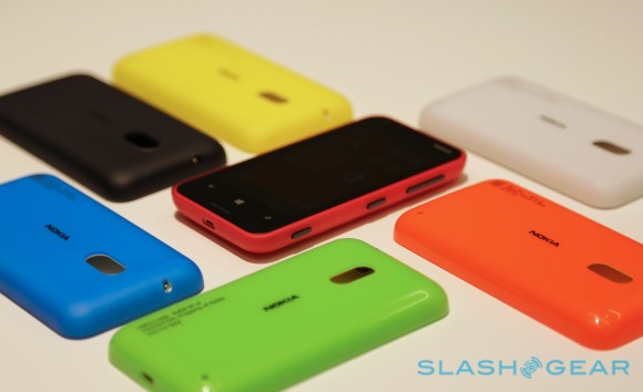
Gallery: Hands On With the Lumia 620
The folks over at SlashGear have gotten some hand-on time with the newly released Nokia Lumia 620. The most noticeable change over last years low-end Lumia (the 610) is the improved screen, replaced by Nokia’s excellent Clear Black Display, and the internals have been beefed up to get rid of the “app incompatible” errors:
Gone is the mediocre display, replaced by a far more pleasant ClearBlack panel, and with its 1GHz dualcore Snapdragon S4 chipset and 512MB of RAM, navigation is swift and there shouldn’t be a problem with incompatible apps undermined by insufficient memory.

The colors are truly gorgeous, with the pretty green (which I’d love to see on a 920) and a matte white, Yes! Matte!!!
Check out more pictures at the link below:
Slashgear:Â http://www.slashgear.com/nokia-lumia-620-hands-on-05259576/
Category: Lumia, Nokia, Windows Phone


Connect
Connect with us on the following social media platforms.