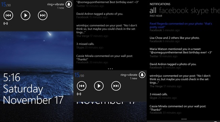
Notification Centre Concept (volume controls)
You may have seen a few concepts already for a notification centre for Windows Phone. The two main concepts that work with the Windows Phone UI utilise either a swipe to the left (thus three homescreen view) or volume control buttons as opposed to pull down notification in other OSes.
http://www.theverge.com/2013/3/3/4060498/my-notification-centre-concept-volume-controls
This one on TheVerge forums uses the volume control option. The notification look like your notification in the people hub/Me tile. The volume control option is accessible throughout the whole UI, more so than a swipe from the main screen. That’s what I love about the music controls. Ideally perhaps there might be some other shortcut controls?
Via: Reddit
Category: Concept, Nokia, Windows Phone


Connect
Connect with us on the following social media platforms.