
iOS 7 to follow Windows/Windows Phone Metro Flat style vs skeumorphic UI?
Like it or hate it, Windows Modern UI (Metro) is influencing others around it. Whether it’s picking up on tiles or the minimalism of flat UIs vs the skeumorphic ones (designed to look like other materials, glass/wood/etc).
iOS has captured many new users for its simplicity and familiarity. The same hardware design has made it iconic and recognisable, made it easy for people to make 3rd party accessories (As there’s limited designs), and almost in the same way, the samey looking UI since its inception is also something instantly recognisable. They’re sticking with what works and refining cautiously as not to alienate their users. But for some, this lack of change feels stale and they’re going over to other more interesting platforms that look more modern.
According to WSJ, IOS might look more FLAT, like Windows Phone’s flatness.
“Some suggested that in Apple’s next mobile operating system, Ive is pushing a more “flat design†that is starker and simpler, according to developers who have spoken to Apple employees but didn’t have further details”
http://blogs.wsj.com/digits/2013/03/21/apple-design-teams-get-cozier/
Some expect the changes to be more conservative.
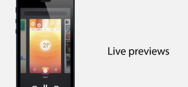
Over at Gizmodo they’ve featured a video concept of what they think iOS should look like. Check out the multitask view, it’s the WebOS/Symbian/MeeGo/WP style cards with swipe away to close (WP does not technically need users to close apps BUT I think it would be nice to have this option as it’s sort of comforting for some to have that perceived control).
Instead of blank icons, they have cards/tiles that are live.
App Switcher Concept: Multitasking Redesign for iOS from Jesse Head on Vimeo.
My favourite multitasking interface is either the contextual sized Maemo cards with LIVE multiscreen action or the initial MeeGo concept multitasking (not harmattan) where you have either the linear card view or grid based on a pinch and zoom. N9’s multitask initiation was bliss too. A lot more fluid than long pressing a back button or menu button like WP or Symbian (even iOS’ double tap home feels better than a long press)
Category: Nokia
About the Author (Author Profile)
Hey, thanks for reading my post. My name is Jay and I'm a medical student at the University of Manchester. When I can, I blog here at mynokiablog.com and tweet now and again @jaymontano. We also have a twitter and facebook accounts @mynokiablog and  Facebook.com/mynokiablog. Check out the tips, guides and rules for commenting >>click<< Contact us at tips(@)mynokiablog.com or email me directly on jay[at]mynokiablog.comSubscribe
If you enjoyed this article, subscribe to receive more just like it.


Connect
Connect with us on the following social media platforms.