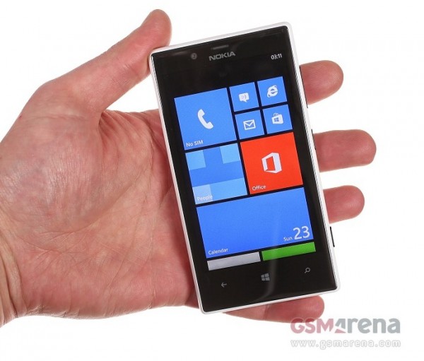
GSM Arena’s Nokia Lumia 720 Review: Perfect Balance – makes mid-range Android green with envy
Advertisements
 Here’s GSM Arena’s Review of the Nokia Lumia 720, which GSM Arena says ticks more than enough boxes for its price tag.
http://www.gsmarena.com/nokia_lumia_720-review-919.php
- Feels reassuringly solid in hand
- Pleasingly slim waistline.
- Looks slimmer than it actually is
- Curved screen much appreciated in side swipes frequently used in WP UI
- Most attractive offering in its class.
- Might even make some 920 owners jealous
- WP8 UI designed in a way that lower pixel density isn’t obvious (except web surfing)
- Clear black excellently bright.
- Splendid viewing angles, even at extremes, everything on screen remains perfectly legible at all times.
- Sunlight readability, 720 at the top of the chart (hey 808 is top!)
- Impressive battery life, exceeding talk time rating and 2.5 DAYS of battery.
Read the rest over at gsmarena.com
Conclusion
- Midrange in Nokia’s lineup but features that elevate it above the midrange experience.
- 720 strikes the perfect balance – affordable price for features that makes mid-range Android phones green with envy.
Cheers again Alvester for the tip!
Advertisements


Connect
Connect with us on the following social media platforms.