Windows Phone 8.1 (Blue) Concept; Brings Fully Functional Notificaion Hub and Much More
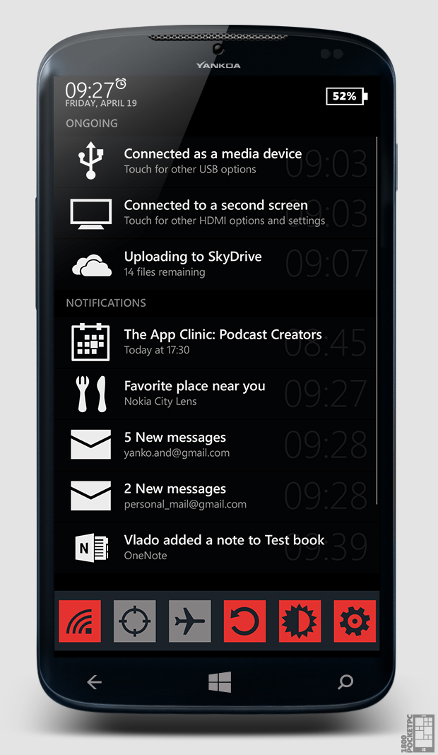
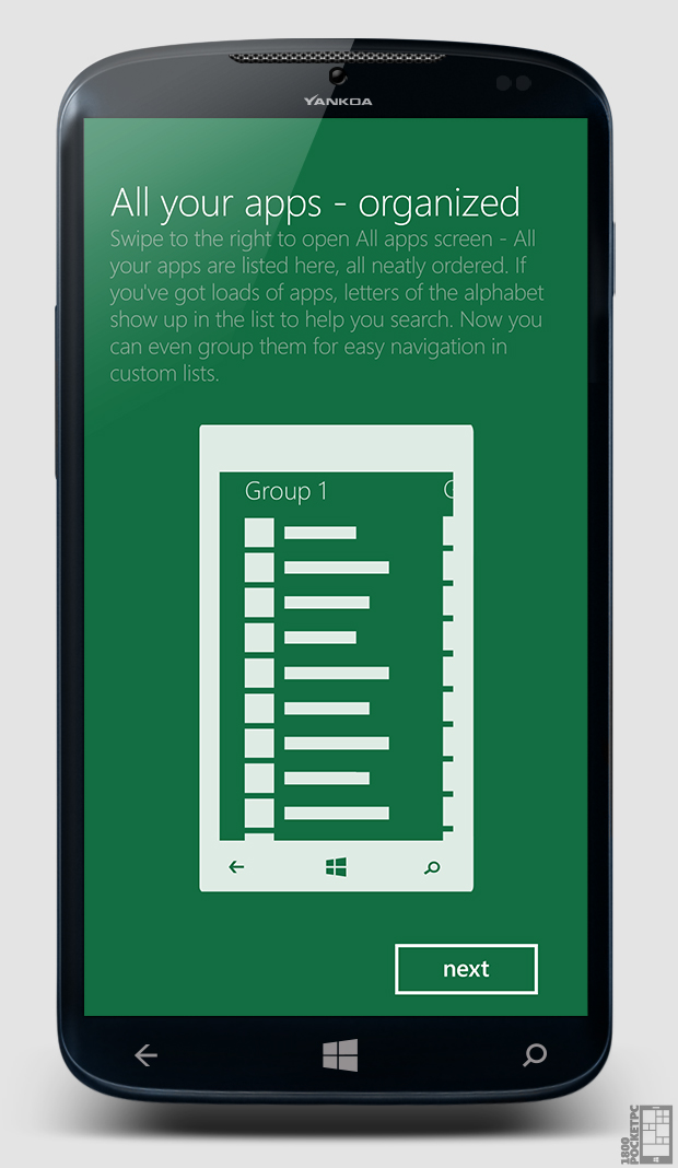
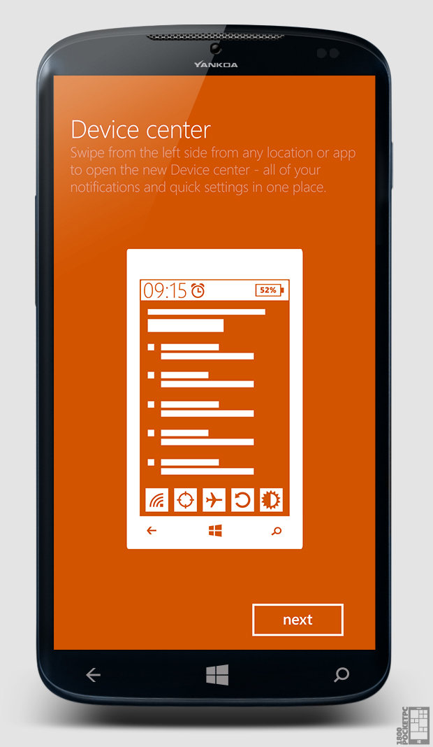
We love to look at possible concepts of integrating a fully functional Notification center/Hub into Windows Phone (if only Microsoft would take a hint already); so here’s another one from the folks at 1800pocketpc which looks REALLY well done. The latest concept shows what an overhaul of Windows Phone would like, going much deeper than just adding a notification center, you can now close apps by swiping down in the multitasking view, arrange apps into groups as well as a redesigned start screen that adds a fourth and 5th tile size.
The concept/features look really cool and I’d love to see them integrated into my next Lumia (and the one I already have!) but one feature that needs to be corrected ASAP is the useless search button; either make it customizable to google or make it a universal search; just don’t make us “bing it”.
Check out more features of the concept at the source down below:


 Thanks for the tip Derrek Leigh
Category: Lumia, Nokia, Windows Phone


Connect
Connect with us on the following social media platforms.