Left Swipe Peek Notifications – WP8 Concept

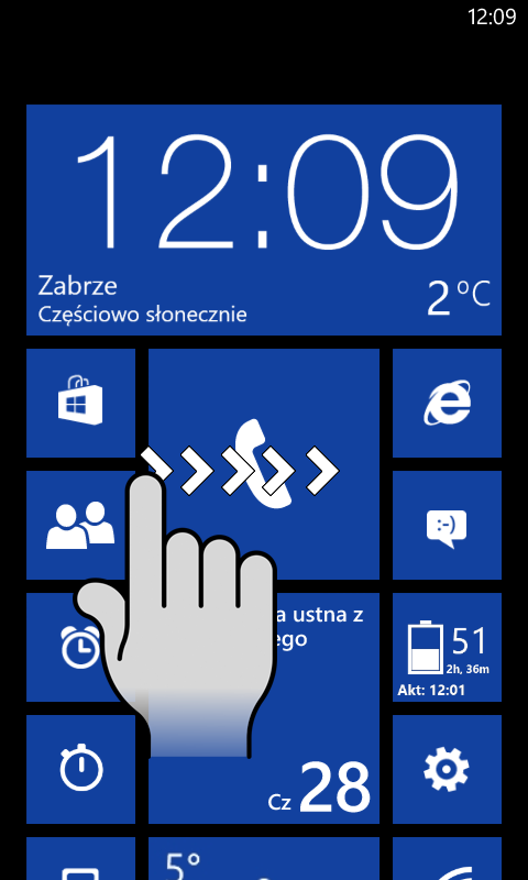
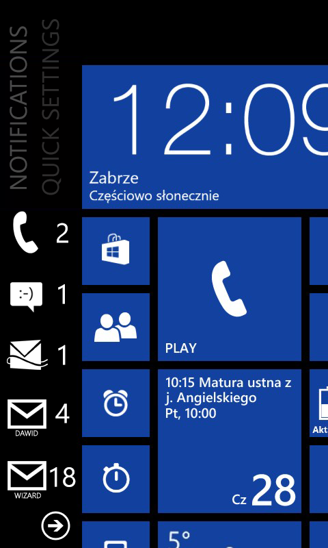
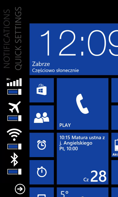
Here’s another notifications concept for WP. It’s a left swipe but with a difference. Instead of having another screen there (e.g. notifications  << >> Tiles << >> App List) there’s just a column of additional icons, one part doing quick controls, another for notifications.

It would work, though I would like to see that pull down that has been teased a bit.
This suggestion was submitted February 28th 2013, and has over 11 thousand votes in the wp user voice feature suggestion section.
Reply from April via WP Admin apparently:
Thanks for your notifications suggestion. Always great to see such great feedback and suggestions. While we can’t promise to ship every suggestion that gets submitted, we will be sure that our product development team receives your feedback. What’s another great idea? Keep those votes coming!
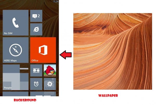
Other seemingly normal, frequent requests. Wallpaper:

I’ll leave it at that because I’ll be here all day writing up the features that should already be in WP8.


Connect
Connect with us on the following social media platforms.