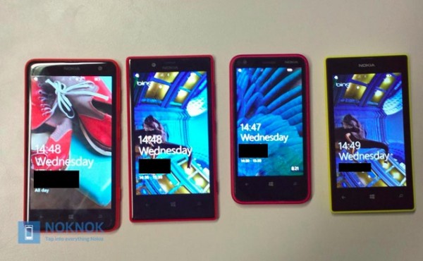
Comparisons: Nokia Lumia 625, Lumia 720, Lumia 620, Lumia 520

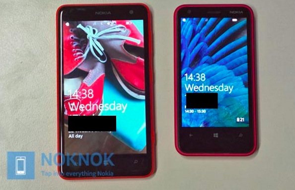
Continuing Nokia’s efforts of having some of the best entry level smartphones ever, the Nokia Lumia 625 with its gigantic 4.7″ screen looks positively beastly against his brothers, the Nokia Lumia 720, 620 and 520.
Check out below, both devices are in the same 62x close family but the difference, crickey! It’s like wittle Mario after eating a red mushroom.

Despite having a large screen, it’s slimmer than the 620, and 520. Possibly by having that larger footprint to space out components, whilst accommodating the larger battery.
- 625 -Â 9.15mm
- 620 – Â 11mm
- 520 – 9.9mm
- 720 -Â 9mm.
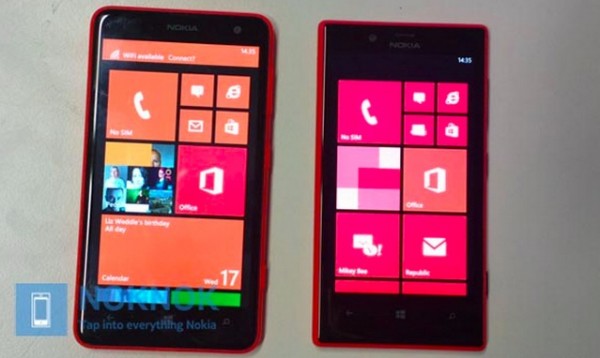
The 720 and 625 are quite similar in height but the 625 utilises the space better. A view of the homescreen doesn’t help the 720 here because it makes it look like the screen is smaller what with those black edges around the tiles, as well as no notification pop up at the top of the 720 to define the top edge of the screen.

Source: noknok


Connect
Connect with us on the following social media platforms.