What the Lumia 1520 Phablet Really Needs
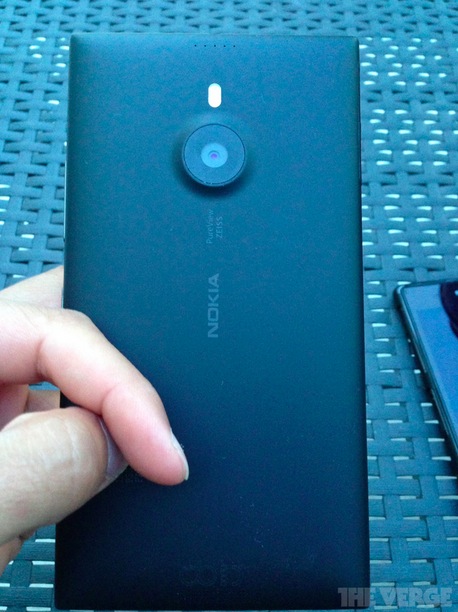
 With the launch of the Lumia 1520 phablet inching closer, we’ve seen multiple leaks of the device, press renders and a load of rumors about the specs; including a 20 Mp camera and a 1080p screen. Hardware wise the Lumia 1520 looks pretty good on paper, it looks excessively slim vs. the Sony Xperia Z; packs some proper internals, an SD card (rejoice memory expansion fans) as well as (hopefully) a killer camera. Unfortunately one major factor that affects the success of phablet devices remains unanswered, the software.
There’s no question that there’s a definite market for phablets, people are buying them; whether it’s for media consumption, larger screens for gaming; or even for reading books. The one thing most Android tablets have however (at least the successful ones) is a differentiating software feature. I haven’t followed the phablet scene much in Android, but some of the features I’ve seen include snapping apps side by side, running two apps on top of each other, great note taking apps, smart stylus support and much more.
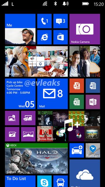
However the rumors of GDR3 don’t seem to bring any of that, in fact feature wise it doesn’t seem to bring much that could take advantage of the larger screen short of 1080p support and more tiles. No groundbreaking features, or uses. In fact there aren’t even any whispers of proper stylus support with the upcoming phablet line-ups (HTC are rumored to be working on one as well).
Once again it seems that Microsoft might have dropped the ball on software innovations (and I doubt there’s much Nokia can do to cause a groundbreaking change in the way things are at the moment). So what can Microsoft do that doesn’t require a huge overhaul? First off landscape support is a must, with the inclusion of rotation lock in GDR3 (finally) it might already be on the way, but if not please do! (there are plenty of mockups and suggestions that make it look quite nice).
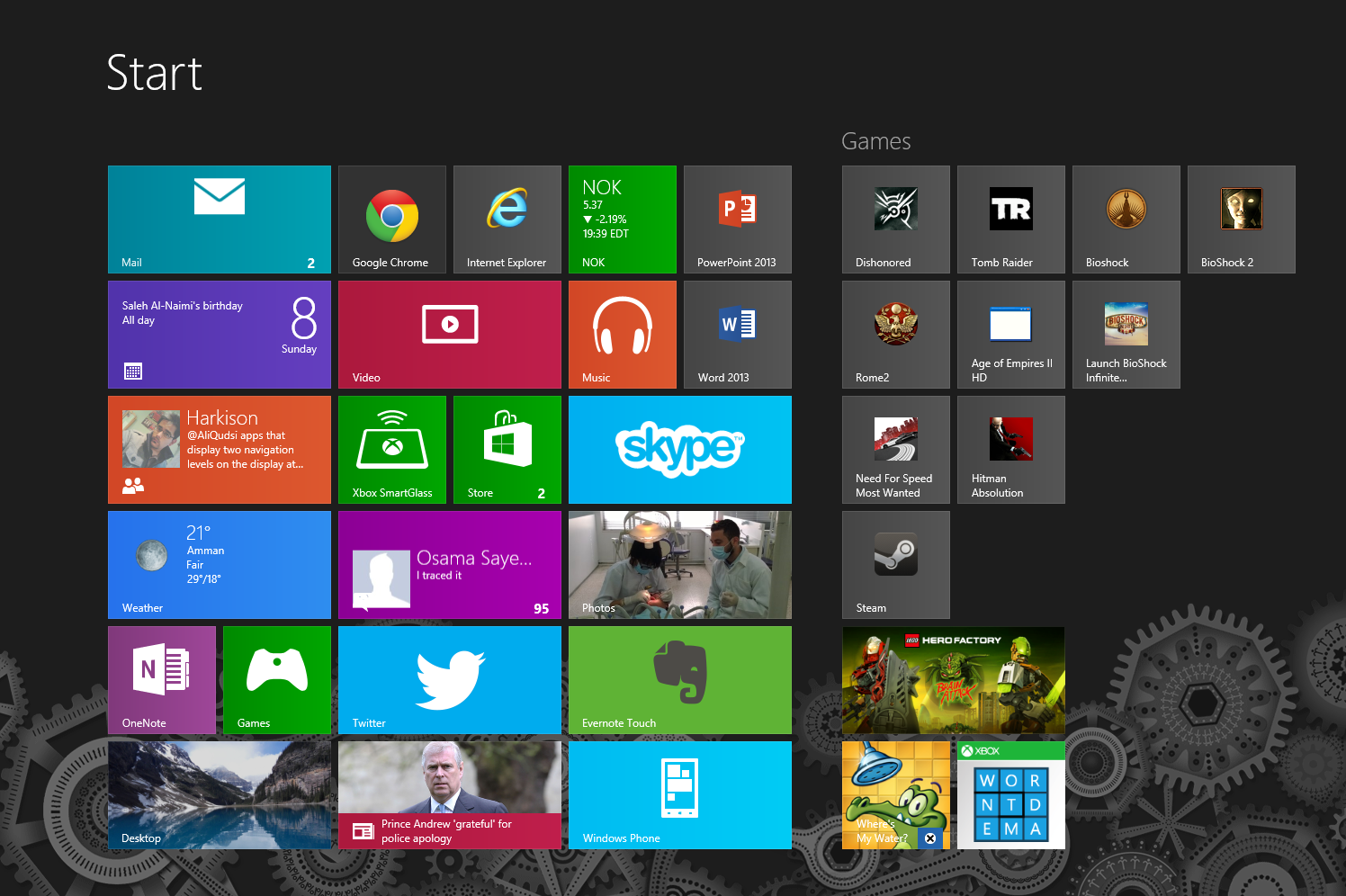
Another important thing to keep in mind (which many of you have mentioned) is preventing the start screen from getting TOO cluttered. The optimal solution would be the option of including page breaks/folders, similarly to how Windows 8 deals with its tiles (the games “folder”- which help organization without creating subfolders in the start screen).

So realistically speaking (keep in mind we’re talking about Microsoft here), what feature would you like to see in a phablet that can actually be done without drastically changing the way WP works?
Category: Lumia, Nokia, Windows Phone


Connect
Connect with us on the following social media platforms.