MNB RG: Lumia 1520, 2520 and Asha 503 hands-on report

Janne had some hands on with the Nokia Lumia 1520, 2520 and Asha 503 whilst at a fair in Helsinki. Lucky! Here’s Janne’s findings. Cheers Janne!
_____
I had a chance to try out Asha 503, Lumia 1520 and Lumia 2520 at the DigiExpo fair in Helsinki Fair Centre. It is on-going until Sunday evening (http://www.digiexpo.fi). Lumia 1320 was not on display as far as I could tell, anyway I didn’t see it. Nokia was also heavily displaying Lumia 1020 at the fair, with most prominent displays for Lumia 1020. Much of rest of the Lumia and Asha ranges were also on display, including some of their accessories. Here are some brief comments – what little one can gather in a crowded expo setting. I also quickly tried PlayStation 4, Xbox One and the new iOS products at their separate booths.
Asha 503: The baby of the show was on display at least in white and yellow, both of course with the translucent dual-shot covers. It does offer a pretty unique look to the phone, I do like the Asha 503 design a lot. I think the yellow color brought out the translucency better than white. From a practical standpoint it seemed the phone is covered all-around with rather scratch-prone plastic quality, so I would keep this phone tucked in a microfiber sleeve. The UI is ever-so-N9-like, now you can even exit apps by smoothly swiping the screen from top or bottom, until the app goes away. I didn’t know how to get back to it, if there is some resume or not – there isn’t full multitasking and no N9-like multitasking screen, though. Screen quality is OK, but nothing to write home about. The capacitive back key was good. Anyway, it was edge-swiping quite naturally and fluidly all sorts of functions, so a great, petite little phone.
Lumia 1520: Now, this thing is huge. Really, I expected big, but Lumia 1520 (read in Anssi Vanjoki’s Nokia World 2010 E7 keynote tone of voice) BIIAARRGG. It’s big. Not big as in thick or heavy, actually it is very light (as far as you can tell with the security devices attached) and slim for its size, the bezels too seem to just disappear from sight, but the 6″ screen itself is just so vast. This is almost a tablet and that means one probably couldn’t use this in most pants pockets without fear of breaking the thing in half when sitting down. That’s the feeling I got anyway (couldn’t test it, but that’s what it looked like). The screen is beautiful, lots of Live tiles on the start screen didn’t look at all crowded when viewing it in live action, photographs always make the tiles look different than reality. The demo model’s camera didn’t offer a RAW option yet, so couldn’t try that – there were only the current Lumia 1020-like options for saving small or small + full-res JPGs. Colorwise the glossy Lumia 1520 colorful colors were close to Lumia 920 look, than the matte Lumia 1020 look.
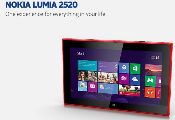
Lumia 2520: I think Lumia 2520 was only on display in glossy red, anyway it looked and felt very nice. Glossy color of course attracting lots of finger prints, so the matte black might appeal to some – I’m loving the red, though. The tablet has a really organic feel to it, not so cold and harsh around the edges as a Surface or an iPad. All edges are round in 2520, like in 1520. It feels very light and thin and the screen is great. So all in all, *if* what Windows RT 8.1 offers appeals to you, from what I’ve seen so far this feels like the best tablet to get for that platform. Unlike Lumia 1520, which looked BIG for its smartphoning purpose, Lumia 2520 looks actually quite petite and very suitably sized all in all. The keyboard cover (which also adds battery and two USB3 ports) was also there and I’m happy to report the suitably rigid keyboard itself felt excellent. If there is one minus, it must be the trackpad area of the cover, which is not rigid but soft (because it bends over the tablet when closed) – it works just fine, but a rigid trackpad would have been nicer.
PlayStation 4 and Xbox One: Played with both quickly and didn’t leave quite as wowed as moving from SD consoles to HD back in 2005-2006, quickly glancing they didn’t look that different to the last generation, but this probably tells more of the already high-level of current-gen console gaming than any lack of upgrade-power in the next generation – certainly a lot of stuff was happening on the big screens in glorious full-HD. Out of the two systems I think Xbox One controller felt more natural, it is just a great evolution of the old controller. PlayStation’s trackpad felt unnatural and unintuitive, but Sony did have a cool PlayStation 4 Eye demo going on there which saw the player and the controller and made it look like the menus on the screen were being projected by the light in the back of the controller. Pretty nifty stuff. It will be interesting to see where Kinect and Eye take the next gaming generation. Still gimmicky or something more?
iPad Air, iPhone 5S and iPhone 5C were also tucked away at an operator booth in a lesser hall. Together with their stand they looked rather frumpy and tiny next to the big and bold competitors and huge expo booths, but I did like the fresh take on iPhone 5C – it had nice colors and they had the Apple-take on them, didn’t look like Lumia clones in real-life at all. But man, the iPhone screens are small these days compared to others.
Category: Nokia


Connect
Connect with us on the following social media platforms.