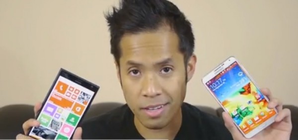
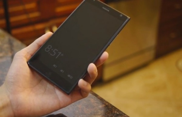
Video: Nokia Lumia 1520 vs Galaxy Note 3

Here’s another video comparing the phablets from Nokia and Sammy. The 6″ 1520 goes up against the 5.7″ Note 3.
The video (almost 15 minutes and 20 seconds long) compares design, screen, layout of buttons, camera, OS, apps.
Despite being on the same processor and the Note 3 having 3GB RAM, they note that the 1520 is more consistent and snappy whilst they see some lag in the Note 3 and there’s sometimes a hitch with performance.
I like how in demoing smart scroll with eyes they had to move the Note 3. It’s neat to think about (as well as hover gestures) but at the moment, current implementation leads pretty much every user I’ve encountered to just turn these off. Similar features are said to be worked on (3D touch? Or is that a different implementation). I hope it’s actually a useful feature (like being able to use gloves when it’s cold).
Battery life, better than average on both.

Atm, it’s a deeper software experience on the Note 3. It takes a better advantage of that screen space (hence why even after finding it on initial release, I warmed later to the original Note). But you’ll also appreciate the 1520 experience, which in user reviews seem really pleased so far.
Price wise, $100 on contract really surprises. An impressive price point considering the features, and performance. The $300 for the Note 3 is apparently greatly out of proportion.
What we’d like to see in future:
- Tiled multitasking, e.g. snapping like in Windows 8
- More information on screen
- More customisation of homescreen
- Pen support (well, I can use any pen, not just S pen, pencil, fork etc thanks to the super sensitive display, but it would be nice to have additional use with the pen too)
- Improved voice recognition/consistency


Connect
Connect with us on the following social media platforms.