
Video: Nokia Lumia 1520 with WP8.1, and a look at the calendar.
Earlier today being forced yet again to temporarily post at the backup site, GOG, I wrote about WP8.1 on the 1520 as well as having a bit of a rant on the calendar.
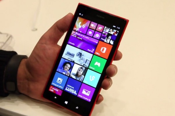
In terms of the Nokia Lumia 1520 and WP8.1 I see that as the real Nokia Lumia flagship despite there being the newly announced Nokia Lumia 930. It has a bigger screen, microSD card slot and you can use Nokia Glance on it. But it all depends really on what you need and what you’re looking for. Some have already made the choice to go with the ICON, (Verizon’s 930) perhaps for being in a smaller, lighter package.
https://www.youtube.com/watch?v=dMorq14RQd0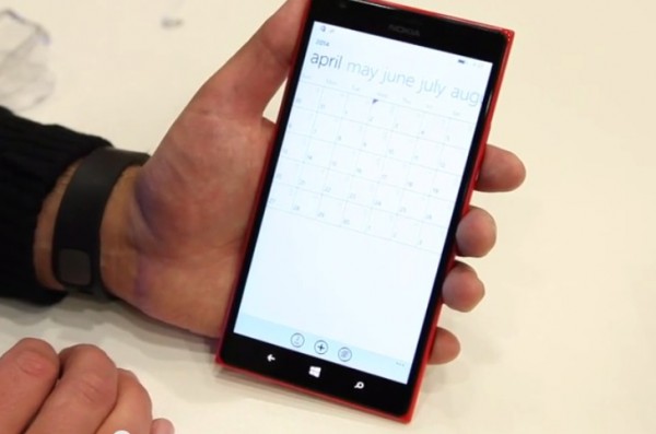
Onto the calendar: Â I felt that needed some work. I welcome the new additions but there’s still much to be done in usability terms.
Calendar has been one of the things that has bugged me in WP since owning an Omnia 7 to test out WP. Whilst I love that it was my first device that seamlessly synced my calendars (appointments made on phone or pc were on both, plus it retrieved FB events), I didn’t like how it presented them. There are some new improvements but I still feel there’s more to do.
In the video, Daniel says that as one of the changes in month view it now just shows lines and not appointments in small text. Yes it did show “appointments” in text but the text never meant anything. It never showed the actual appointments in small text in month view. If you zoom in, you get that “Lorem Ipsum” text generator jazz.
My main issue was the lack of use of the calendar view optimisations. First no week view. Second the month view does nothing other than to tell you there’s something there. There’s space at the bottom where it could tell you quickly what’s on for today whilst in month view but no.
Week view is present. I don’t know how it looks in landscape.

Here’s possible ways to do it and not this way. Note how big the screen is and how much resolution is available. Granted they are trying to get this on smaller low res devices but look at this.


I don’t recall if iPhone always had week view. I know the tabs had list/day/month. But even then, their calendar was already better looking as it showed you appointments under the calendar month in the same view. Perhaps not as detailed but it allowed you to see what’s there.
This may not be native, it might be an app. But imagine if you could view all of this in ONE view should you want the topion

I also like the line that Google Calendar or iOS’ calendar shows that indicates the current time.
Also, instead of going to menu to change between day view/week view/month view, could we not pinch zoom as another option?
Just a few rambles. Perhaps I’ll like it more when I get to use it.
Category: Nokia
About the Author (Author Profile)
Hey, thanks for reading my post. My name is Jay and I'm a medical student at the University of Manchester. When I can, I blog here at mynokiablog.com and tweet now and again @jaymontano. We also have a twitter and facebook accounts @mynokiablog and  Facebook.com/mynokiablog. Check out the tips, guides and rules for commenting >>click<< Contact us at tips(@)mynokiablog.com or email me directly on jay[at]mynokiablog.comSubscribe
If you enjoyed this article, subscribe to receive more just like it.


Connect
Connect with us on the following social media platforms.