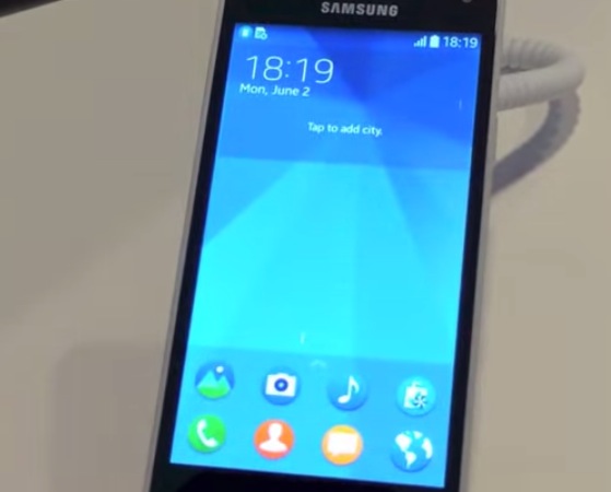
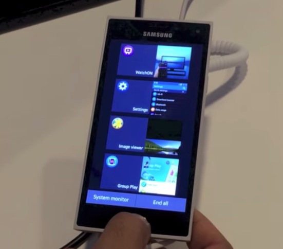
Video: Tizen UI on the Sammy Z
Advertisements

When Maemo became MeeGo and MeeGo went caput, one of the two main ‘directions’ of sorts where people went was either to Jolla or to Tizen (notably, a few of the Maemo/MeeGo blogs became Tizen focused). It’s more Bada than anything.
Vaibhab Sharma, prominent blogger of Nokia and all things handset types, filmed this hands on of the Tizen UI on the Samsung Z.
It’s similar to TouchWiz, with a splash of minimal flatness as influenced by metro UI.
Should Google be worried? What about MS?
Scrolling through the comments, I read one that mentioned this handset looking a little bit like a Nokia design.

Maybe from there:
Kinda like Lumia with a bit of Symbian?

Advertisements
Category: Nokia


Connect
Connect with us on the following social media platforms.