Nokia (MM) announces Nokia X2, Hands on video, getting closer to Windows Phone UI on Android
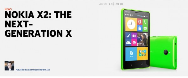
The Nokia X2 has just been announced and it’ll cost ‘just’ 99 Euros*. Â Addressing the confusing single button that didn’t really accomplish the intended task intuitively, there’s now a separate back and home key.
Like Windows Phone, the Back Key lets you go back to the most recent actions. Long pressing sees the apps you have. Swipe to the left and you have your app list, organised like Windows Phone and looking like Windows Phone.
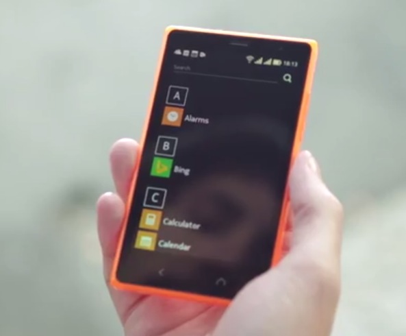
Swipe to the right and you get fast lane. Now, I’d like the ability to swipe to the right and get that additional pane of information on the left.
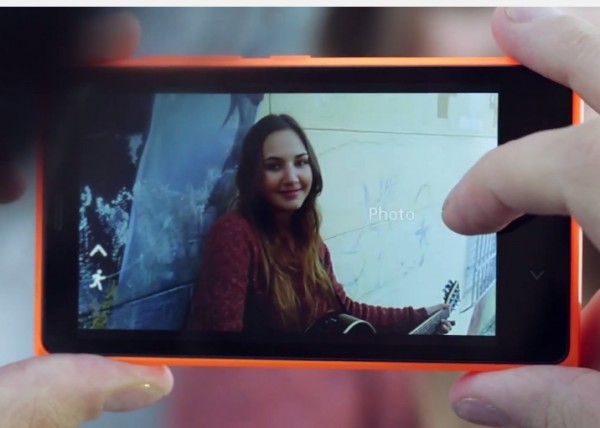
Nokia X2 gets that translucent outer covers. It ‘even has a front facing camera’ for skype or whatever. To get to the camera (without having a camera button) press the lock button and swipe left (i.e. down when pressing landscape)
Camera UI looks a lot better. It uses the full screen and the frame rate doesn’t look like a potato from 1969.
Swipe down for settings. These are nice and big.
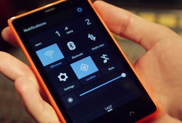
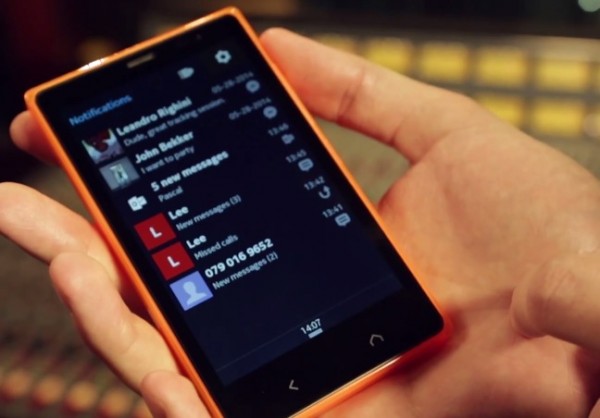
But if you click the ‘notifications’ you get the different app notifications. Kinda like having fast-lane again and kinda not.
Category: Nokia


Connect
Connect with us on the following social media platforms.