
HERE Maps gets a brand new Design! Featuring Peter Skillman and weird Lumia like device
HERE from ‘old’ Nokia have updated their Maps design to best match their “Maps for Life” slogan. The aim was to reflect the advanced thinking about maps that has been evolving over the past months.
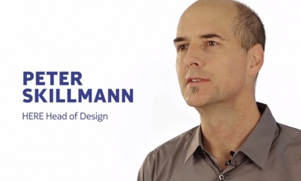
Peter Skillman, head of HERE design, features in this video.
Check out this phone. It’s there for just demonstration purposes perhaps but it’s a first time we’re seeing a new phone ‘design’ as it were from Old Nokia.
Kinda like a 920, with some interesting different buttons.
What actually is new?
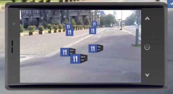
- Intuitive Maps, so you can separate elements better than before.
- Better street hierarchy
- More colour and contrast to make things stand out and more pleasant to look at the map.
- Shading to emphasise terrain
HERE will add more detail to the maps and continue to make them a lot more relevant and easier to read.
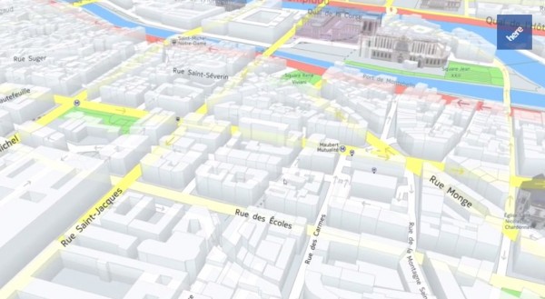
I didn’t know HERE already had these kind of 3D images. I knew about landmarks but not every day general buildings.
It’s interesting sometimes to think that the powerful Nokia bought the NAVTEQ company all those years ago. But keeping their own mapping was so important, it was one of the big reasons not to go ahead with Android..
Source: HERE
Cheers nht18 for the tip
Category: Nokia
About the Author (Author Profile)
Hey, thanks for reading my post. My name is Jay and I'm a medical student at the University of Manchester. When I can, I blog here at mynokiablog.com and tweet now and again @jaymontano. We also have a twitter and facebook accounts @mynokiablog and  Facebook.com/mynokiablog. Check out the tips, guides and rules for commenting >>click<< Contact us at tips(@)mynokiablog.com or email me directly on jay[at]mynokiablog.comSubscribe
If you enjoyed this article, subscribe to receive more just like it.


Connect
Connect with us on the following social media platforms.