Multitask View: Horizontal individual cards or stacked vertical? What about grid?

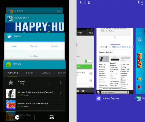
On the left is the task switcher on Android 4.4.4 on the Note 4. On the right is the task switcher on WP8.1.
Essentially, they’re the same. Snapshots of the last thing you were doing, neither actually live (like it was say on the Nokia N900…).
On the left we have vertical stacked cards. The cards themselves are zoomed in and only a portion of the actual screen. The advantage however is that you can click on any of the four instantly visible cards before having to scroll.
On the right, it’s horizontal in action, with individual cards where you can see everything on that screenshot. You can see one full card and a bit of the next one in the first multitask view.
I actually prefer the one on the right because when I look at this view, I can get any information on the screen and quickly switch back. With the way it’s done on the left, I often have to open that app back up to see the cut off information. There’s no confusion about what’s on the screen.
iOS eventually moved to the single card view too and in iOS 8 added recent contacts above (not sure when the apps shortcuts were added at the bottom). But I think that’s a great way to use up the extra space without feeling too cluttered.
With super high resolution screens, this would be great to have again…smart, contextual size, all screen view.

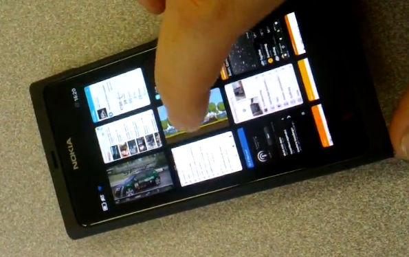
N9 below, almost but not quite. Were these live? I’ve forgotten – trying to memorise/learn so many other things into finals.

Sort of related as well, I really don’t like the inconsistent delay between pressing the button for multitasking on the Note 4 and then the actual cards appearing. On the 1520, I hold back button, it vibrates, the multitask view is present.
On my Note 4, I press multitask…sometimes there’s a wait (3-4 seconds), sometimes it’s a bit quicker (1 second). I’ve already gone into developer settings to remove animations but that does nothing. It’s only quick after I have already opened multitasking recently. It’s really quite annoying. This inconsistency with the UI is growing old on me very quickly and makes the phone very annoying to use. I think as I’m getting accustomed to it and personalizing the Note 4 more, it’s bogging it down and things are getting so slow. I mean my gallery takes 4-5 seconds to open a picture. It’s not even super high res (sometimes photos have detail, othertimes it looks like I took a screenshot of a nHD display).
Category: Nokia


Connect
Connect with us on the following social media platforms.