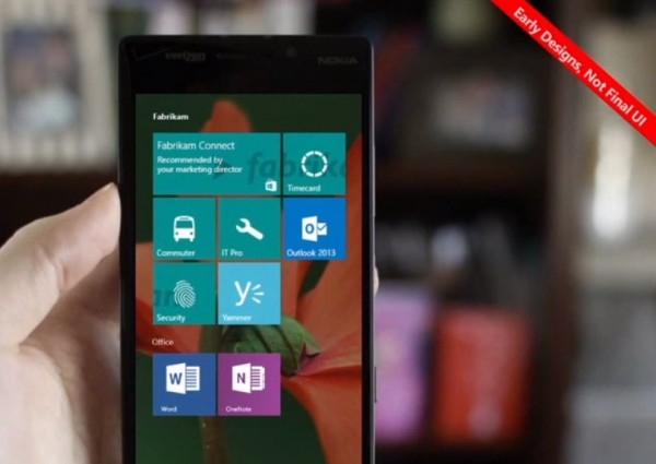
Early Design: Windows 10 for Phones

Alvester shared the video below from October which has an early preview of Windows 10 for phones.
It says that this is just early designs and NOT final UI.
Funnily enough, I don’t think I’ve seen this particular screenshot before. It may be because I’m trying to concentrate on exams so other things in the periphery of my memory are lapsing.
I think it has the potential to look quite nice. I like how the apps seem to be grouped. Nazwil has previously mentioned having this background wallpaper with some transparent tiles. With the possibility of more interactive live tiles (I don’t really know enough about ‘exploding tiles’ to want it) this could make the windows for phone homescreen even more functional too. That’s quite a difficult balance to get – the dead sea of icons on iOS or potentially the mess of Android (There are many launchers and themes to wade through) – and all hopefully without compromising on performance and battery life.
I know some users feel that WP might be limited, and that the homescreen isn’t all that. But with all three main OS devices at hand, I really do think it’s the best of the bunch for me. Just bits of tweaking here and there can raise it even more. It doesn’t need that much changing. I actually miss it a lot.
Cheers Alvester for the tip!
Category: Windows Phone


Connect
Connect with us on the following social media platforms.