Phablet designs: Nokia Lumia 1520 vs iPhone 6 Plus vs Samsung Galaxy S6 Edge
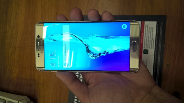
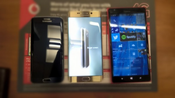
On Saturday I got to play with the upcoming Samsung Galaxy S6 Edge Plus. Although I’ve never really been a fan of previous Samsung designs, since the S6 Edge, they’ve really got me interested. It reminded me a lot of the Nokia N9 in the way curved screen edges were an integral part of the phone’s design. With the S6 Edge, Samsung brought a curved screen display on both sides. It’s not really practical (the curved edges on the N9 helped with Swipe UI) but it’s certainly beautiful.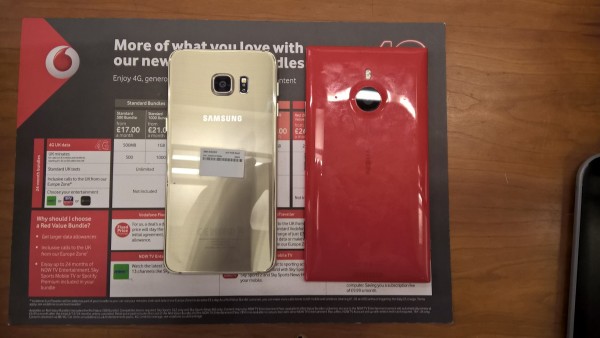
I’m a big fan of the gold, although I think the curved design of the Note 5 looks nicer.
If the 1520 was polished I think the back might actually look a lot better too..
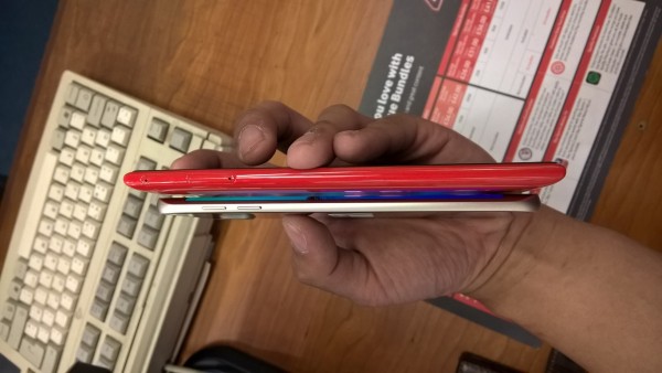
The 1520 was one of the slimmest Lumias at launch. The curved screen edges on the S6 edge plus are very slim (hiding the actual thickness of the device from the middle screen) and feels almost like a blade.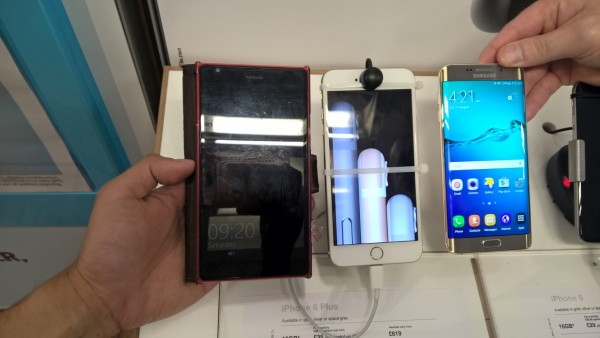
It kinda makes this white iPhone 6 plus look like a toy (black is better as the curved edges there blend more).
I think 1520 pushed the fabula a bit. The petite version, aka N9 might fit a little better – just as I think the smaller S6 Edge is a tad more in proportion than the S6 Edge plus (though I prefer the latter because I can’t go below a 5.5″ display).


Connect
Connect with us on the following social media platforms.