Windows Phone 7: Impressions and opinions
In recent weeks we’ve been through a ton of ups and downs regarding Nokia’s decision to adopt another software platform in their smartphone strategy. In my post on Nokia’s options in the near future I outlined what I believed to have been problems and associated solutions within Nokia and their current smartphone strategy. I outlined the reasons why I felt Nokia would NOT join a Windows Phone ecosystem citing the following major reasons.
- The thousands of people employed by Nokia that are involved in Qt and Symbian development.
- Their acquisitions such as Trolltech and Navteq in recent years amounting to billions of Euros worth of investment
- Nokia’s own mail services, file sharing service, Application store and development frameworks
My entire point in that post was that abandoning any or all of the above intrinsic parts of Nokia would have been self-mutilation and likely harmful to their future long term. Having said all of this, in light of recent announcements, I attempted to embark on a journey of enlightenment; attempting to familiarize myself with as many specifics of the deal as have been made publicly available via interviews and presentations, in as objective a manner as possible while also using and familiarizing myself with the current state of the Windows Phone platform and what Nokia’s additions could mean to the platform from the perspective of a Nokia smartphone user (majoritatively) for nearly 5 years.
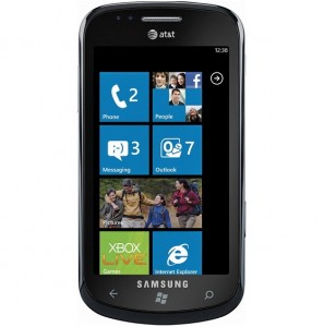
I picked up  a Samsung Focus (known as the Omnia 7 in Europe) as my test bed device partly because Samsung are known for decent if plasticky hardware and I might hold on to this device for longer than 2 weeks and thus wanted something I found at least passable looking. It sports pretty much the same generic hardware specs as pretty much every other high-end Windows Phone device out there, Qualcomm Snapdragon processor at 1GHz, 512MB RAM and ROM, HSPA, Bluetooth 2.1 etc etc.
There’s a passable 5 megapixel camera with LED flash round back but in comparison to the pictures I took with the N8 the other day, it’s not really much good it’s also capable of 720p video but much like it’s stills, it’s not much to brag about.
Of course the focus in this is the software experience, the possibilities for future Nokia devices and not necessarily the hardware and software or lack thereof available today.
I’d initially thought about telling you about all the issues I had with Windows Phone 7, the little annoyances that borderline break the user experience first, Â and then telling you guys about the good aspects of the OS. Knowing you lot, I’d be pretty much pouring lighter fluid on a flame and the good aspects of Windows Phone would be lost in a bunch of tirades and rants directed at Nokia and in particular Elop.
TL;DR
Instead I’ll start by saying this; I really like some of what I see in Windows Phone 7, not in the sense that it does more for me than Symbian does or did, but because doing everything is fast, fun and fluid to do and for the most part very, very intuitive. Some of you may dismiss my opinions as typical American, non-power-user gibberish but compared to anything else that I’ve ever used, I like the process of  using Windows Phone 7 the most. If implementing WP7 is easier and faster on the technical side than it is to implement Symbian or MeeGo on similar hardware then I think that Elop and the executive board made the right decision.
What I like about Windows Phone 7:
Setting up my accounts and importing my contacts from Google, Facebook and Hotmail is an absolute breeze, and linking contacts, importing pictures from their social networks and the like is pretty much perfect.
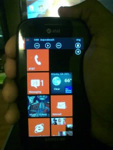
Live tiles, provide as much information as the widgets on Symbian devices. There seems to be better utility in tiles than the widget slots on Symbian with variable sizes etc.
“”Toast notifications” are generally unobtrusive and provide a decent glimpse at the information you want to see. Unfortunately these disappear much too quickly and you cannot recall them after they’ve decided to disappear. In a sense I’d prefer to see them handled in much the same way as WebOS’s notification framework. Hopefully Microsoft will open up this notification method to choice third-parties if they have not already done so.
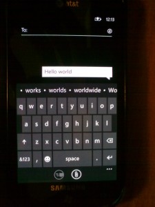
The keyboard in either portrait or landscape mode is just wow, quick, easy and arguably better than any other virtual keyboard I’ve ever used, ever. The ability to add custom words, a much better text selection and cursor placing mechanism than Symbian and pre-Android 2.3. It really is great to use.
Xbox Live integration and the Marketplace are good, easily on par with Apple’s store and I find the available applications of generally great quality with support for OTA updates to apps  and update notifications (something that has yet to be implemented on the Ovi Store)
Applications are made to fit the User interface. This is not a knock against Symbian app developers and designers but the presence of a consistent usage paradigm that is mandated in order to get placement in the Marketplace is great and something Apple have done a wonderful job of. Â It’s simply jarring to go from an App like gravity to the mail or messaging applications on S^1.
Access to search at any point in time via Bing which, given that it’s NOT Google, is surprisingly good.
Built in applications:
Like any phone released in this day and age there are going to be apps that come with the device, some are for very obvious reasons impossible to remove, the odd thing is, there’s no centralized application management app. Coming from Symbian or Android it’s sure to be a particularly confusing omission if not for the fact that a long press on any non-default app will result in its removal. Now on to the meat of the matter.
Email:
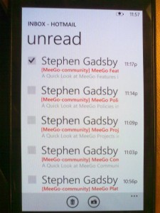
As mentioned earlier, setting up Email accounts on the device is a very quick and very easy process. Simply choose the  email provider and your credentials and it takes all of a few seconds on a decent internet connection to start pulling down your emails, contacts and calendar information.
Email can be configured to be pulled down in intervals or as soon they’re delivered to the server as well as the specific content you want downloaded in terms of images, full html et al. Attachments are also supported provided the file format is one that can be opened on device. Unfortunately, the lack of an accessible file system means that document storage is a bit of a mystery.
In any case, navigating and replying to emails is a lot faster and more pleasurable experience than it is on any Symbian^1 or S^3 device I’ve ever used.
Messaging:
Much like any new device these days, messages are displayed as conversations. Strangely enough messages sent and messages received are not differentiable by colour. Why they’d decide to stick with the same colour for both is beyond me, ’tis only an annoyance when trying to track conversations that happened a long time ago or to find a specific message that you sent while scrolling quickly. Haven’t experience any bugs with messages going to the wrong contacts so far though. (looks at Android).
Maps:
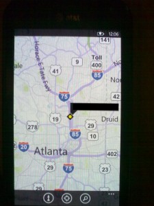
Maps is a bit of a mixed bag, locking is pretty fast, the point of interest lists are pretty great, search is impressive (especially voice search) but that’s it in terms of the good. In terms of the bad now.
Maps have to be downloaded on the fly, no local maps is a SERIOUS problem but that has nothing on the fact that there is no turn by turn navigation. “What?!?! ” was my initial response to that knowledge and then I thanked the stars that Nokia is bringing both their mapping software and algorithms to this partnership. I can’t imagine NOT having free, voice-assisted turn-by-turn navigation at this point in the game.
People:
This application is an amalgamation of regular phone contacts and Facebook. Yet somehow, not only does it work, but it works oh so very well. Personally I think this is one of the best (if not the best period) example of integration of social networks into the OS. All it entailed was a simple login to my Facebook and Google accounts and the People hub started pulling down everything and everyone. You’d think it’d be a long process or fraught with bugs but it was nigh-on seamless. Linking phone contacts to their cloud-based compatriots is so very fast and easy compared to the implementation in S^3 with excellent suggestions made based on phone number similarity, name or email address commonality. It truly is a nice implementation. Admittedly, I don’t spend much time on Facebook, but for those that do, this hub will be an indispensable part of their lives. Contact cards are well detailed with as much information as available on these networks being provided with birthday’s et al pulled down as well. What is rather annoying is the fact that it’s a rather annoying process to add multiple mobile-phone numbers to a contact. It necessitates creating a new contact and then merging that contact to an older one. A silly oversight to say the least.
The “What’s new” section is pretty much your Facebook feed and allows you to like or comment on status’ and/or post on friends’ walls. It is surprisingly well implemented and everything you could possibly do on Facebook proper is achievable here without leaving the comfort of the application. The one omission is the ability to send private messages to your contacts which is something that I’m hoping to see rectified soon.
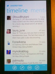
Twitter integration is on tap for the next few months and hopefully things like Skype, Google Chat/talk and a few other social networking/ chat services are integrated as time goes by. Another nice touch would be to only display contacts of a specific type in the hub.
There’s also a “Recent people” section that allows you to quickly get in contact with the people you most recently communicated with and/or looked up.
One annoyance is the absence of a persistent or at least semi-permanent scroll bar. It’s an annoyance felt all over the OS but it’s a particularly annoying pain-point when you have that many contacts to navigate.
Internet Explorer:
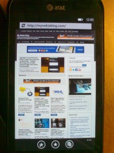
I haven’t touched an Internet Explorer (IE)-based browser since 2004 when I discovered Firefox and since early 2009 I’ve been using Google chrome almost exclusively. The reasons for avoiding IE are simple, it sucked! It was slow, it was buggy, there were so many issues with plug-ins, tons of viruses and spyware targeted attacks using ActiveX. I mean it was really really horrid to use. Imagine my surprise when I found myself using the browser and finding that it ran rings around the default Symbian browser. I mean it’s so much faster than I expected, both in terms of loading, rendering and interaction. It truly is a good mobile browser and doesn’t get bogged down loading even the heaviest of web-pages, even with multiple tabs open at once. Of course the lack of Flash, Silverlight or download manager is rather unfortunate but if it comes at the price of an order of magnitude in usability, I’ll take it (somewhat).
When I was trying out the N8 I would try to load pages like Arstechnica or Anandtech to keep up with appetite for very detailed coverage of technology and science news. Sadly, while I could load these pages just fine on the N8, attempting to interact with the pages was less than pleasant. Between an inability to zoom, lack of responsiveness of the app at all, literally being unable to scroll or do much of anything with the web-page fully loaded (as was the case with Anandtech), it was less than a promising experience.
NB. The N8 was still unresponsive even after turning off Flash, Javascript and closing ALL background applications.
Performance stays the same regardless of the level of zoom and/or the amount information being displayed on the screen and due to much better Javascript performance, things like Disqus actually work. Much like Symbian’s Browser, IE is expected to receive a pretty major upgrade to its rendering engine. This should allow for better HTML5 support and hardware acceleration of some page elements. Â In summary the web-browser is one of the better elements of the OS even though it is missing some “key” functionality.
Zune:
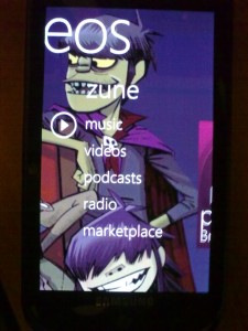
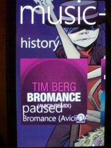
Pretty much carried over with little change from the interface on the Zune HD is the Zune app. This app is your go-to place for music, videos, podcasts and radio on Windows Phone devices. The first level of the interface gives you the option of which form of media you wish to access. A quick swipe to the side reveals the currently playing or last played piece of media, tapping it will of course bring you to the album or artist that this media came from. A further swipe will reveal the album art or name of other recently accessed media. Swiping a little further reveals the most recently added media, be it music or video. Going into the music section you’re greeted by a list of albums, swiping gives you a list of albums, swiping again gives you songs and a further swipe leads to your playlists.
For whatever reason, Microsoft decided to not allow users to create playlists on the fly. Worse still, there’s no dedicated playlist for your most played songs, top rated songs, most recently played or recently added songs!!
While the latter two are somewhat mitigated by the front end of the Zune application, that’s in no way an adequate substitute. Put simply, FIX THIS MICROSOFT.
Unlike the Ovi Store in the USA, there’s a very good choice of music in the Zune marketplace and even better integration with the actual Zune software. With a Zune pass (NOT MANDATORY), I can get access to as many songs as my data package and free time allow with unlimited streaming and the ability to download up to 10 of these without any additional charge per month. Â Coupled with their “Smart DJ” software, you’re more than likely to be able to get a playlist of music that you want. It should be noted here that unlike other, free music streaming services, you the user will be able to choose what song you listen to and when. Tried out a 14 day trial myself but couldn’t find out how to keep songs for the life of me. Stream quality is pretty good I might add.
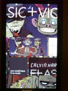
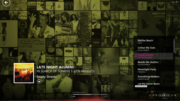
I haven’t mentioned album art here before because the Zune application does something really cool with the album art of the songs you choose. Not only does it display album art like pretty much every music capable device these days but it uses the album art as the background for the music player app itself, overlaying the Zune UI on top of this album art. It’s not a necessary touch, but it brings a small smile to one’s face. This album art is also shown in the Zune “live tile” too.
As for video, codec support for video is limited but the Zune software for PC that we’ll cover later seemingly trans-codes most video into a WP7 compatible format when transferring them. Video is as you would expect with few frills although increased codec support would be MUCH appreciated in future Windows Phone devices.
Marketplace:
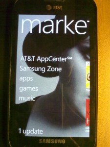
As mentioned earlier in the review the Marketplace supports updates and actually notifies users when updates are available via a counter on the Marketplace live tile. Inside the marketplace app itself, there are 4 or 5 broad categories. Carrier specific applications, Manufacturer specific applications, games and of course music.
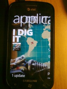
Digging into the application section a number of broad categories are available. It’s not too different from most other application stores and data loads as fast as I’ve observed on Ovi Store 2.0 (with Qt 4.7 installed, not default 4.6.3). I’ll admit that in my experience, quality applications are easier to find in the Marketplace itself rather than hunting around the internet or serious digging in the Ovi store. Carrier billing is supported via AT&T but I’m not sure what the situation is like outside the USA.
Miscellaneous and 3rd party apps:
There are a number of minor applications bundled with Windows Phone 7 like the calendar, alarm clock, calculator, camera, photos, settings, etc. and they all function as one would expect. I’ll specifically mention the calendar app because there are a number of people wholly reliant on Google calendar, mail and other associated services. I can say that Google calendars should sync flawlessly with your device. The calculator deserves a mention because it has some useful scientific calculator functions making it quite easy to perform (more) complex calculations on the fly.
The camera application is rather no-frills and pretty bog standard. Much like the camera on the N8 it restores everything to default once the camera application is closed. *facepalm*
3rd party apps:
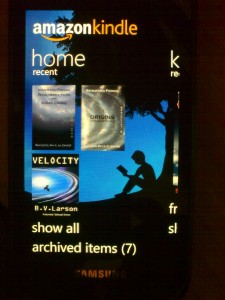
Two of the first applications I downloaded were the official twitter and Facebook applications followed closely by Kindle for eBooks and Netflix for watching movies while I lay in bed. For the most part they’re good, some very  good, unfortunately the Achilles heel of all 4 is the lack of adequate support for third-party multitasking and/or a reliable state saving mechanism. I emphasize reliable because on occasion it functions fine and other times, nothing happens and the application has to practically start from scratch. Annoying cannot begin to describe it! In any case, Microsoft need to get their act together, omission of decent third-party multitasking is unforgivable at this point in time.
Zune for PC:
There really is only one way to get content on your device and it’s certainly NOT drag and drop. While for some users the simplicity of the mechanism is brilliant, for others, including myself it’s QUITE an annoyance. The Zune software itself isn’t bad, but it’s not much better than Ovi Suite while having significant performance overhead. It’s worse of a resource hog than any other media software on my PC and I think I have a pretty decent one. In any case, it allows for the purchase of applications and other content via an in-app marketplace (much like iTunes) and then pushing these over the cloud to your device.
In addition to the regular USB syncing there’s an option for sync-ing over Wi-Fi. It of course requires both devices to be connected to the same 802.11 network and your Windows Phone device has to be charging at the time but it’s a nifty little addition. I personally would have preferred the creation of an ad-hoc wireless connection but that’s bordering on the Bluetooth 3.0 spec so I’m sure there were reasons for the choice.
Strangely there didn’t seem to be an option to back up device content, something which both confuses and worries me.
Wrap-up:
It’s been pretty clear from the onset that Windows Phone 7 is not targeted at the power users that have become accustomed to Maemo’s flexibility or those people that eke out the maximum amount of functionality out of their Symbian devices. Windows Phone 7 in its current iteration is targeted at the masses, the ordinary people that want to do fun, cool stuff with their phones but without much hassle, fuss or complexity. For the most part, I like what I see and am interested to see where it goes under Nokia’s influence but the geeks and nerds that have backed Nokia and Symbian for years are unlikely to pick up these device unless key functionality issues are rectified. Is Windows Phone 7 a bad OS/UI combination? Â In my experience thus far, no. Is it a better choice than Symbian, Maemo or MeeGo for the future? I’d be hard-pressed to say yes.
In any case, for a 1.0 OS targeted at regular (non-geek) users, I have to admit it’s a valiant and good effort. Whether it’ll ever climb to the top of the table in both usability and functionality remains to be seen. Regardless of upcoming updates and timing, I will be holding on to this Windows Phone device until Nokia, or someone else releases a device running hardware and software that I feel are worth it.
I’d advise the most skeptical among you to give Windows Phone a try or at least the benefit of the doubt, it really isn’t as bad as it’s been made to seem, in spite of the criticisms I’ve leveled at it.
Be sure to sound off below on ways to make this review and future reviews better and check out my laundry list of bugs/annoyances/missing features post and feel free to help me add to it by leaving your own questions or bugs there.
Category: Nokia




Connect
Connect with us on the following social media platforms.