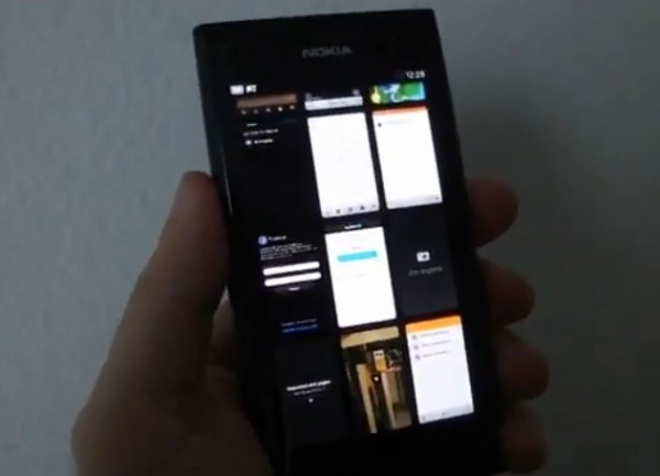
Video: 10 minute hands on with Nokia N9 #MeeGo-Harmattan
Advertisements
Here is a recent hands on with the Nokia N9 – the date on the phone says July 26th. I think it’s in Portuguese.
- Love the colours on the screen. They just pop. And even at extreme angles the colours appear as if they’re printed.
- The thing that astounds me again and again is the fluid nature of this new paradigm of SWIPE UI.
- No confusion between swiping photos and swiping screens. You can see it in some demoes, but when you get the hang of it, it’s very fluid not just visually, but in the motion of your finger to the screen. No hunting around for the menu button or having to long press or double tap or any other seemingly old fashioned button use.
- Pinch and zooming still seems a little ‘slow’ to me. It should be that at least in one large pinch and zoom gesture, I should be able to zoom in quite a bit at the photo.
- Maps has a globe. Remember old Nokia maps where you start with a globe and you zoom down to your position? I kinda missed that. They don’t actually show anything else for the maps bit.
- I fear this swiping between screens might be something to be stolen (or ‘inspire’ other OS – e.g. the active lockscreen – Nokia Bubbles – I might be wrong but was that always in HTC?)
- Start up on camera time does look to be as advertised. Just smidge over 2s (and quicker successive shots)
- Check out all those multitasked apps towards the end of the video. The awesome thing about no buttons to activate multitasking is that you eventually have to come across the multitask screen to see your open apps (A bit like maemo 5 in a way) so I guess that would help users manage their apps  (which I’m guessing having more open simultaneously would reduce battery life more quickly)
- App Switching is really quick
Video by rodrigostoledo1
Advertisements


Connect
Connect with us on the following social media platforms.