New WP7 Apollo Concept
Advertisements
Hey folks, it has been a long time since I posted something. I was kind of busy- enjoying summer holiday, then moving to Denmark to start my college education…
Today I would like to show you my new ideas for Windows Phone 7. I have been using this amazing operating system since May (Mango since July).  And I completely love it!!!
This article is going to be a little bit different than others. I’m going to talk about previous articles (why some of my ideas weren’t good) but I also have some new stuff to show.
Let’s start with Aero!I came up with my Mango Concept few months ago. Look here if you haven’t seen it.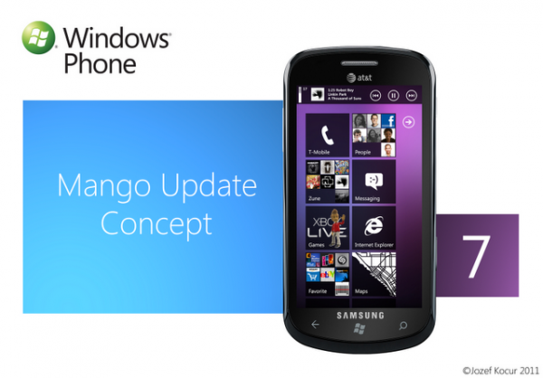

I’ve seen many people who loved all those transparency effects, own backgrounds…I’m asking them… Have you tried Windows Phone 7 yet? Try it, and you will love it. And please forget about AERO! We are not in 2008! I know it was my idea to combine AERO and METRO…but it was a bad idea!!! Metro is perfect as it is …it does not need freaking AERO!The main disadvantages of AERO are…
- it does go against METROÂ philosophy!!!
- it looks good in my mock-up, but can you imagine different wallpapers, different transparency levels…It would be a mess!!!!
- it would also use up more of your phone’s battery
For people who still think WP7 has monotonous UI:
Try to rearrange your Tiles, use white background instead of black (use up more of your battery), and try different accent colors. Also, the whole WP7’s UI looks better at the AMOLED screens 🙂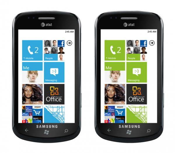

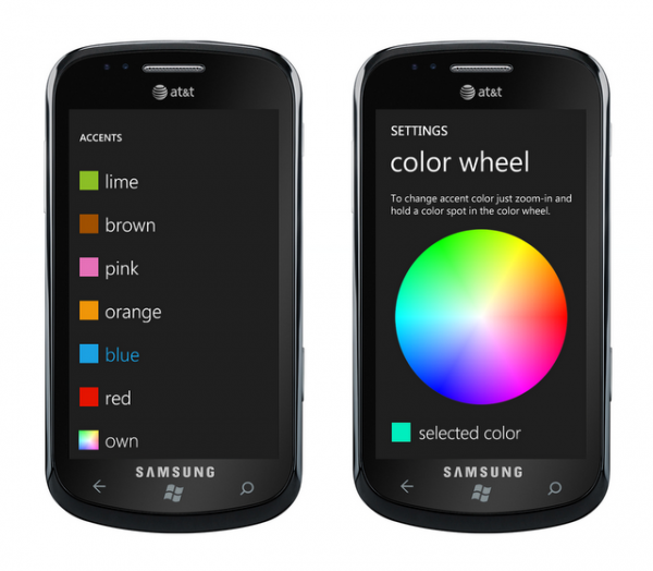
One more advice for developers in Microsoft. Try to create something like a “Color Wheel†that would allow users to pick any color as a accent color.
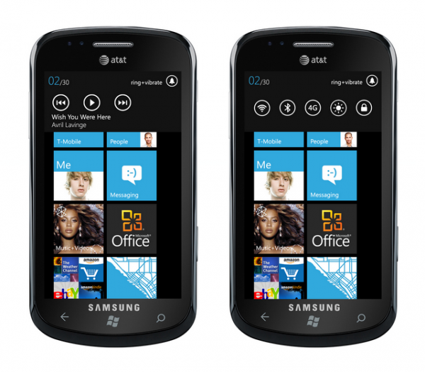
Do you remember Control Bar?
Today, I’m coming up with a new, much better Control Bar.
New Control Bar has 2 parts- Zune part and Common Settings part. To switch between them just slide to the left/right. You would be able to personalize Common Setting Part in System Settings.
What about Live Thumbnails?Â
  |
| Live Thumbnails Mango Concept |
I know this concept wouldn’t work (9 icons on such a small Tile is too much). So I tried to fix it and I’m coming up with Group Tiles.
Group Tiles let you to create a “Group†of Applications, Contacts, or Web Sites’ bookmarks (2-4 mini Tiles).  It’s the simplest way to keep your Home Screen organized. I think this is usable just for the titles that are not showing life content, such as Adobe Reader, Netflix, different games, etc.  Also, if you add a Live Title or a Contact Tile, they won’t be showing any further information, just a plain icon. It basically divides a Tile into 4 small mini-Tiles.
  |
| Applications/Contacts/Bookmarks |
To Create a Group just tap and hold a Tile. Then drag that Tile and drop it on top of another Tile.  A group tile will be automatically created.
Lock Screen InnovationsÂ
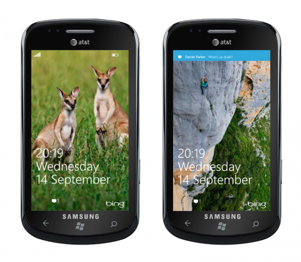
Windows Phone 7’s lock screen is perfect already! But I would like to show you 2 little changes…Bing WallpapersThis feature would change your wallpaper every day to a Bing Wallpaper.
SMS Notifications
Slide to the right to reply to new message, or to the left to hide a notification. This won’t work if the password is on.
 Well, that’s all what I have for now. I will try to come up with something new soon. If you have any questions, just contact me. If you like some of my ideas, share it with others, and support them at http://windowsphone.uservoice.com/forums/101801-feature-suggestions/suggestions/2285315-setting-toggles-group-tiles-color-wheel-to-pick . You can also follow me on Twitter. Thank you 🙂
Advertisements
Category: Nokia, Windows Phone




Connect
Connect with us on the following social media platforms.