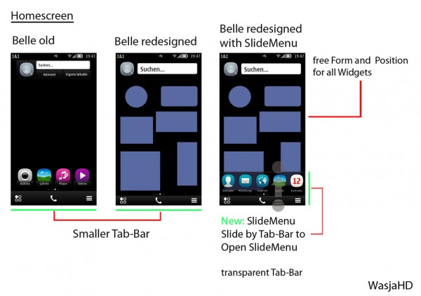
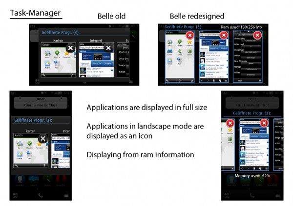
Symbian Belle – redesign ideas.
I’m not sure if this is just an ideas project thing, I’ve not really been following it but there are quite a few good suggestions in this post as to the changes that could take place in Belle.
Some welcome changes include increasing the grid view in apps to 4 column like MeeGo-Harmattan instead of 3, and a full sized card interface and not just a thumbnail. With the column view, you have the option to change from 3 or 4 columns by pinch and zooming – something a little MeeGo esque in a way. I’m a fan of giving users the choice instead of taking one feature when a new one is introduced (if possible and not conflicting severely with the UI).
Cheers Kristian, James, Blackidea and Rhodes for the tip!


Connect
Connect with us on the following social media platforms.