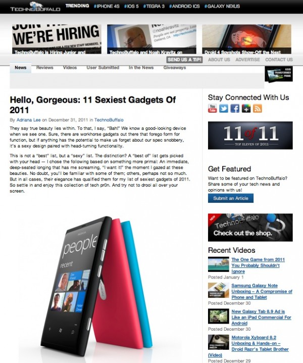
Nokia Lumia 800 top of TechnoBuffalo’s Sexiest Gadgets list for 2011 (+ramble on N9/Nokia design)
In the past, Nokia has always been known for head turning design, either by being bold and distinct or just being utterly beautiful. Nokia’s touch phones have looked nice but nothing to light the world on fire.
Then came of course the Nokia N9 which gave a glimpse as to what the Lumia 800 might have been like. It was a stunner on screen, in pictures and videos and quite something to behold when in your hands. It is quite a remarkable feat what Nokia has achieved given that everyone and their mother seems to be stuck doing:
a) cloning the iPhone (hello Samsung 🙂 )
b) making shitty ugly phones (hello HTC 🙂 )
c) copying Nokia (hello Acer iconia 🙂 )
d) cloning the iPhone (hello Apple. Only you trump Samsung)
Either way, no one is really making fresh, daring, new but gorgeously designed phones. Then came what we saw in N9 (and later in Lumia 800) of something so sleek as to have come from a 26th Century Modern Art gallery. I kinda wish Nokia opted for the invisible capacitive keys (ones where they disappear when there’s no back light) so it can assume the N9’s near perfect untainted obsidian black screen. I say near perfect as the front camera taints it a little when held at certain angles. I’m sure it would have been possible to make it less visible.
The love for this new Nokia design is not by Nokia fans alone, it was met with rapturous applause and worship even from Nokia’s harshest critics on the blogosphere. Those famed for defaming Nokia, either out of sheer hate, spite (or paid to :p jk) could not deny the brilliance achieved by Nokia’s design team.  It was something of a revelation, something revolutionary. It is something that Sir Ive would be proud of. My Mac Air is jealous of its design. Also it’s not just pretty, it’s damn durable and practical too.
Long, long ramble aside, you came here for the TechnoBufallo angle. Top of TechnoBuffalo’s list for the sexiest gadgets of 2011. Quite an honour. Or I thought so until I saw the vomit inducing BlackBerry Porsche 9981. But let’s ignore that blemish and read what they had to say:
To be honest, I was tempted to put the iPhone 4S here, but I decided against it for one simple reason — the form factor hasn’t really changed in two years. But Nokia‘s Lumia 800? Maybe it’s not the analysts’ darling, but I think it’s a fresh take that stands out in a sea of smartphone form factors that, frankly, all starts to look the same after a while. The company took those rounded edges and deep-colored polycarbonate — and put it together with Windows Phone OS, a 1.4 GHz CPU, 8MP camera, and Clearblack display. The result? A stunner of a design-forward package. While I do bemoan the lack of a front-facing camera and a few other specs, I also have to say — never has WinPho looked sexier than when it runs within this handsome handset. Available in Europe, those of us in the States will have to wait until next year to see if this (or its successor, the Lumia 900) will be enough to make the platform a real contender. Personally, I can’t wait.
http://www.technobuffalo.com/technobuffalo/hello-gorgeous-11-sexiest-gadgets-of-2011/
When you have a strong design, it becomes part of your identity, something you’ll be recognised for. It’s in part why iPhone has been vastly successful and why Samsung has been so darned insistent on cloning it. It is a design that works and has become ingrained into consumers mind as belonging to one particular company.
It seems that Nokia will go that way with the Nokia Lumia 900. Well at least in terms of design hints. It’s not going to be a near enough minimally distinguishable like the iPhone (all the same size, all the same face. The back sort of changes and then finally the last two you cannot tell apart in design even if you were Sherlock Holmes…) The Nokia Lumia 900 is of different proportions. It’s larger, has a larger screen and the buttons are all in slightly different places.
But how far should Nokia pursue making similar N9 esque shapes? Do they need to move on? You can kind of see from the Nokia N8 an evolution of tapering curves. I think there’s still room for improvement even upon the amazing N9/Lumia 800. They could just have a 100% visibly seamless phone. There’s space still to trim at the top and bottom.
But keep the shape, those sweeping curves, those tapering edges (the last thing we want is a plain rectangle with curved corners which of course, is patented by Apple :p). Hopefully, Nokia can keep making fantastic designed phones that don’t compromise on the internals as they aren’t used to having such slim phones. I perhaps can live on with this camera, but I really want to be back to using one where I know it will come out great and not just “well, it’s better than nothing”. Nokia is becoming synonymous for these tapering edges. And it’s a design that’s working as Acer and Motorola are copying it too. Oh, please, no raised bezels. As functional as they are they kinda look ugly and present a hiccup in another wise flawless design (for finger flicking, it interrupts the swiping and scrolling motions).
Thanks Alan for the tip!


Connect
Connect with us on the following social media platforms.