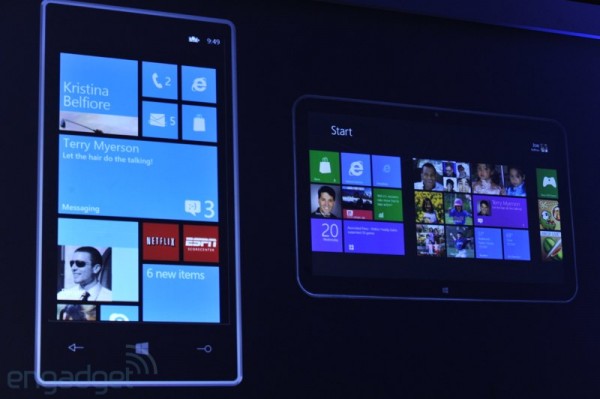
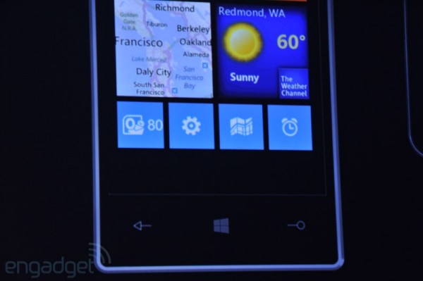
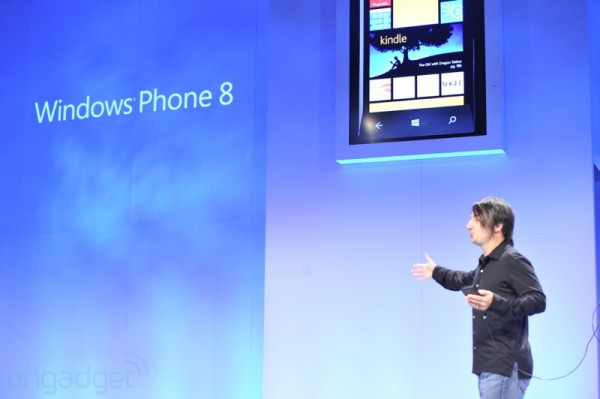
Hello new Windows Phone 8 homescreen
Yay! The tiles are doing a bit of evolving. Now they fill up the entire screen with different size tiles of your choosing (before it was only ever one square or rectangle, the latter of which you could not choose anyway).
This dynamic look resembles W8 a bit more. I think I remember seeing a similar tile layout on a Japanese phone and folks were mentioning that MS should follow that. If you’re a fan of Piet Mondrian, you’ll enjoy this homescreen.
Check out the new windows button. Also is this just a generic demo handset or lumia?
Also, yes to a huge phone if the first image is to scale :p (ok maybe just Galaxy Note size, max)
. Check out the curved glass. lol, the bezel here is insanely thick. Going back to the image above, it looks like a very lumia colour scheme.
Source: Engadget
Category: Nokia


Connect
Connect with us on the following social media platforms.