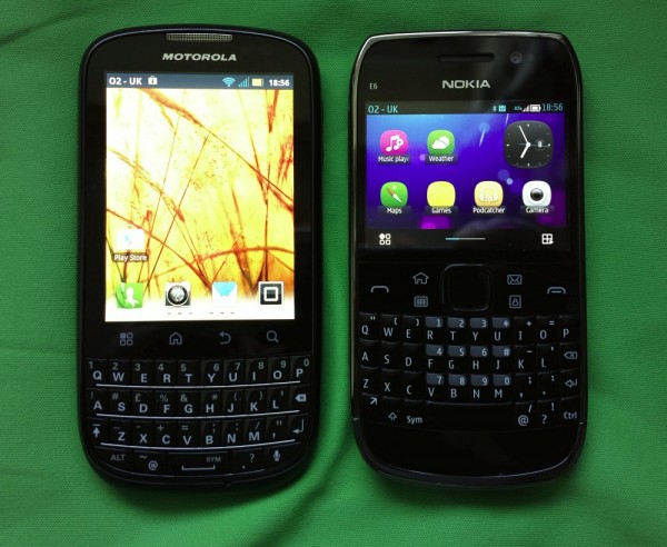
Nokia E6 vs Motorola Pro+
Advertisements
2011 contenders go head to head in Steve Litchfield’s post comparing these two BlackBerry alternatives. Whilst both phones have VGA screens, the Moto opts for a portrait 3.1″ vs landscape 2.46″ in the E6. They’re not too different in size, but the E6 is slightly smaller.
As a device focused on typing, the E6 wins it for Steve, with bonuses such as better pictures, video, GPS signal as well as superior build quality/materials.
The functionalities are split so despite the 7 vs 4 in favour of the E6, Steve said he can’t award a win.
I’d like to see an E6 successor. Slightly larger screen, portrait QWERTY.
Source: AAS
Advertisements


Connect
Connect with us on the following social media platforms.