Infographic: App Store Comparisons WP Vs. Android Vs. iOS
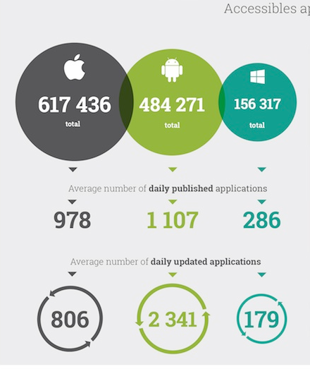
 Here’s a pretty sweet inforgraphic showing a comparison of the health and activity on each of the three big app stores. Notably iOS is still in the lead with over 600K apps, with Android heating up behind them with >480K; and WP a ways behind with 156K. However on Windows Phone the average publisher has 5 apps to his name, something that may or may not be a good sign; for example Rudy Huyn developer of 6Sec, 6tag Wikipedia, 9Gag and more has about 5 in his name; on the other hand the BB 10’s stores biggest woe is the fact that 1/3rd of the market place is owned by a single developer! Which flooded the store with crap apps.

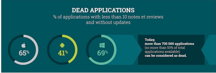
Another slightly misleading, yet interesting figure is the number of “dead applications”; at first I thought this referred to the percentage of apps with close to zero downloads, instead it’s the number of apps with less than 10 reviews and zero version updates. In this aspect WP is in the lead with 69% of the store being “dead app”, followed closely by iOS with 65%.
It truly is an interesting infographic check it out below (full size link)

Thanks everyone who sent this in.
Category: Lumia, Nokia, Windows Phone


Connect
Connect with us on the following social media platforms.