Poll: Should Windows Phone lose its capacitive buttons?

This topic has come up many times, what with some preferring the physical or capacitive keys and others wishing it were done away with (with the alternative being virtual or even gestures).

[polldaddy poll=7439610]
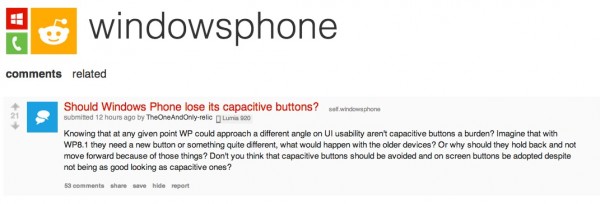
It’s posing quite an interesting discussion over at Reddit.
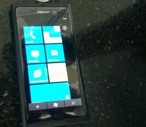
With regards to Nokia Lumia users, we were treated to this possibility before the first Lumia was ever known. Remember that N9 with virtual buttons? Yeah they looked ugly but it did show a potential future.
Unlike most Androids with virtual keys, the N9 version didn’t eat up screen pixels because WP was 800×480 and the N9’s screen was 854×480. An extra 54 pixels for virtual buttons.
Pros for losing capacitive/physical face buttons:
- Sleeker look
- Less bezel
- Can easily be customised (lol, as if MS would allow this. If they did, goodbye annoying bing button that no one uses. I much prefered it for contextual search)
Cons for losing capacitive/physical face buttons:
- Irregularities in apps causing black bars on screen
- Not quite the same ‘sensation’
- Loss of simplicity/uniformity
There’s much more to add of course but now I have paediatric respiratory diseases to read up on :).
Category: Lumia, Nokia, Windows Phone


Connect
Connect with us on the following social media platforms.