Yet another…WP Notifications concept for WP 8.1

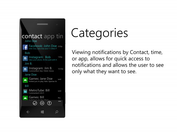
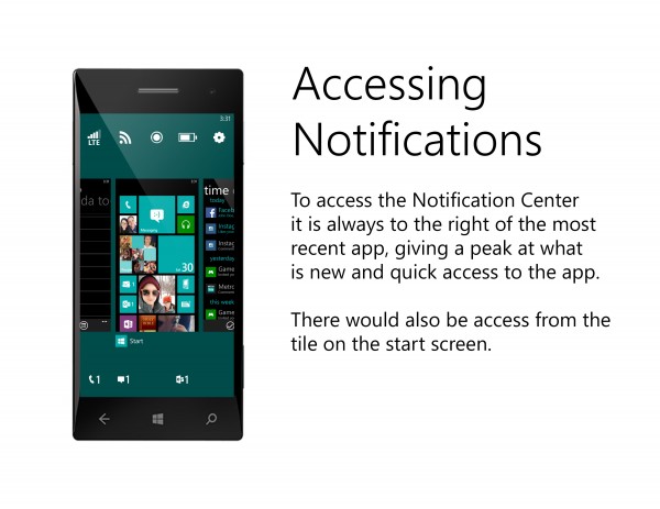
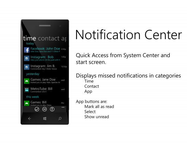
Here’s another Notification Centre concept. The descriptions in the picture are pretty self explanatory. Â A little bit like Peter’s Hyperspace concept, pressing back reveals the notifications.
Instead of pressing back and then swiping to see notifications, you get a little window peak, just right to the most recently used app.I’m not quite sure if those icons are just status indicators enlarged or possibly quick launch icons (e.g. the settings cog). It would be nice to be the latter.
At the moment, it seems the official method (according to rumours) is a long and short gesture from the top that gives access to notifications control and quick settings.
This concept method might please the purists that hate the idea of having another pull down.


Via: Reddit
Category: Concept, Lumia, Windows Phone


Connect
Connect with us on the following social media platforms.