@Nokia Lumia 1520 first impressions of the flagship @windowsphone phablet

The Nokia Lumia 1520 arrived on my door last Friday. I kept the package hidden away until Saturday evening as I knew I’d get distracted with the 1520 all weekend if I opened it. Got to keep uni/education/studying in balance peeps :p.
Anyway, so I’ve had it roughly since Sunday. About 5 days. What do I think of it?
I love it!
Some reasons why I love it. Not really in any particular order.
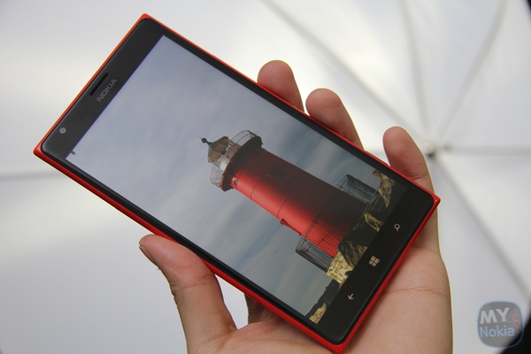
1) The big 6″ 1080p display.
It’s quite glorious to look at. Bright, crisp and so much information on the screen. I half keep getting annoyed at sites that will only view on the mobile version. I want to see moooar!
Reading Kindle, news apps or PDF textbooks has never been so good.
Usability of the big screen hasn’t been an issue. In fact, typing in portrait has, unexpectedly, been even more comfortable.

2) The design.
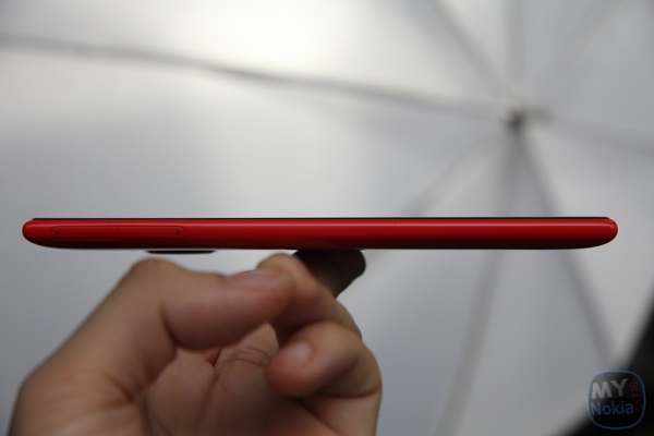
It’s quite a stand out design and definitely whiplash inducing sleekness to it. It’s like a bigger, more refined 925. The size shocks some (those used to piddly little blackberrys :p) whilst it fascinates some others. “That’s a phone, it’s more like a tablet”, is the response of those who have never heard of the word phablet and thinks it’s something I’ve just made up (they’ve been around for a while, non-geek peeps! It’s like when I got told about Nokia cameras being surprisingly good in comparison to iPhones. Erm. They’ve been insanely awesome before, during and after iPhones)
3) WP8 tweaks for the big screen.
There aren’t as many optimisations to the bigger, higher resolution screens but it’s definitely there and much better than simply increasing the size of everything.
- In emails/messages you see more text per line
- In mails menu you see a more of the preview of the message
- More albums in view (triple column vs 2)
- More items visible in menus
4) Triple column homescreen
This is really part of 3) but the homescreen is such a big aspect of what you interact with and the identity of WP. Whilst it seems so trivial that there’s an extra column for the big square (so 6 mini columns in total) it really does change how my homescreen looks.
It’s so much more dynamic. More, larger active tiles visible at ones, or much more mini tiles. But of course you have the option to have as much or as little on your homescreen at all.
I’ve found I tend to scroll a lot less since everything is pretty much visible on the first part of the homescreen. I really wish an update in future would mean triple column for smaller displays (heck even the 92x range/1020).
5) Battery Life
Man, this thing is a beast in terms of battery life. The first few days of a new smartphone’s life is usually the worst for me because I’m using it heavily to get to know it. It lives up to Nokia’s claims and GSMArena’s findings. At least 14 apps providing toast notifications, lots of active tiles.
6) Speedy
WP is consistently speedy from the entry level hardware to their flagships. But, like the other reviews have said, there’s just something extra in opening apps and processing that is most appreciated.
7) Closing tasks.
It’s a small change that a lot are welcoming. Purists of WP say it isn’t needed since WP is meant to manage the tasks preemptively. But I like that added sense of control. Perhaps it would be nice to have flick close gestures like N9/W8?
8) The Camera
I looove this camera. Perhaps it’s partly because the viewfinder is so big and clear but also because Nokia Camera is much more responsive. Quicker to start, quicker to process, quicker shot between shot. This is due to smaller files to process (20mp vs 41mp) and the faster processor.
- The colours look better than my 1020. What I see in the viewfinder is pretty much what I see in the gallery. This may also be partly to do with the screen having less of a yellow tone on top of the 1020 not yet being on black (amber has more yellow tones).
- Much closer Macro. The 1020 has to be a quite a bit further than, say the 925 on close up subjects. A bit like the 808 PureView. The 808 compensates by having all that zoom. The 1520 is able to get super close, so I get more versatility in that sense for framing close up shots. Plus there’s still a bit of zoom in that 20mp.
- The flash is surprisingly quite good. Just like Steve Litchfield’s findings. I need more time on this though.
- Video is nice and stable, like previous generations. This also needs a bit more time to test.
9. The MicroSD slot
Finally. MicroSD slot on a flagship. 32GB internal is great but 64GB means I don’t have to keep an eye on remaining memory as often.
10. Wireless charging built in
Slim, yet the wireless charging is built in. The 1020/925 omitted inbuilt wireless charging but had it as an optional accessory.
Dislikes:
1) The screen seems awfully easy to have microscratches. Now, not even considering the previous post, the 1520 was picking up a lot of fine scratches on the oleophobic layer from being in a fur lined pocket. I recall some mentioned this happen with the 925. I didn’t experience this until some months down the line with the 925 but the 1520 got these fine scratches (you’ll only see with the screen off and reflecting against some light) fairly quickly.
2) Nano SIM.
Not a big issue. It just made things slightly more inconvenient to switch to the 1520 immediately.
3) Several non 1520 specific/more MS/WP related things.Â
The usual WP8 complaints, plus requests to make MS office actually usable?
4) Glossy back is a bit slippery
Well…
Overall:
I love the Nokia Lumia 1520. I didn’t think I’d like it this much. Especially after the 1020 camera has spoilt me so much. I thought I couldn’t escape having PureView and Xenon
But the camera is more than good enough at the moment. I’m ready to have it as my main device. I think that says a lot. When the 925 arrived, I still kept using the 920 as my main device.
Setting up the 1520 seemed so much easier this time around. Signing in to my Microsoft account brought back my contacts, messages and settings as it was on the 1020. Both 1020 and 1520 routinely sync so that my texts are both visible on both devices. Perhaps others might not like that but I found that helpful.
Category: Lumia, Nokia, Windows Phone


Connect
Connect with us on the following social media platforms.