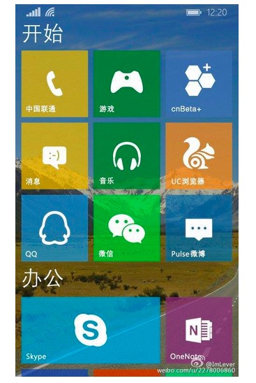
Windows”phone” 10 with grouped settings?
One of the things that I’ve found frustrating on most phones is the lack of logic in organising settings. It felt like they were just thrown together and that was that.Â

WP did make some of the basic/most used settings available first but beyond that, it felt confusing. It’s not much better with iOS on my iPad or Android on Note 4 so at least now I know it’s not simply WP that’s the issue.
Here was a post discussing some ideas to fix it. http://mynokiablog.com/2014/09/03/suggestions-for-windowsphone-reordering-the-settings-menu/, with some Symbian inspirations.
Now it seems like we’re beginning to make progress:
Settings appears to be bunched together now in groups. e.g. for display or networks. Less of that hunting around for a randomly placed settings option.

Oh and there’s more suggestions that the grouping will appear in the homescreen to, as seen in previous leaks.
Would it be an idea to quickly see all the labels somehow (like you can in gallery by pressing a month?) so we can quickly jump from one item to another?
Some are skeptical and say these might be fake. We’ll see next week.

Source:Weibo
Category: Windows Phone


Connect
Connect with us on the following social media platforms.