Advertisements
Advertisements

Tag: Screenshots

Advertisements
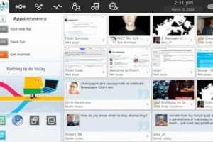
More MeeGo Phone UI screenshots – Dual Lock screen, highly customizable themes and UI mechanics.

More MeeGo Phone UI screenshots – Dual Lock screen, highly customizable themes and UI mechanics.

| September 3, 2010 | 96 Replies

Advertisements Some more MeeGo screens from the MeeGo blog. It’s part of the UI guidelines and is quite informative of what’s coming to MeeGo. Note that this is the stock version and that there may be differences depending on manufacturer customization. As you’ll see from the blog page, MeeGo UI is highly customizable. Thanks to […]

Read More

Pics: New Symbian^4 screenshots

Pics: New Symbian^4 screenshots

| July 16, 2010 | 45 Replies

[I keep getting distracted from blog posting today.] A while ago in February, we saw some screenshots of Symbian^4, and today they’ve been updated somewhat. Ignore the Windows XP border (they’re from the ’emulator’). They can be found at Symbian.org Wiki page (I think someone tweeted it this morning but I forgot whom) Here we […]

Read More

MeeGo Screenshots!

MeeGo Screenshots!

| April 13, 2010 | 48 Replies

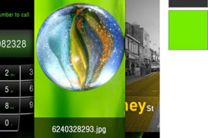
Some images found through @MickyFin and @Camb078 of early MeeGo screenshots. The icon bar at the top somewhat resembles the icon bar of Moblin. This one’s from Micky. The screen ratio looks to be 16:9 and not the 16:10 of Maemo. What could that suggest about the resolution? Please god, NOT nHD. Note the call […]

Read More

Symbian^4 Screenshots: #symbiangives Death to the ugly font! Post updated with more screenshots of new App Switcher Icon! No more long press necessary when multitasking!

Symbian^4 Screenshots: #symbiangives Death to the ugly font! Post updated with more screenshots of new App Switcher Icon! No more long press necessary when multitasking!

| February 13, 2010 | 35 Replies

Some supposed Symbian^4 screenshots. For me, the font change makes a world of difference. I think it’s “Arial” which looks much more appealing (fresh/new?) than the standard “Nokia Sans”. [Update from Symbian – it’s Veranda :)] Font change! The screenshots are still 640×360 – hopefully Symbian^4 handsets will increase further in resolution? It’s hard going […]

Read More

Gigantic Nokia N97 Review! Live Pics, Sample Pics and Screenshots!

Gigantic Nokia N97 Review! Live Pics, Sample Pics and Screenshots!

| May 19, 2009 | Reply

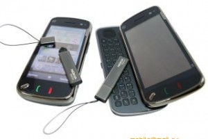
Here’s another Nokia N97 review, this time by mobile.mail.ru. The full review is very detailed, with plenty of live pictures, sample photos and screenshots. So if you’ve got some time and want to know how the N97 is getting along, it’s a really good read. Here’s the original Russian version; the google translator version and […]

Read More