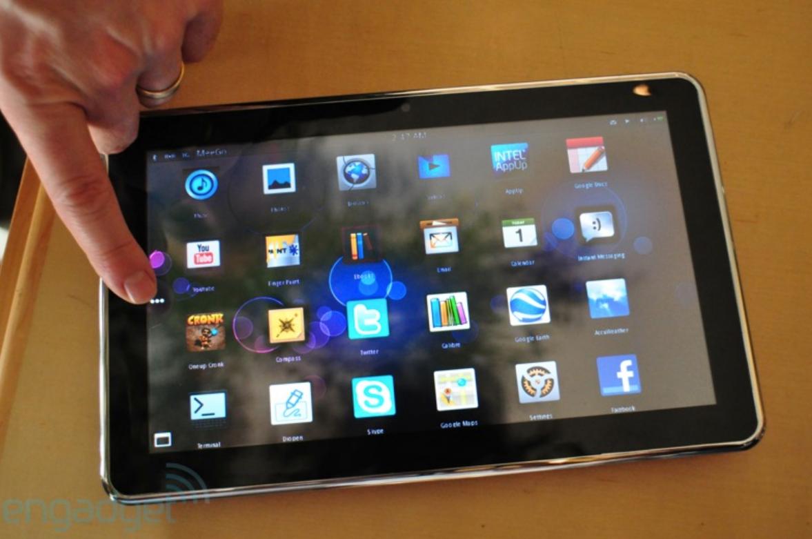
New MeeGo Tablet UI. Looking impressive.
You may have seen MeeGo on a netbook. The interface looked pretty similar to Intel’s Moblin for netbooks.
As Engadget discovered on a 10-inch Moorestown Quanta Redvale tablet, the MeeGo tablet UI looks completely different.
“To say we’re impressed with the “pre-alpha” version of the software is a huge understatement.”
This tablet is powered by 1.5GHz Moorestown chip, and according to engadget, plays 720p videos smoothly. That’s a feat some netbooks right now find difficult.
What’s even better is that there are several MeeGo netbooks/tablets coming soon, not just this.
We’ll update this post with the video once Engadget unprivates/finishes uploading their video.
MeeGo UI Video Demo
Head over to engadget for the video demo. It’s embedded in their player. I’ll update with a youtube version when it appears.
- 720p plays smoothly, and apparently even supports up to 1080p
- No lag
- Pinch and zooming/rotating absolutely smooth
- Battery life at 6h?
Alternative vid by stevechippy – longer than engadget’s vid.
[youtube=http://www.youtube.com/watch?v=iVIKYF7MOzU]
Check out the homescreen view. It’s a blast from the past, taken in 1970 doncha know?
It seems we have notifications (calendar/messages), time, a supposedly apple patented slide up to unlock and battery indicator. Let’s hope for good things on the battery life side. I’m looking for at least 7h on the trot with quite heavy usage.
App/Menu view has traditional grid but with uniform icons. I hope Nokia adopt this.
I’m not too concerned about the design of MeeGo tablets since the tablets are basically just a shell for MeeGo. What’s really important is how MeeGo itself looks.
Having said that, what on earth is going on in the profile side view? No wonder the photos look like the tablet is floating. It hope that’s not too thick and that future tablets are completely flat all the way through.
Also, for this tablet at least, the screen is resistive. Engadget is quick to point out however that it is very responsive.
Just like the press photo, something new with MeeGo is this panel UI.
As for the MeeGo Smartphone UX, that’s still to be seen (we’ll definitely know it by Nokia World 2010 – it’s apparently not MeeGo 1 yet but just Harmattan/Maemo 6 rebranded)
I’m really looking forward to a Nokia MeeGo tablet. The tablet form factor is one of the best ways to consume data and online entertainment and multimedia. There is of course, the iPad, but I don’t want to be locked in that ecosystem.
Via Engadget


Connect
Connect with us on the following social media platforms.