Gallery: The Real Symbian^3 Portrait QWERTY keyboard demoed on the Nokia N8
As promised alex68Â has updated us on tips@mynokiablog.com about the portrait QWERTY of the Nokia N8. This is the real one (mid development perhaps) and NOT the 3rd party QWERTY keyboard that we saw the other day.
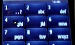
Here’s the standard T9. Note how the text field is no longer separate. You can see exactly the app you’re typing in without being whisked away into a separate text box.
The T9 on a touch screen has often been criticised as being outdated – but I think T9 is a great option to have. Folks can still type with one hand very easily like their own candybar T9 handsets. It helps if you have big hands. Some folk just prefer typing with T9. It’s good to have the option there – but even better were the QWERTY portait given also as an immediate option.
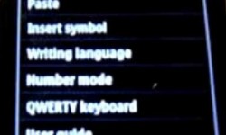
 Well let’s quickly pop into settings: See QWERTY keyboard. Not bad – immediately visible without having to dig around the menu.
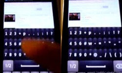
 And Voila. The portrait QWERTY for Symbian^3. Typing very responsive. Not sure about multitouch support. Not such a requirement when in portrait as you’ll be one handed.
The portrait QWERTY should mean future portrait QWERTY for Swype – for me, that’s what swype is made for. One handed thumb swyping. Portrait is ok but possibly not as convenient as a single thumb drag.
Note: This is NOT an English QWERTY keyboard. I don’t know how the button placements would appear were there to be fewer letters. Perhaps they would be not directly aligned and offset like a proper qwerty?
Numbers Button:
What do you think? What do you like about it? What could be improved?


Connect
Connect with us on the following social media platforms.