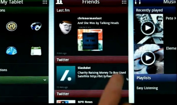
Video: MeeGo Tablet Experience
Advertisements
 The last time we saw the MeeGo tablet UI, it was the pre-alpha version. Here, from MeeGoZone seems to be the most recent iteration. This is alpha stage apparently.
- Panels looking good. Long press for contextual menu is a little boring.
- Calendar autosyncs with google/yahoo
- Animation when it reaches the end of side scrolling is a little jerky (could be the camera)
- I really don’t like the theme used here. But that’s possibly just me.
- I can’t help but thinking, is that it?
- Perhaps more to do with the demos – tablet expert @chippy says he’s genuinely impressed. His video is the third one added in this post.
Update. Shawn has found another demo from engadget. Hmm…MWC and it isn’t ready.
Advertisements


Connect
Connect with us on the following social media platforms.