
Nokia Conversations’ Interface Idea (and more talk on new Nokia Pure fonts)
 This morning we heard about Nokia Pure font. I won’t repeat my excitement and love for the fact that we’re ditching Nokia Sans. You can check out that post.
Nokia Conversations – the OFFICIAL Nokia blog has covered the new font change, which is part of a whole rebranding – Pure and Simple.

This is the new typeface that’s been created for Nokia by the branding people. It’s called Nokia Pure and we like it a lot. The third picture, with the lower case ‘c’ and ‘e’ up close is worth particular attention. Not only does it look… well, pure and simple, but the letters flow into each other somewhat, creating the impression of forward movement. The idea of flow and movement appears frequently in the new branding
Via Aapo Bovellan http://brandbook.nokia.com/

Advertising is now also equally simplified. Bolder, cut the crap. Leave in what’s important so at a quick glance, the consumer has all the message Nokia wants to send.

Via Aapo Bovellan http://brandbook.nokia.com/


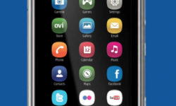


Of great interest is how this pure/simple, minimalist clean look will reach Nokia Interfaces. It’s NOT something we’re getting, just an idea.
Take the images below with a pinch of salt. They aren’t pictures of forthcoming products. Rather, they show some ideas of how the new branding might extend onto the user interface of our mobile devices.
Cheers Arts for the Tip!
About the Author (Author Profile)
Hey, thanks for reading my post. My name is Jay and I'm a medical student at the University of Manchester. When I can, I blog here at mynokiablog.com and tweet now and again @jaymontano. We also have a twitter and facebook accounts @mynokiablog and  Facebook.com/mynokiablog. Check out the tips, guides and rules for commenting >>click<< Contact us at tips(@)mynokiablog.com or email me directly on jay[at]mynokiablog.comSubscribe
If you enjoyed this article, subscribe to receive more just like it.


Connect
Connect with us on the following social media platforms.