My Dream Nokia #27: The Nokia Windows Phone 7 concept design with Symbian Anna grid Icons
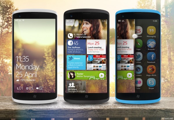
 My Dream Nokia #27 is the work of Tommi Incrosnatu of sciant.net from Finland! It looks a lot like the official Nokia concept designs for Windows Phone which is absolutely BEAUTIFUL! I love that someone has taken these designs so we can see them again in different views. What makes it so much nicer is that he’s got rid of METRO (Cry, Metro Purists!).
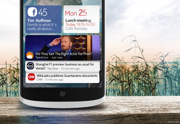
The lock screen stays the same, but the homescreen panel has (as seen in previous Windows Phone concepts) a background and modified tiles. These are NOT in keeping with metro’s square and bland look. They have information on them MORE than the plain numbers. I hear Metro purists screaming to leave Metro UI alone.
And then the biggest change. Goodbye ultra-list of scroll, scroll, scroll! (To be fair, even with a lot of apps installed, 80 to be exact, the max scroll to get to one end is 3. That would be a similar affair on Symbian or maemo with that much apps). The positive thing about lists (especially alphabetical ones) you WILL always find your app, even if you’re a newbie to the phone as you’re not digging around folders (e.g. Symbian). This would be helped significantly if the search button acted appropriately instead of going to bing. With grids, over time you do get used to the grid placement.

I think maybe perhaps give the users a choice? Put the default list view with option for grid (my older uncles/aunts would love the massive text), maybe even an extra option to have grid view alphabetically like Maemo 5 (in one of the app mods). I think something like this will help the transition to WP. Would it alienate potential Nokia Windows Phone users that have expectations of Metro (not that there are that many). I hope this is not too much of a change that would affect updates. I don’t want repeats of Symbian updates or worse, be the Samsung of mobile phone updates (which is LATE on every platform, Symbian, Windows Phone, Android).
WINDOWS 7 PHONE CONCEPT
So Nokia’s Symbian is bitter sweet history and Windows 7 phone is the next big thing? I like to think so. The Windows 7 phone is really great, but the Metro UI alone doesn’t quite cut it for me. I certainly hope that we’ll see some scandinavian quality design in Nokia’s phones. This feeling inspired me to add some Finnish look and feel by pimping the Metro tiles a bit and adding those lovely ANNA -icons. I also dropped out those redundant hardware keys from the phone, I think we all know by now that multitouch gestures work well.
Oh I thought the back and search button was just off. No they’re gone. I liked them oddly enough. Back lets you quickly go back or resume the previous task. Search will search contextually most of the time (within phonebook, market place, though needs much more attention)
Cheers Concept Phones for the tip!
Category: Concept, Dream Nokia


Connect
Connect with us on the following social media platforms.