Gallery: Nokia N9 versus iPhone 4 versus Xperia Arc
Someone (DÅ©ng Noble) posted a link to our facebook page (facebook.com/MyNokiaBlog) of a fantastic gallery of Nokia N9 again (note, tips are preferably sent here if you want posts shared quicker).
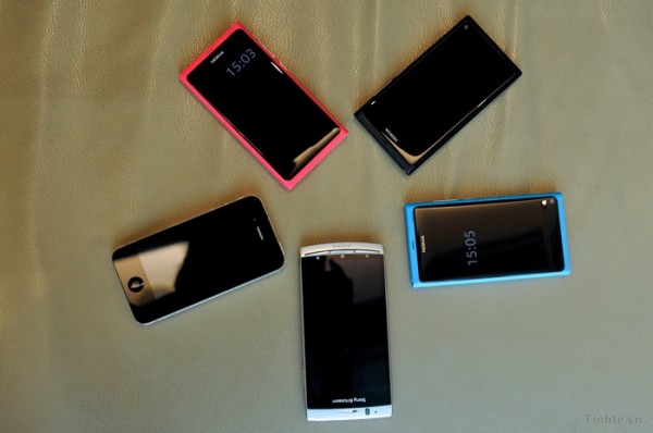
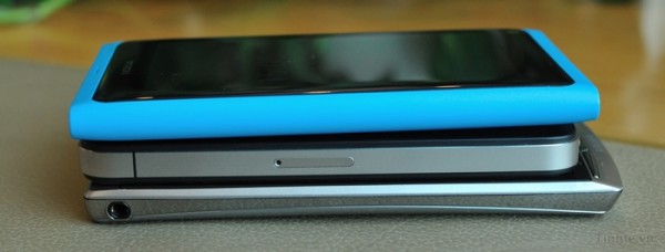
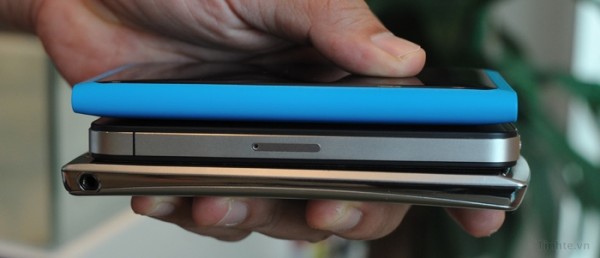
Amongst the myriad of N9 solos, you have the N9 pressed up against Apple’s iPhone 4 and Sony Ericsson’s Xperia Arc.
Check it out here: http://www.tinhte.vn/meego-tin-tuc-gioi-thieu-406/tren-tay-nokia-n9-o-viet-nam-739108/
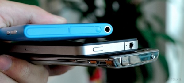 Like the Xperia Arc, the N9 has varying thickness. At the thinnest point, the N9 is 7.6mm (12.1 at thicker raised glass?)
N9 does come in three colours (well, of what was in official press shots anyway, we have seen other colours :p), Black, Pink in addition to Blue. The solid blue blockiness does make it look that extra bit thicker where as iPhone uses illusionary thinner silver band. To be fair though, iPhone 4 is slim (9.3mm) as is arc (8.7mm – which part is that?)
Other colours – they say black is a slimming colour :p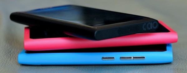
BTW, does N9 have the Battery monitor integrated? Dammit, I think I’m going to love using the N9.
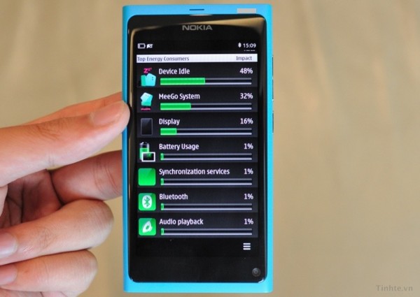 Check out their gallery. Seen a few times already now, but I love how screen brightness is immediately editable in first settings view (though you can edit from drop down setting right?). There’s a lot of intuitive changes in MeeGo that looks like it was made to just make it easier to use for the end user.
I’m interested to know if the power button can bring up profiles as traditional Nokias always do.
There’s another screenshot showing google settings. I wonder how it manages to cope with Calendar Sync. I’ve loved that on Windows Phone – it was so easy to set up. I’ve got my google calendar and live calendar. Things I put on phone are on live calendar and things I put in google or live go into the phone (I wish they could all just sync together).
via tinhte.vn
Category: Nokia



Connect
Connect with us on the following social media platforms.