Three International Design Excellence Awards(IDEA) for Windows Phone 7
Windows Phone’s Metro UI gets much flack here for having an ‘ugly’ or ‘boring’ UI. Whilst as a user, I can welcome some important changes I’ve seen in concepts, I think Metro is great. It’s clean and simple, simple, logically arranged and gets things done. I could live with changing the tiles and scrolling app list (hopefully to see some Nokia Stamps, aka SWIPE in future NWP, 2012) but the rest of the Metro-Pano stuff and all the little nice touches  (like how a button/label moves at a different angle depending on where you press it like you’re really pushing something) produced for me a very cohesive and engaging experience (note, just talking about UI stuff, not features).
If you’d like to know more about Windows Phone design you should read these posts from Paul Thurott, a blogger about all stuff Microsoft.
Or you can read the official design guide here. <<Actually an interesting read. Will have to revisit these later.
Awards for Windows Phone 7
IDEA (International Design Excellence Awards) was decided by The Industreal Designers Society of America (IDSA).
Windows Phone 7 has won awards in the following categories:
- Gold award in the category of Interactive Product Experiences,
- Silver in the Research category and
- Bronze in Design Strategy
Would be interesting to see what else is in these categories and what other OSes won other designs awards.
Well we can. Check out http://www.idsa.org/idea-2011-gallery
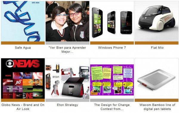
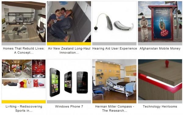
For Design Strategy: This is in with the likes of Boeing’s Dream Liner (Gold).
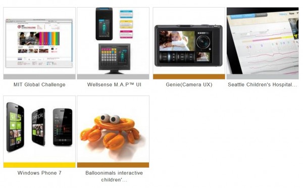
Interactive Product Experiences:
Via wmpoweruser.com/
Category: Windows Phone


Connect
Connect with us on the following social media platforms.