Leaked Screenshots and tour of Symbian Belle from Nokia 700 Zeta
A bunch of Symbian-Belle screenshots have appeared (taken presumably from a Nokia 700/RM-670) on a Romanian Nokia Blog (via zCJ).
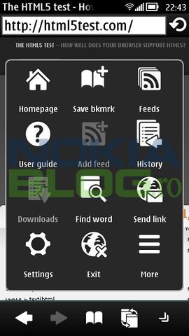
1) BROWSER:
1) Looks similar to Anna. However look at the bar at the bottom. You now have persistent/quick access to bookmarks, back/forward button and tab/window switching. Hurrah! Those were the issues I noted in my Anna/E6 review and seems at least to have been fixed on that front with Belle.
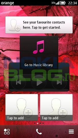
 2. The Homescreen
This is slightly interesting. Check out the free icons. No more being trapped in a shortcut widget.
Further more, we have widgets of differing size.
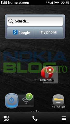 Also note at the bottom, homescreen switching, call and options.
Apparently it seems you might be able to overlap. Now with a clock/signal always on show, you save much more space than the previous Symbian view.
3) Call Screen
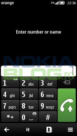
Minor change just to the toolbar at the bottom (instead of options and exit) . Green call button is bigger and phonebook button is now in toolbar.
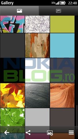
4) Â Gallery view.
Again instead of options and back, you have back, share, slideshow? and options.
I guess it’s picture view and album at the top?
5) Email view.
Subject bar is now quite small, giving all the space to your message. Toolbar is just back and options. Where’s delete?
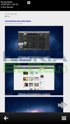
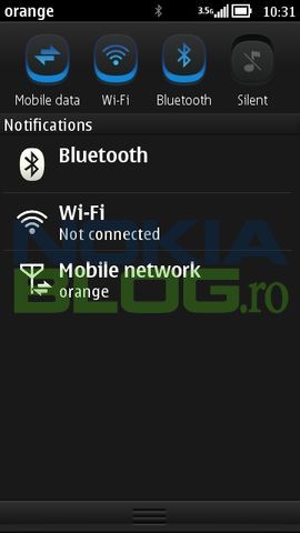
6) The notification bar.
We’ve had a preview of this before.  Here it is not in black and white.
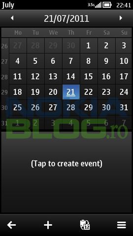
7. Calendar
The calenda view is also cleaner. Mostly similar to Anna except the toolbar at the bottom
8. The OS details:
– Nokia 700, RM-670, browser version 7.4 (Belle)
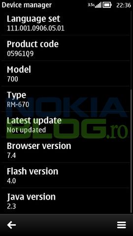 There are many more screenshots so check out that Romanian Nokia Blog. The keyboard seems to have stayed the same. The browser scores 130 in the HTML5 test.
Nokia Blog.ro via zomgitsCJ
 fu.st!



Connect
Connect with us on the following social media platforms.