Symbian design going more MeeGo-Harmattan like for Carla/Donna? Looking SWEET!
Back in July we saw some UI guidelines in Symbian that suggested a more unified look with MeeGo-Harmattan on the N9. You might have seen these before, most are familiar but there are some that seem to be new to me (could just be some temporary amnesia from last night’s party though :S). These indicate how much nicer Symbian apps are going to be but also Symbian itself as a whole.
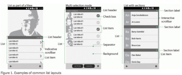
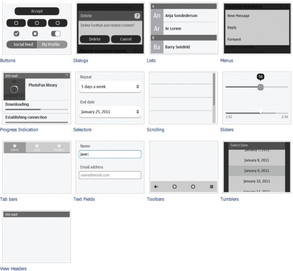
Looking at the recently updated UI guidelines (From November 24th) you can see a lot of changes made again that makes it even more beautiful and more in line with MeeGo-Harmattan. See below the lists. You can imagine that to be a look for contacts.
The buttons becoming more squircly.
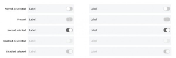
 I especially like the nice touch of squircle switches.
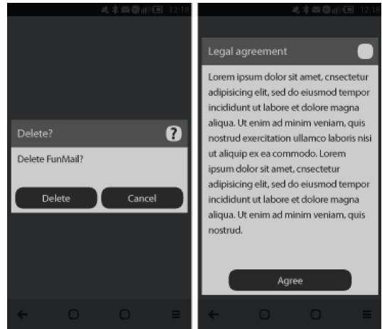
 The notification dialogues looking nicer than the blocky kinda plain rectangle that looks out of place right now in Belle. It’s somewhat too inconsistent whether certain things will have soft or hard edges. They look so much nicer than the overly fat and old looking buttons.
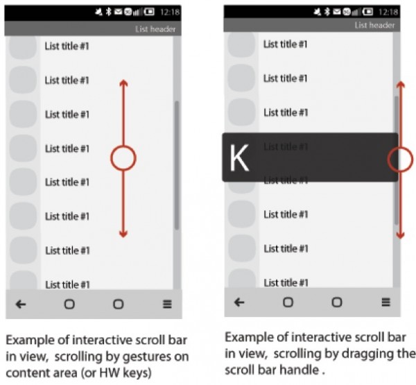
Not sure if this is possible in Belle already (I wish I had a Belle handset :S) but it sure is on the N9. Just drag and bring up letters on the side for quick list jumping.
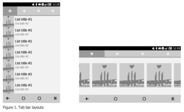
 This one not new, but I’m still liking quick tabs to switch. It’s an alternative mode to panning and much better than digging through menu layers.
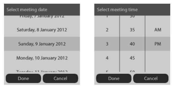
 Tumblers…been liking this type of number/date selection since N900.
It’s so much more consistent. Fantastic work on Symbian. Shame it wasn’t able to appear sooner. On the upside, new Symbian handsets next year are going to be even more awesome. Now the last thing left we might we wanting is a taste of Swipe, no? 😀 That might heavily change things up, especially if Nokia put some similar high class design there.
You can see all of the design guidelines for Symbian here:
http://www.developer.nokia.com/Resources/Library/Symbian_Design_Guidelines/ui-toolkit.html
BTW as a reference here’s Belle on the Nokia 701. Relative to the old Symbian^3 Belle is stunning. But now compared to the new Symbian design guidelines that we might see in Carla/Donna, it’s looking a little dated already – but that’s a good thing as the new Symbian is looking even better than ever before. Now it’s just the case of waiting again, right?
by gsmarena07
Thanks BlackIdea for the tip!



Connect
Connect with us on the following social media platforms.