Windows Phone Mango Review, Starring the Lumia 800
The amazing people at Nokia Connects were nice enough to send me a Lumia 800 to trial out for a while, so first off a shout out them for making this possible, they have some truly wonderful people working for them.
Now a bit about the extent of my relationship with OSes other than Symbian/S^3, I have an HP touchpad (Firesale FTW) so I’ve used WebOS as well as Android (CM7 Mods FTW too) on it, I’ve never owned an iOS device but I’ve seen my friends iphones, ipads and ipods more than enough to know quite a bit about the OS; but I have NEVER used Windows Phone (be it Mango, 7 or even 6.5) so the experience with the Lumia 800 was weirdly exciting for me because it mixed an amazing hardware design with an OS that could only be described as “Differentâ€.
Therefore the main point of this review is to hopefully give readers a good look at what Windows Phone is all about, more than a review the Lumia 800 itself. The way I see it most of us Nokia fans were too busy fawning over the N8-00 when Windows Phone was first released (November 2010), of course back then S^3 was still fresh so nobody could have possibly imagined that within a year Nokia phones would be running Windows, for that reason I realized/guessed (possibly incorrectly) that a lot of Nokia fans have no idea what WP is like (to be specific: ME), I don’t want to get into a discussion of whether it was the right choice or not, the fact is that it IS done so let’s see what the new Nokia looks like.
#1) Unboxing + Design
#2) Setting Up the 800
#3) Metro UI & People Hub
#4) Camera:
#5) Media (Pictures, Videos and Music)
#6) Bing Search
#7) Miscellaneous
#8) Wrap-Up
1) Unboxing + Design:
There are more than enough unboxing videos of the Lumia 800 floating around the internet, and the hardware specs of the device have been covered more than enough; regardless no review would be complete without an unboxing so here’s my attempt (My first unboxing vid ever, I obviously did a wonderful job, dropping the device before it’s even out of the box and all!)- filmed using my ingenious N8 quad-pod (patent pending)
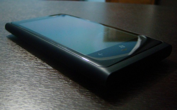
My first impression of the device design wise is that it’s GORGEOUS, (I had requested a Cyan one but oh well). Even though the 800 is made of polycarbonate (which in all honesty is basically plastic) Nokia still have managed to make it feel amazing. I fail to understand how this feels sturdier than me Aluminum bodied N8 but it does, it feels more compact (which just proves that you can make a device that isn’t glass or metal that doesn’t feel like twig- *cough cough SII Cough* ).
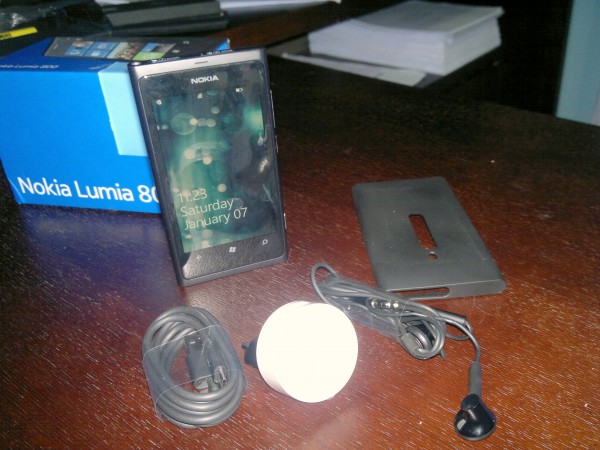
The phone comes with what you would expect: Standard 3.5mm earphones, A Micro-USB cable which doubles out as a charger when attached to the plug converter thing; however Nokia have gone above and beyond, providing a Silicon-Rubber housing for the 800, which hardly adds any width to the device at all, and has a super snug fit (personally I wouldn’t use it; simply because I love the feel of polycarbonate). As you might have noticed in the Quick unboxing I wasn’t all too impressed with the headphones accompanying the device, they had no dedicated music control (just a single talk/answer button) and I couldn’t get them to stay in my ears at all! Not even to test out the sound quality, I literally could not keep them in for more than 5 seconds.
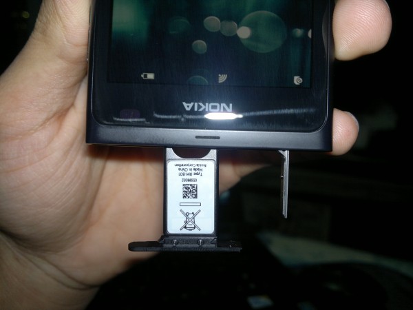
Of course the Lumia 800 (and the 710) use Micro-sims rather than normal sims (seeing as this is a trial device I couldn’t bring myself to cut my sim for a review sorry). The sim and charger port mechanism is really interesting and/or weird; the charger port/USB  is a sort of flip thing where you press down on one side to make it pop-up (very fragile, so be careful), once the USB port door is open you can slide the micro-sim slot to the left a bit to have it pop-out as well; the cool part is that the area around the sim and USB slots are magnetic, to ensure proper closure of the ports I guess.
Design-wise I think it would have been better to have the USB port at either end of the device, not next to the Headphone jack, just because it would be easier to press down on (really difficult to explain but anyone who’s tried the 800 or the N9 should be able to understand).
The 800 comes with a 3.7″ (800×480) AMOLED capacitive touchscreen, which like the N9 is ever so slightly curved making those glorious swiping motions much more fun. I’ve read reviews about where people were bashing the 800 and the N9 for using something called PenTile display (basically if you look really close you *should* be able to see a bunch of lines running through the screen) personally I see nothing at all; in fact the screen is the second best thing about the 800 (after the amazing design), due to the curvature of the screen anything on the display looks like it’s floating somewhere between the phone and you’re fingertips (in the interest of being un-bias it is possible that I don’t see the PenTile because I’m upgrading from my N8 which has a less than acceptable Pixel density).
2) Setting Up the 800:
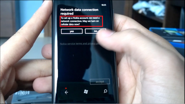
The first time you boot the Lumia 800 you have an option to set-up your Windows Live account as well as your Nokia account immediately before getting to anything else (visible in the un-boxing video); however since the WiFi connection wouldn’t have been setup yet I skipped over that part and set it up later. As soon as the Lumia detects a Wifi network in range it asks if you’d like to set-up a Wifi connection with it, alternatively you can set it up through “Setting>Wi-Fiâ€, However try as I might I wasn’t able to locate the “Nokia Account†later (by the prompt I understood it was referring to a Nokia account similar to my Symbian Nokia account and not a Nokia/Ovi Email account).
Nokia have included a handy tool called “Contacts Transfer†which can be used to copy all your contacts from an older Symbian device over to your new WP device via Bluetooth, which works quite smoothly (demonstrated below), however one feature I missed was the ability to transfer SMS messages from your older phone onto the new one as well (this function as available between older Symbian devices and Symbian 3).
Setting up your accounts can be a bit tricky if it’s your first time around on WP (check out the Video for a walk-through), I spent the first 30 minutes trying set it up from my “ME hub†rather than from the “Settings>Emails+Accounts†menu. Once you’ve got your accounts up and running all your contacts from all accounts (Facebook, Gmail, Hotmail, Twitter) will appear merged together in your “People Hubâ€. You can choose to filter out these accounts leaving only ‘Windows Live’ (Phone numbers/contacts are saved to your windows live account); unfortunately with 4 different accounts synced my people hub became a complete mess, cluttered with emails of people I only contacted once mixed with random Facebook friends and twitter followers; a feature that is definitely needed here is a confirmation of contact syncing when the details aren’t enough e.g.: if I have two contacts simply named ‘Joe’ on two different accounts I would have preferred a prompt checking if this the same Joe or not.
3) Metro UI & People Hub
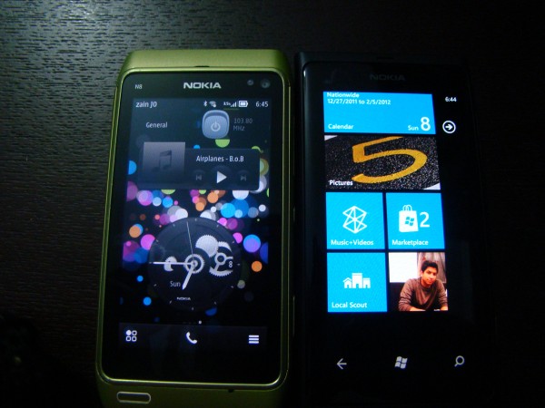
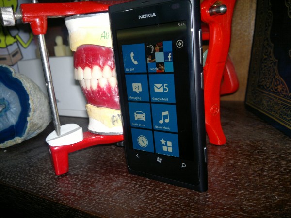
One of the most unique features about WP is the Metro UI/Tiles look, rather than Widgets; WP is based on a single ‘Homescreen’ on which you can place as many  ‘Live Tiles’ as you want, but only 2 or 1 tiles per row depending on the width of the tile (Reminds me of early S^3 widgets). The tiles on WP Mango are called “Live Tiles†due to the fact they are constantly updated/refreshed to give a more interactive feel to the user, allowing you to view your missed calls, emails, messages and much more without having to access said location; the Live tile simply displays the fact that you have a message on your home screen.
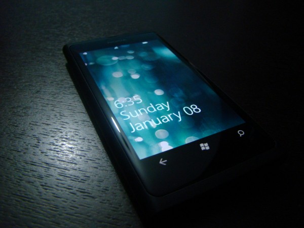
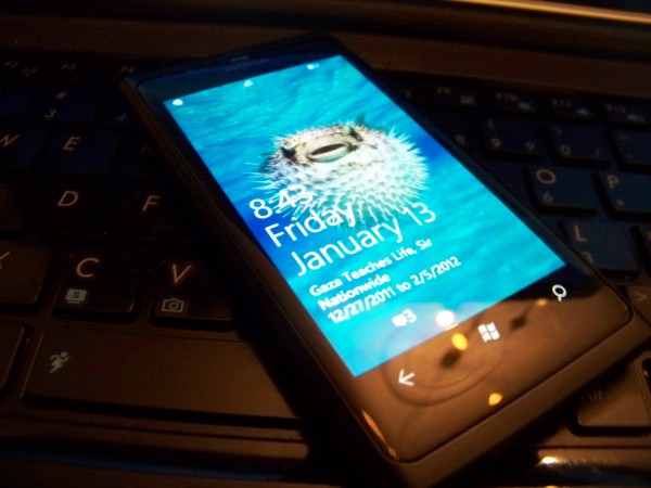
When In standby mode there is almost no way to tell if the Lumia 800 is even on or not, unlike the N9 which has the amazing “double-Tap†to wake up, or S^3 phones with their always on Clocks, the 800 appears dead unless the lock screen button is pressed, upon which you get to the unlock screen which displays your upcoming events, the time & date, notifications as well as battery life.
Once the phone is unlocked you get to the Metro-UI which can be customized to multiple colors depending on your preference, to change the theme color simply head to ‘settings>Theme and choose whatever color suites your mood. However the Lumia 800 comes with a special “Nokia-Blue†color for its UI which seems to be the most attractive on the phone.
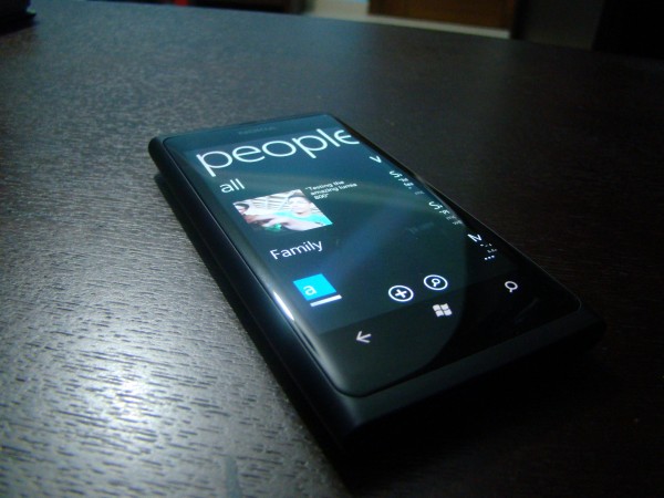
Windows Phone distinguishes itself from other OSes by bringing your contacts to life, on WP contacts stop being names on your phone and become ‘people’; hence the People Hub, which combines all your accounts from Google, Windows Live, Facebook and Twitter all in one place to keep you updated and constantly linked. WP automatically merges contacts from different accounts with the same name together (which lead to a bit of confusion due to incorrect merging), each contact has a number or tabs including: the main contact info/Profile, What’s New (which brings you the latest updates from FB and twitter), Pictures (which brings all pictures recently uploaded) and history which displays your latest contact with the contact be it via email, phone or FB message.
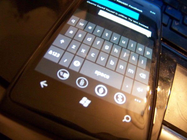
The Virtual keyboard on WP is an absolute joy to use, with accurate text correction and nice tapping sounds every time a key is hit, it’s definitely my favorite onscreen keyboard; a complete 180 degrees polar opposite of the atrocious stock S^3 keyboard that we all love to hate. I didn’t bother reviewing the Keyboard here as Jay has already made a nice comparison video between Symbian Anna and WP 7.5 which can be found HERE. My only complaint about the onscreen keyboard would be that in landscape mode the space on the edges is not fully utilized, losing about a complete centimeter to the time in the upper left corner.
Market place & Pre-Loaded Apps:
Apps… the whole reason Nokia have a Windows Phone, “ecosystem†that magical word, what’s so special about the Windows Phone market place? At this point I’m going to say something that I’ve never believed until I used WP: “Quantity is irrelevant!†this is where my usage of Android kicks in, sure android might have a gazillion apps, but almost 75% of them are buggy, have a garbage UI and consist of trying to connect two dots together (Nokias Snake on the 2100 was more sophisticated than some of the apps on the android marketplace).
Windows Phone on the other hand seems to be promising in both aspects, quantity as well as quantity; the growth of the WP market is steadily increasing (currently at 55K) but what’s more important is the fact that they are fifty-five thousand quality apps out there. The one consistent factor between almost all apps I’ve tried on the Lumia 800 is the fact that they have a beautiful UI alongside a well coded game/app engine (due mainly to the fact that Microsoft is offering large incentives to bring in the developers).
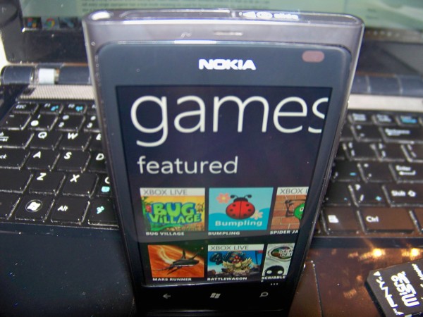
The market place app itself is beautifully designed dividing its content into Nokia collection/apps/games/music/podcasts, with detailed classification of each category/genre of apps and games; for example games in the market place are classified into Xbox live/ top/ free/ new making finding whatever you’re looking for loads easier. Another wonderful feature is that as far as I can tell every single app/game has a trial mode meaning no need for buyer’s remorse, try out the app if you like it buy it; if not nothing lost.
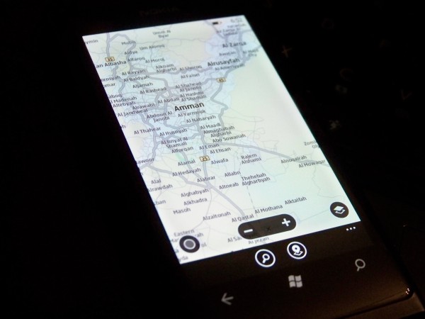
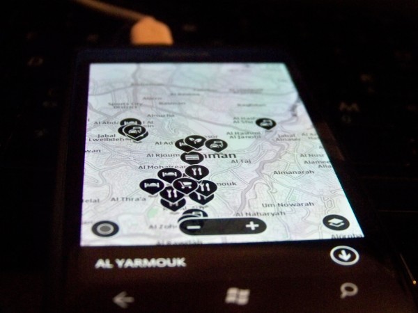
One feature setting the Lumia 800 apart from the rest of the Windows Phones out there is the inclusion of the ever amazing Nokia Maps/Drive, which is just as smooth and amazing as it is on S^3 with a considerably faster GPS lock than that on my N8. Maps can be downloaded for your selected country from within ‘Nokia Drive’ to enable navigating in offline mode. Nokia Maps also has a feature to find nearby popular places, relying on tour guides as well as other users reviews to give you the best recommendations of nearby places.
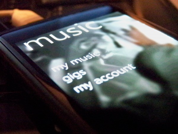
Nokia also includes their own “Nokia Music†which enables you to connect to Nokias Own music server (formerly Ovi Music) rather than connecting to the Windows Phone marketplace to download any tracks you might have purchased on your old Symbian phone. Nokia also included ‘Gig Finder†which locates nearby concerts/events depending on your location and will display them within the app (sadly no gigs were located when I tried this in Jordan); one other interesting feature is something called “Nokia Mix Radio†which is their own Online Radio service that customizes playlists depending on what music you have on your phone, to help find music similar to your taste. Nokia Mix Radio enables you to directly download the tracks you enjoy from the Music store; however my Lumia 800 didn’t have Mix Radio at all, nor was there an option to activate it (possibly region related?? Although it’s an online music service so that shouldn’t matter???).
4) Camera:
Now to what is usually the most notable feature on Nokia phones: The camera. Without beating around the bush I must say that the 8mp shooter in the Lumia 800 was sadly a let-down, here’s why. The main reason is that alot of previous N8 owners who fell in love with the N8s camera are going to be switching to WP soon, unless they want to stick around for the rumored N8 successor which is supposedly running Symbian as well; regardless for me transitioning from the king of camera phones down to the Lumia 800 (yes, I used the word ‘down’ cause it is indeed a couple of steps down) was a difficult process, on my N8 I became used to “Quick-Draw Point and Shoot†with almost all pictures coming out at near professional range quality. The Lumia 800 on the other hand is a phone that is difficult to get a handle on, but once you get setting just right to it can still produce an impressive shot.
Now the 800s camera isn’t as horrible as I’m making it out to be but as mentioned I’m comparing it to the abilities of my N8. Normal everyday capturing is quick and simple, and will usually give you a decent picture provided there’s enough lighting available; however the landscape low light photos were absolutely dreadful barely capturing any light at all (smaller lens?) compared to the iPhone4s and the N8 it didn’t stand a chance at low-light images. Macro images surprisingly were extremely nice, even with below optimal lighting they still came out stunning, even somehow surpassing those of my N8s when it came to super closeups.

A close-up macro mode in low light, surprisingly nice (the candle is surrounded by glass so no flash was used for capturing this)

Un-impressive low light scene capture, the water isn't supposed to be lit, it's just normal water (BTW that's the worlds tallest fountain)
More Images Here:Â http://www.flickr.com/photos/23218958@N05/sets/72157628855141245/
The video capturing was above par on the 800, it has the ability to shoot at 720p with full autofocus, which results in decent sample videos even with indoor fluorescent lighting; the autofocus was snappy to respond and coped well with closeups/macro videos. However it did seem that some colors ended up over saturated when filming up close, in the video below (final 5 seconds or so) the crown of the parrots head is actually closer to a greenish-yellow, yet in the video it appears almost blue/turquoise, regardless I can’t complain about the Lumia 800s video capturing abilities as it was overall impressive.
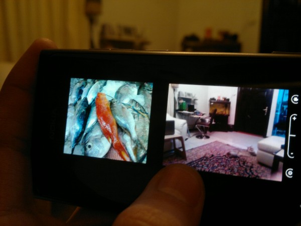
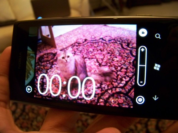
Another point worth mentioning is the beautiful camera/video camera UI on windows phone, it’s a completely flexible experience allowing you to swipe directly into your gallery from the camera view, as well as pinch out to view your previously taken pictures side by side with whatever you’re looking at in normal camera view. I also loved the display of the video length during recording; the big numbers on the screen are large enough to be viewed from 3 feet away yet un-obtrusive to your recording view.
I’m not sure whether this option is unavailable in all WP or just the Lumia 800; but there is no ability to zoom while recording (you have to select your preferred zoom level before starting, and stick with it). Another thing that puzzled me is the inability to use the volume buttons to zoom in/out in normal camera mode, nor can you pinch to zoom, the only way to zoom is to use the onscreen +/- buttons which in all honesty is annoying.
5) Media (Pictures, Videos and Music)
Media on Windows Phone is split into Music and Pictures, with each type of content appearing in its respective category; while videos appear in both categories. Both Pictures and Music come with their own live tiles that continuously randomizes different background depending on the content of the phone.
The Photo hub consist of 3 different panes Content on Phone/What’s New/ Favorites, Displayed on a backdrop of a random photo from your album split onto three separate screens giving a sort of panoramic view to your pictures.  “Content on the phone†display all content on the phone itself be it downloaded, captured or photos from a favorite contact you chose to save on your phone. “What’s New†displays the latest photo media coming from all accounts you have linked to your phone be it Twitter updates, Facebook, or skydrive pictures shared via Windows Live; What’s new also enable you to directly view all comments on a specific picture and to add your own without having to enter the browser or Social hub. Favorites are a set of photos you choose to star or add to favorites, making them quickly accessible and making them appear as the background for the Photo Hub and the Live tile more often.
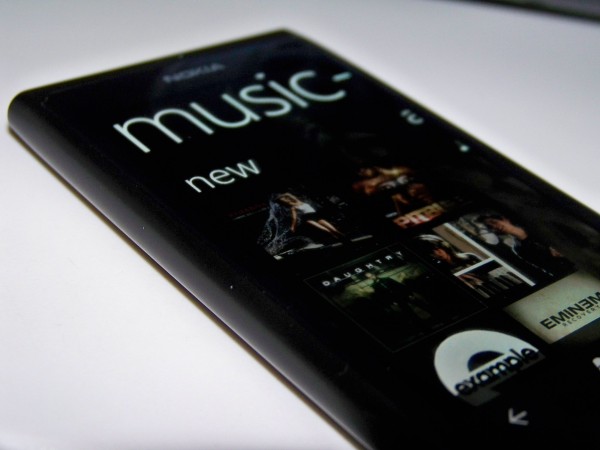
The Music Live Tile will take you to your music library where you are first greeted with a pane containing your last played music, and currently playing for quick access; from there you can quickly access the rest of your music library and playlists by simply swiping to the right. The Music hub directly supports entering the Zune music store to download Music, Videos or Podcasts from the Music Marketplace; exclusive to Lumia phones however is “Nokia Music†which also syncs your OVI account music files to your phone and bringing you access to Nokias “Mix Radioâ€.
When playing music you have an option to use “Smart DJ-Mixer†which is an addition to Windows Phone Music player, basically it searches your music library to tracks similar to what you choose to play be it by Genre, Artist, or Album and plays them after each other to suite your mood, a nice feature for those of us with 16GBs of music. Music can also be controlled from your homescreen or lock screen by simply pressing the volume buttons, which will bring up the currently playing track with the options to skip/previous and Play/Pause.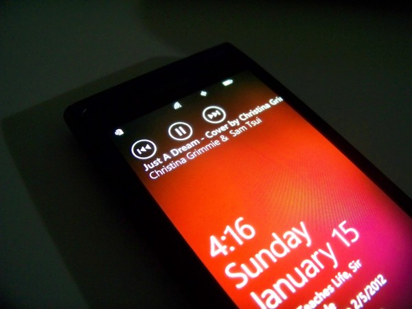
Videos as mentioned can be accessed from both the Music hub and Picture Gallery, playing only in landscape mode with the ability to resize to full screen or play in a slightly windowed mode. Unfortunately the Lumia 800 is incapable of playing DivX files and .AVI which must first be formatted into .Mp4 through Zune. As a long time Symbian user I found myself constantly long pressing on photos looking for a “mark multiple†option, which sadly does not exist, therefore you have to delete each photo/video separately one-by-one.
6) Bing Search:
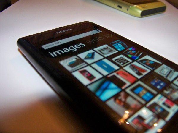
In all honesty the moment I opened the search feature on the Lumia 800 I tried to look into the settings on how to switch the default search engine to Google (hint: you can’t), for good reason though. The Bing search that comes bundled with the Lumia 800 is nowhere near the slow socially awkward search engine that I last tried about 4 years ago, the new Bing is fast smooth and sexy, coming with image search, voice input search and a music finder (similar to Shazam) it truly is a fully functional wonder.
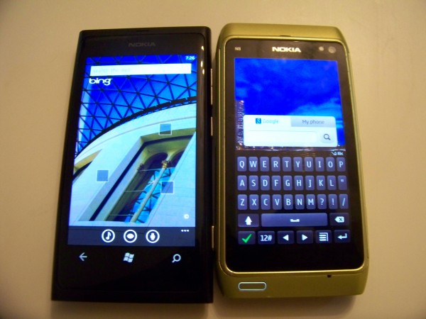
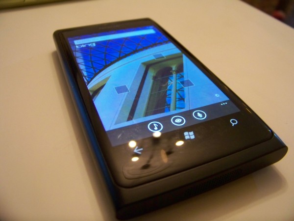
The background Image on the Bing Search (Quickly accessed by the capacitive magnifying glass button) changes every day showing you a random image with a set of new ‘information squares’ related to the search image, which will either take you to a related Photo or Map location depending on the ‘hint’.
Normal text searches are straight forward carried out on Bing bringing you Web Results, Images Results and even Location based results depending on where you are. Once your location is enable you can select any location from Bing maps and search for Highlighted areas, Shopping places, ‘eat & drink’ as well as ‘See + Do’. My two favorite features regarding Bing search are Picture Search and music detecting service, Picture search scans QR codes and gives you their direct link to their source, or it can be used to scan text and translate it into multiple different languages. The even more impressive feature is the music identifying feature (Anyone who’s used Shazam knows what I’m talking about); it took less than 5 seconds of playing “Adele’s- Set Fire to The Rain†(at random time-frames) for it to pop-up as the result with a link directly to the Zune Marketplace in case you feel like purchasing whatever track you just found.
Overall Bing search is extremely impressive (although I’d prefer it if Microsoft stopped promoting the phrase ‘Bing it’), if Bing had as much functionality on my desktop as it did on the Lumia 800 then it would be my default engine in a heart-beat.
*Note: I didn’t review the browser due to the fact that I’m not really good at browser comparison, the only note I can say about it is that don’t let the fact that it’s called “Internet Explorer” put you off, it’s really good
7) Miscellaneous:
(Some of the things about WP in general that bugged me, especially being a long time Symbian user)
First off of course is the fact that WP is a closed platform, meaning there’s a very limited amount of freedom when it comes to customization and side-loaded apps; in all honesty my biggest argument against iPhones was “at least I can do what I want without jumping through hoopsâ€, sadly you can’t say the same when you’re using a Windows Phone. Until almost 2 weeks ago Windows had offered a small piece of solace in the form of “Chevron unlocker†which for $9.00 enabled you to purchase a token that ‘unlocks’ your Windows Phone device, this unlock enabled you to side-load (install from outside the marketplace) up to 10 apps at a time; not exactly Symbian/Android freedom, but it was nice. Unfortunately as of two weeks ago Chevron ran out of unlockers and this option is no longer available; the only alternative is a $99 developers unlock which is quite pricy for something that most of us have grown to as a standard. Sadly the lockdown on outside settings isn’t just for applications, even the ringtones are just a selected few, without the direct option to set your favorite tunes as your ringtone. The limitations have even hit Bluetooth, meaning you can’t send media files over Bluetooth from one device to another (I tried multiple times with my N8 as well as my touchpad to the Lumia but always received the same failure message).
Another puzzling ‘feature’ about Windows Phone is that every-time you lock the screen your WiFi disconnects, presumably in the interest of saving battery, but I found this ridiculous; considering how  if your connected to cellular data the data connection remains active when the device is in standby which definitely takes a much larger toll on the battery life. At the very least there should be an option to stay connected to WiFi while device is locked, how else would someone without a data plan receive Emails and Notifications???
The battery life on the 800 is ‘amusing’ to say the least, as it doesn’t seem to follow any laws at all; the first two days that I received the device it barely made it 6 hours each day (without a sim/airplane mode)! However the battery life has steadily increased with me over the past week to make it easily through a complete day; add to that the promised Battery update sometime mid-January and it shouldn’t be a problem.
Of course if you plan on owning a windows phone you’d better have Zune installed on your PC/Laptop as it’s the only easy way to copy content to and from your mobile. Thankfully though Zune isn’t as tedious to use as the original Ovi Suite.
8) Wrap-Up:
The Lumia 800 is a beautiful phone, paired with what is possibly one of the most beautiful and consistent UIs I’ve seen so far, sure it might have some niggles in the design and setbacks in the OS being walled up; but when I think about the amazing People hub, the beautiful screen design and the general feel of the device it’s definitely a phone that shouldn’t be passed on, or at least not before taking an extremely long look at what you’re giving up, followed by second thoughts and doubts if you choose something else.
Windows Phone is an OS that was obviously not rushed, it was kept under covers until almost every bug and defect were weeded out, appearing only in its best; unfortunately the OS itself is more walled up than most Symbian fans will be used to, but nothing that’s an absolute deal breaker alone.
Obviously the 800 isn’t for everyone, if you want a N8 Successor this IS NOT the phone for you, if you want a second N900 this IS NOT the phone for you. If like me you grew bored of having an amazing phone that unfortunately had almost no proper apps, running an OS that had potential but was neglected and under-appreciated, if you want to upgrade your phone to something more modern with an OS that’s silky smooth and a beautiful yet strange UI then THIS IS the phone for you.
-Once again thanks to the people at Nokia Connects for making this possible, you guys are great!
Category: Android, aPPLE, Applications, Battery Life, Competition, How to:, ideas, iPhone, Lumia, Mango, MNB, Music, News, Nokia, Nseries, OVI, Photos, Reviews, Speakers, Symbian, Symbian^3, Technical Specifications, Test, Touch, Unboxing, Windows, Windows Phone







Connect
Connect with us on the following social media platforms.