Weekend Read: Windows 8 Logo – Finnish Flag inspired (or Shetland flag).
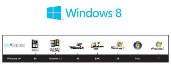
Yesterday you might have seen the Windows 8 logo was revealed. This time gone away are the curves, now there are straight angular lines that are core to the new Metro UI in Windows 8, to which Nokia is expected to produce some new products (tablets) on. They do actually look like a Windows now. It’s very plain. One of the comments (by DjiXas)Â on the Windows Team blog was to change it at least to the MS colours.
They have an interesting picture showing the progression of the curvy flag like design to this more metro look.
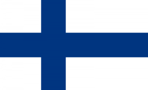
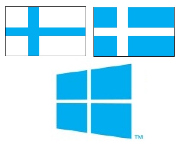
On the point of flags (which the Windows Blog addresses the logo is a Window and not a flag) it sort of reminded me of the Finnish flag.
Well a somewhat reverse colour Finnish flag, which btw of blue with a white cross is the Shetland flag. Since Shetland isn’t a country, then I guess the more prominent connection will have to be Finland, and why Not since Microsoft’s biggest partner in mobile is Finland’s Nokia – possibly the saviour of MS’s mobile efforts should things come to plan.
That logo does look more like part of the tiles on the Windows Phone start screen (the classic blue ones). They’re definitely trying to unify their brand to wards one common identity – Metro. The logo will apparently change colour when you change your colour (I’m guessing colours on Windows 8 as opposed to you personally activating our inbuilt chameleon skills).
The purpose of the design is apparently to bring it back to its roots. Windows being just a window.
With Windows 8, we approached the logo redesign with a few key goals on mind.
1. We wanted the new logo to be both modern and classic by echoing the International Typographic Style (or Swiss design) that has been a great influence on our Metro style design philosophy. Using bold flat colors and clean lines and shapes, the new logo has the characteristics of way-finding design systems seen in airports and subways.
2. It was important that the new logo carries our Metro principle of being “Authentically Digitalâ€. By that, we mean it does not try to emulate faux-industrial design characteristics such as materiality (glass, wood, plastic, etc.). It has motion – aligning with the fast and fluid style you’ll find throughout Windows 8.
3. Our final goal was for the new logo to be humble, yet confident. Welcoming you in with a slight tilt in perspective and when you change your color, the logo changes to reflect you. It is a “Personal†Computer after all.
Apparently there’s a Nokia W8 tablet in Nokia Russia though we’ll not talk about that.


Connect
Connect with us on the following social media platforms.